VAKAcademy

VAK Academy is an education institution built on the Visual, Auditory, and Kinesthetic learning framework — a methodology that recognizes every student learns differently. ARCT Studio led a full rebrand, creating a complete visual identity system from logo to brand guidelines that communicates the joy of learning, the credibility of an institution, and the energy of a modern academy ready to compete in the education market.
Solving the Complexity.
VAK Academy had a strong educational methodology but a visual identity that didn't reflect it. Competing against established private courses and learning centers, the brand needed a visual system that felt both academically credible and genuinely inspiring to students.
Pain Points
- Logo lacked distinctiveness and conceptual depth.
- No cohesive visual system across any touchpoint.
- Brand didn't communicate the VAK learning philosophy visually.
- No guidelines — team applied the brand inconsistently.
- Missing key visual assets for promotion and office presence.
Objectives
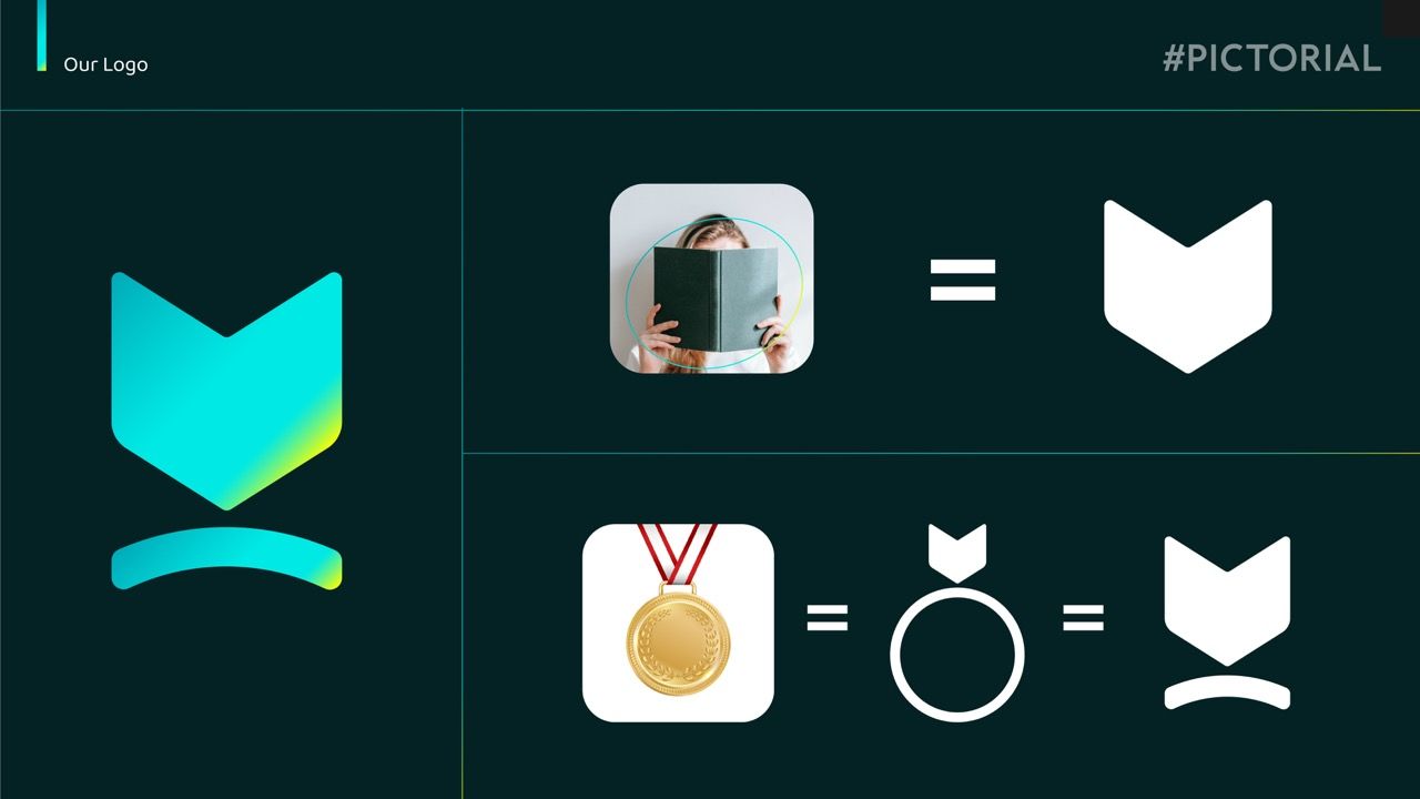
- Design a logo combining book, medal, and VAK acronym meaning.
- Build a vibrant color system communicating learning as joyful.
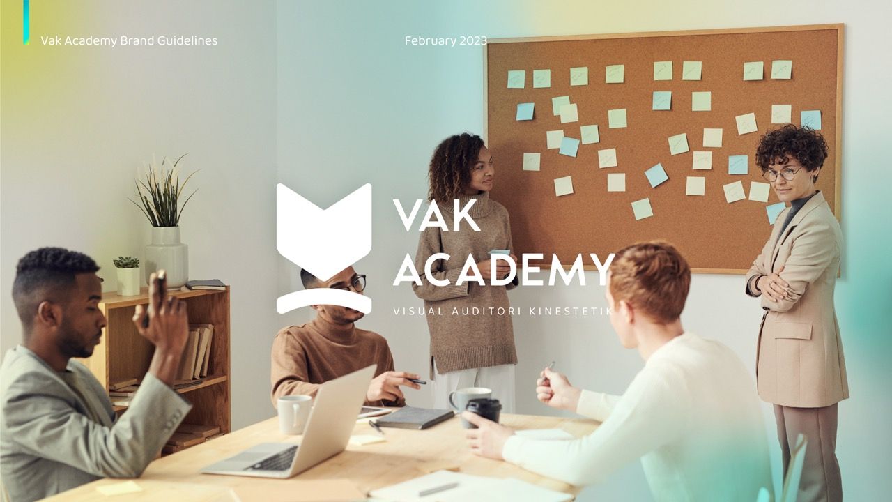
- Produce a complete brand guidelines document for internal use.
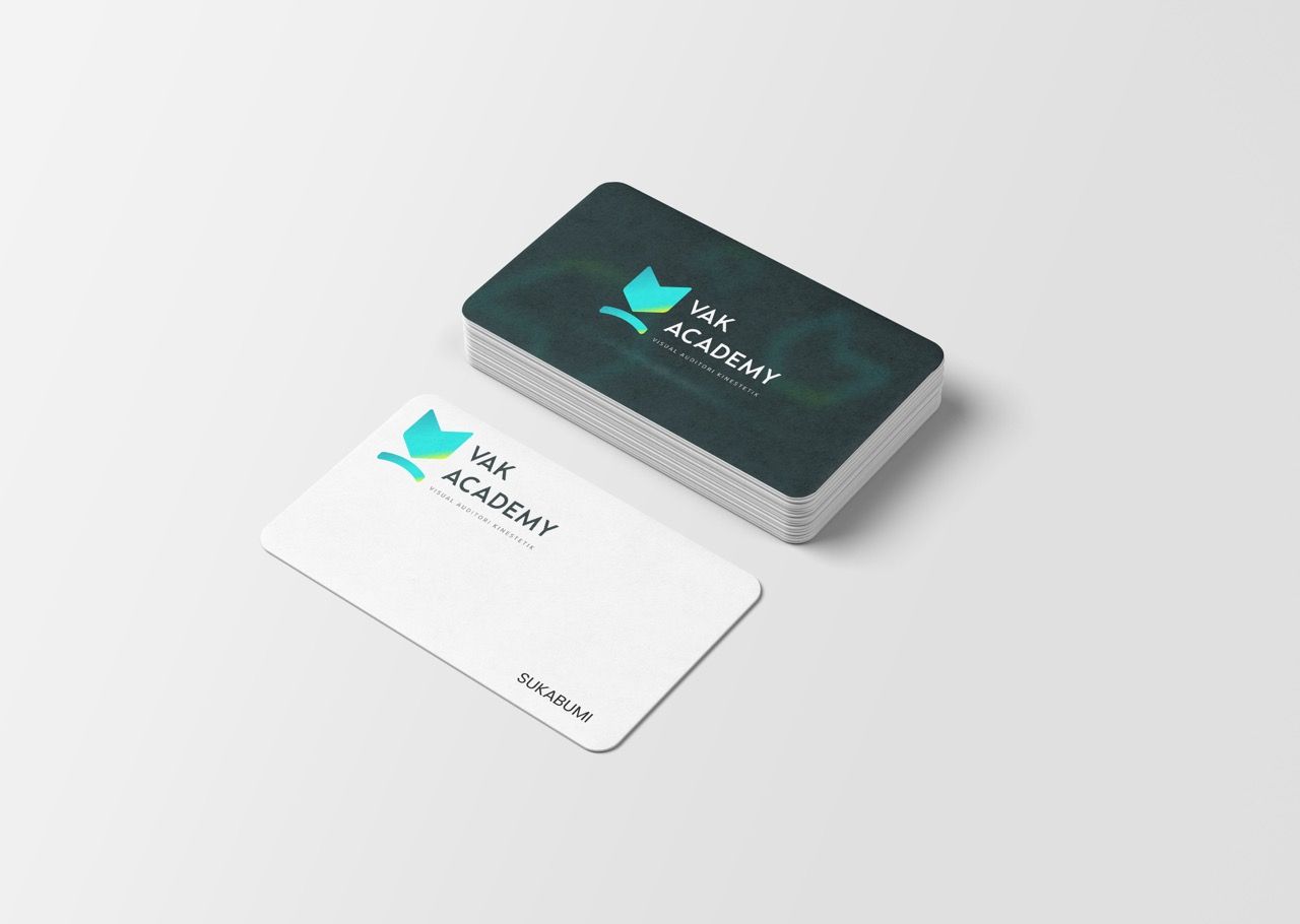
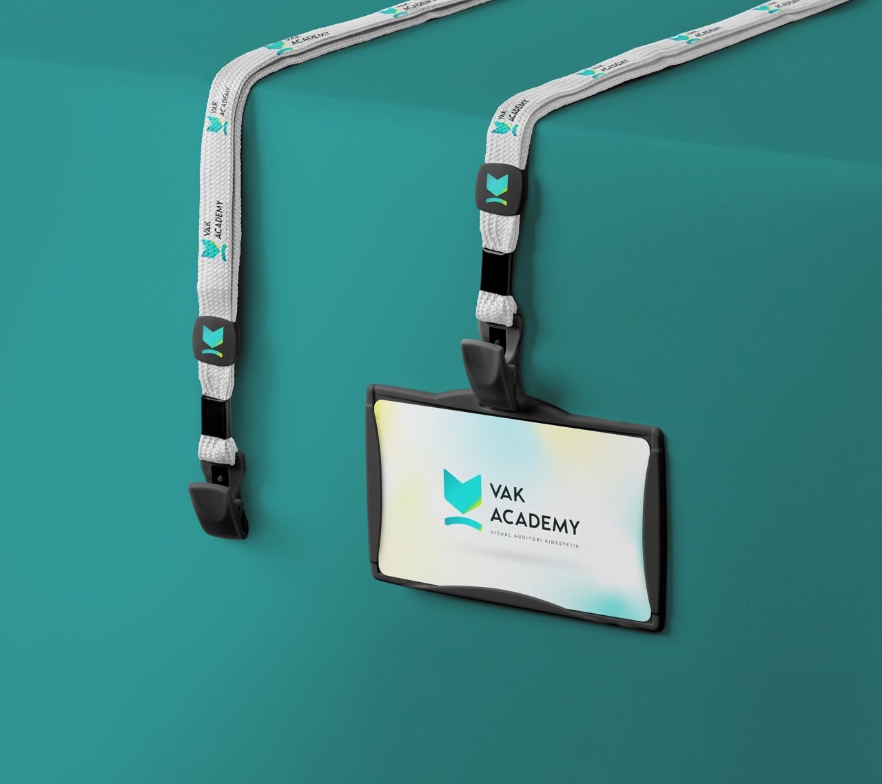
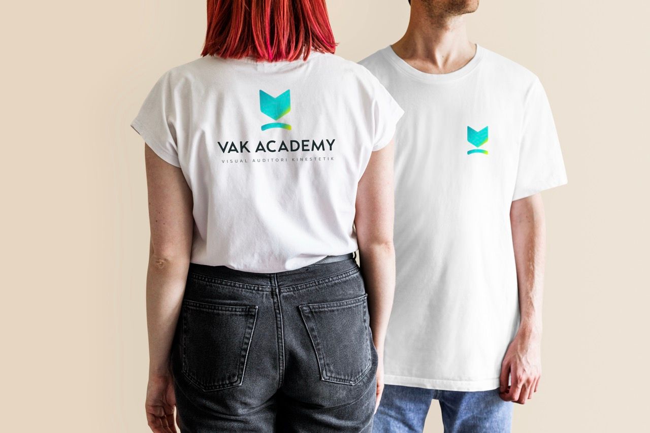
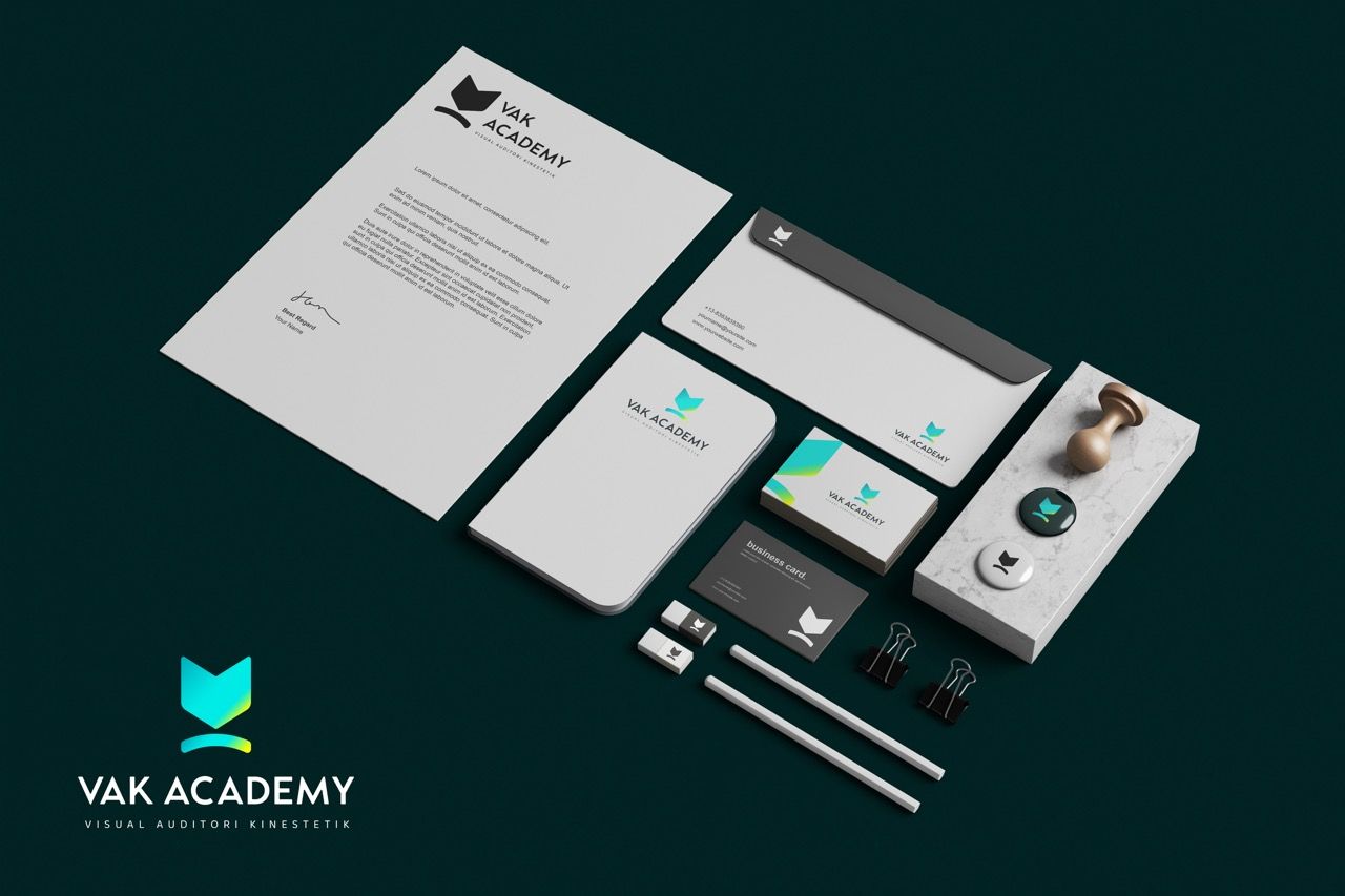
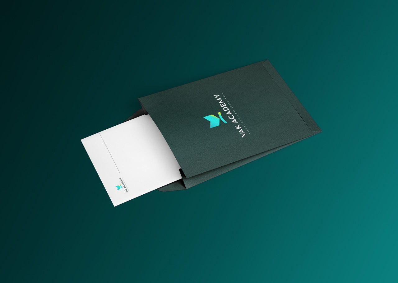
- Create a full mockup suite covering stationary, merch, and office.
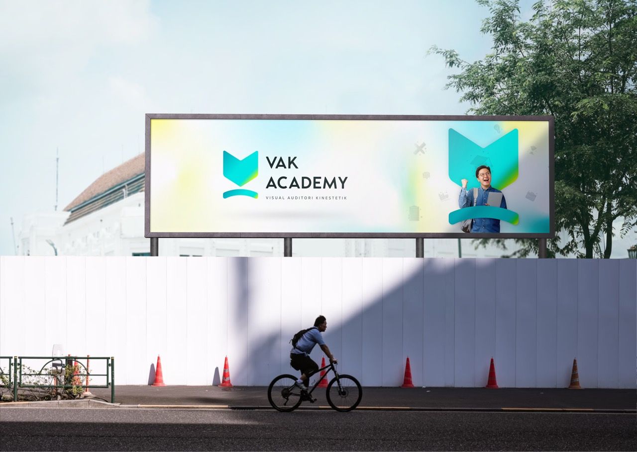
- Deliver a key visual system for promotion and stand-out content.


Decoding the Audience Psyche.
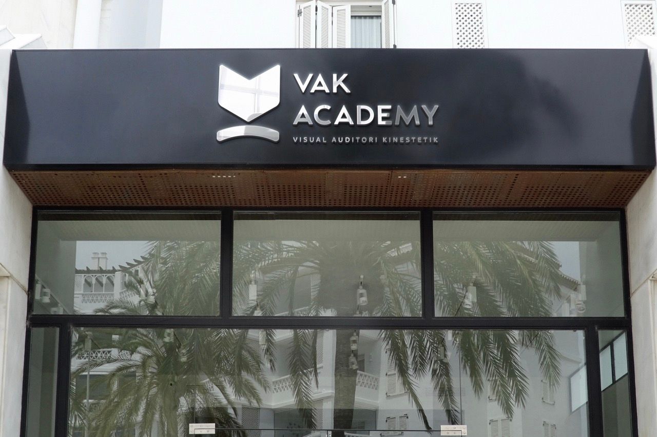
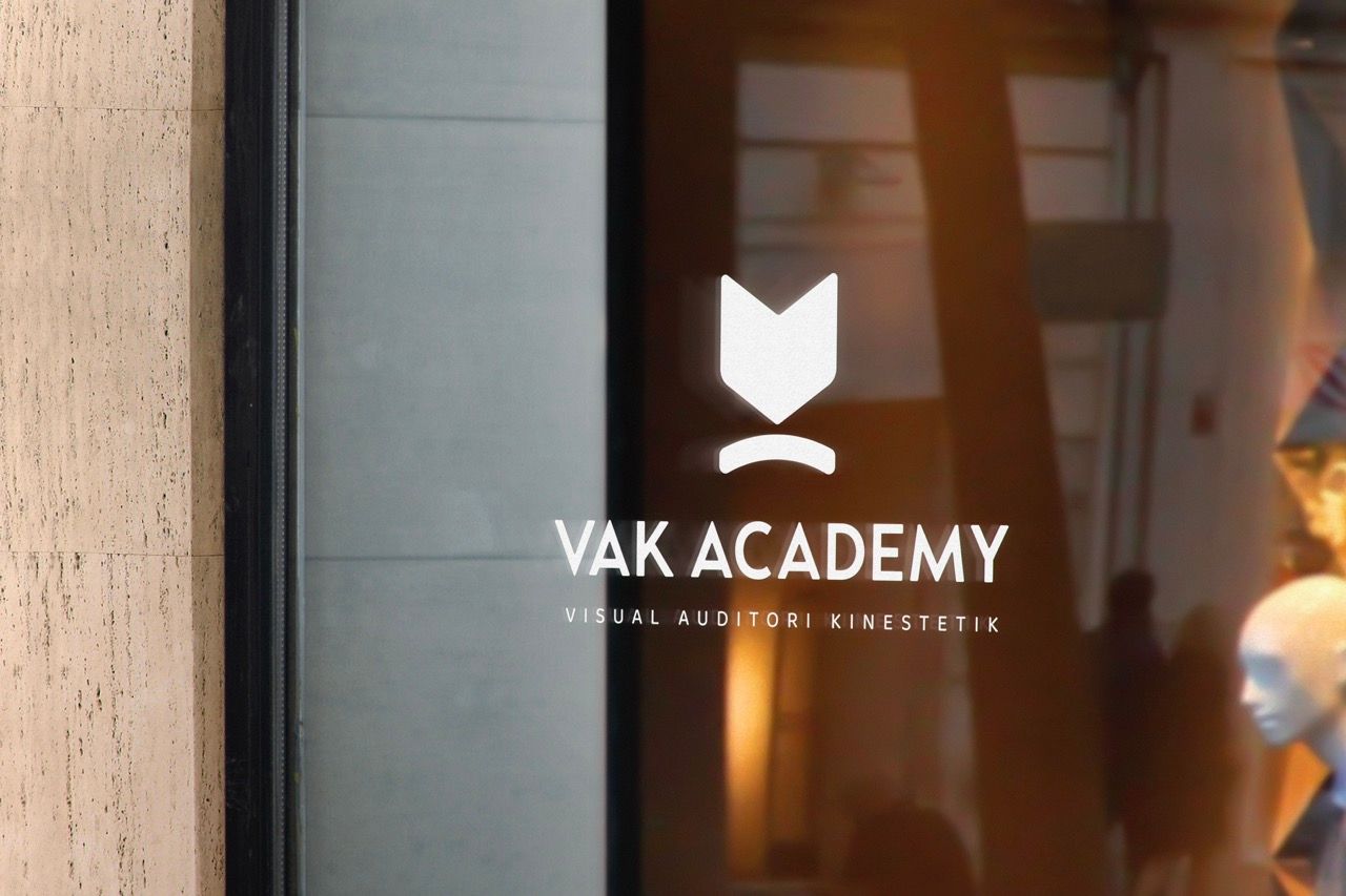
Local private courses and bimbel centers across Indonesia typically operate with minimal branding — text-heavy banners, generic logotypes, and zero visual consistency. VAK Academy's new identity immediately positions it a tier above the standard education provider.
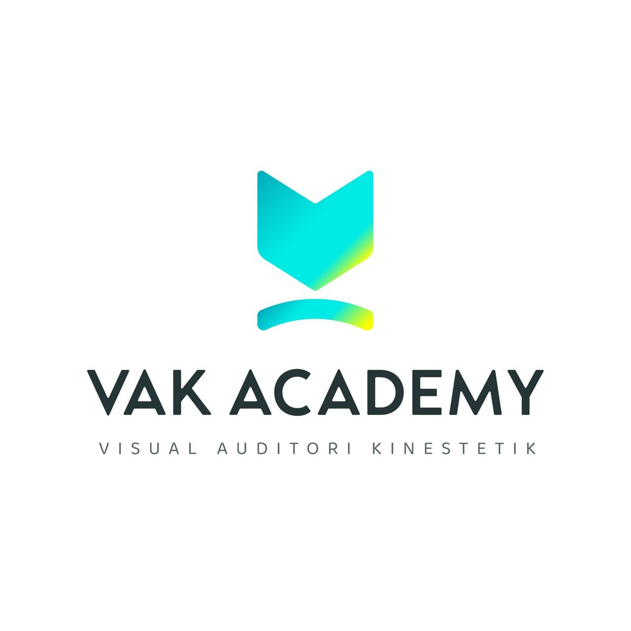
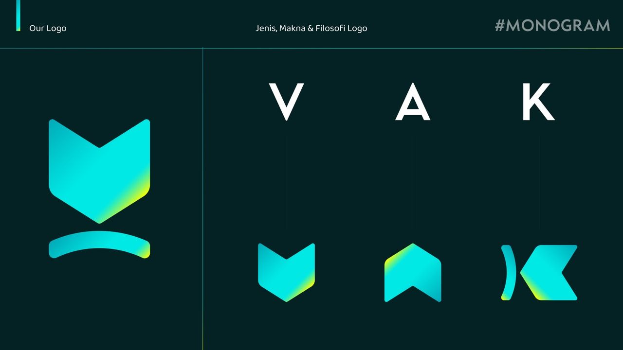
The logomark must carry meaning on three levels simultaneously — book, medal, and the letter V — without visual overload.
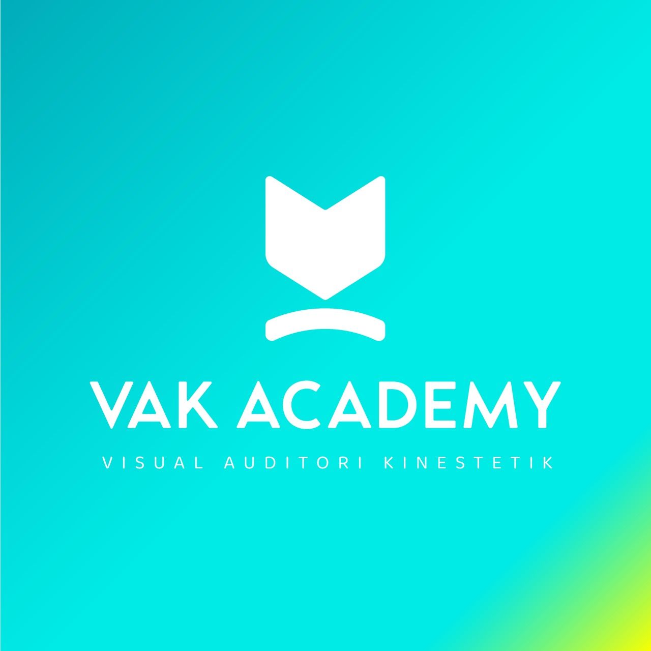
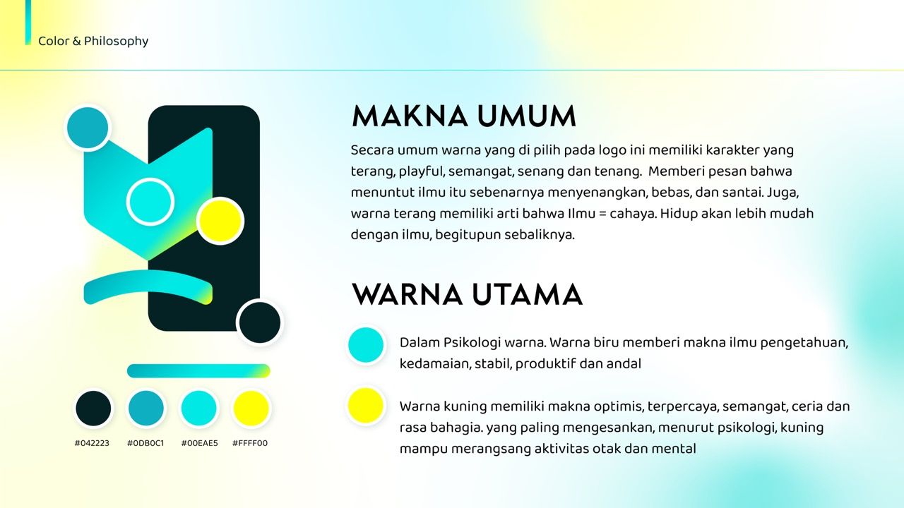
Bright teal-to-yellow gradient communicates the core brand truth: knowledge is light, learning is energizing, not heavy.
Yellow in color psychology stimulates mental activity — it is literally the most educationally appropriate accent color available.
Brand guidelines are not a luxury for an education brand — they are the first proof to parents and students that the institution takes itself seriously.
A key visual with a real student inside the logo shape bridges brand and humanity — making the institution feel accessible, not corporate.
Crafting the Identity.
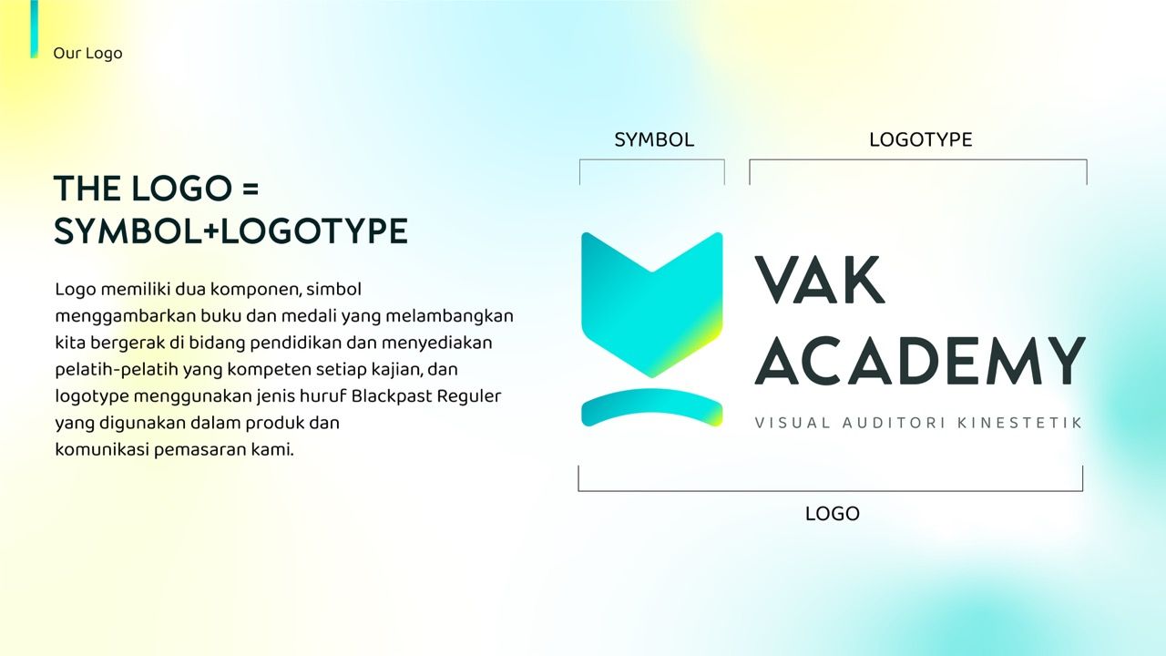
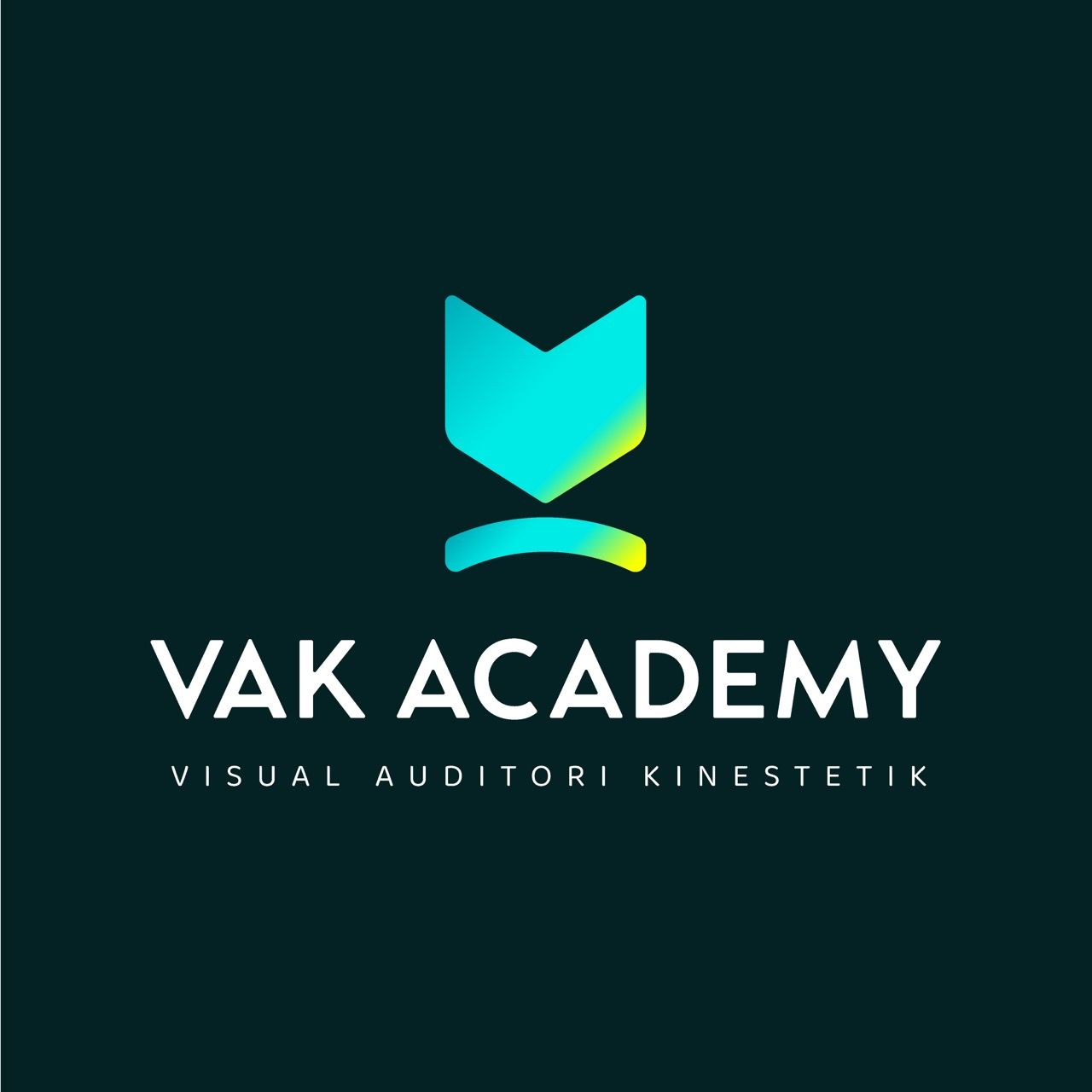
VAK Academy was redesigned around the idea that "knowledge is light." The logomark fuses two powerful symbols into one clean geometric form: an open book viewed from above, and a medal — representing learning achieved and achievement recognized. The curved base element beneath the mark abstracts the medal ribbon into a smile-like arc, adding warmth without decoration. The gradient moves from teal (#0DBOC1, #00EAE5) to electric yellow (#FFFF00) — communicating the progression from calm focus to energized breakthrough. Dark forest green (#042223) anchors the system with depth and credibility. Blackpast Regular was chosen as the primary typeface — structured, modern, and confident — paired with Baloo Chettan 2 for body text warmth and readability.
The Final Execution.
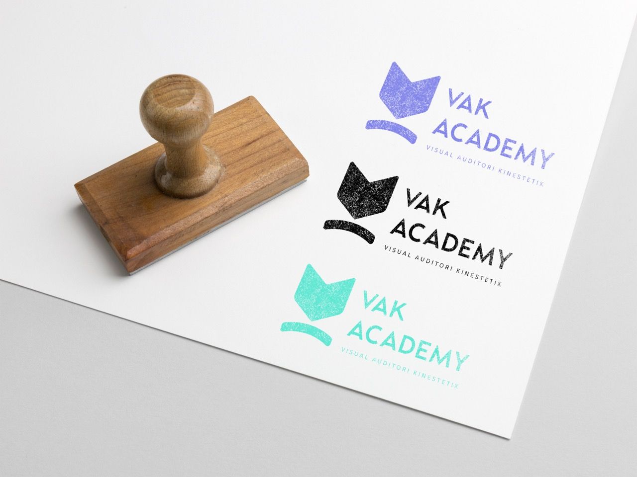
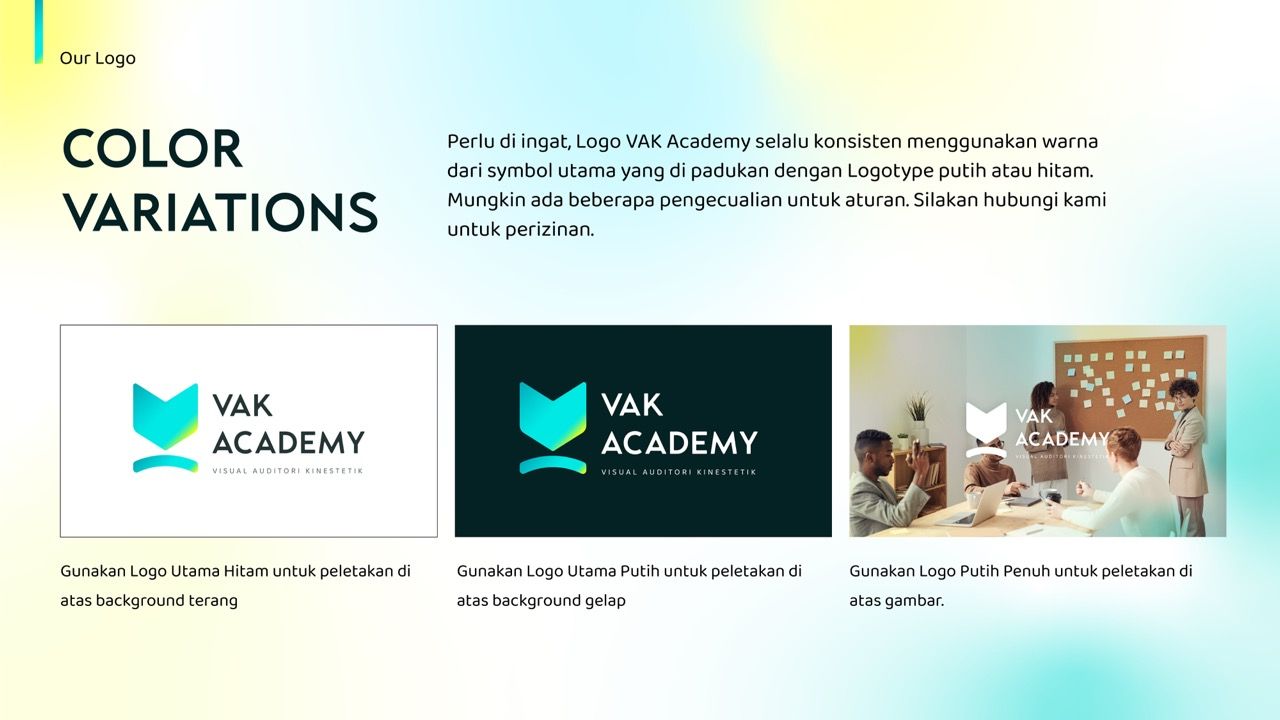
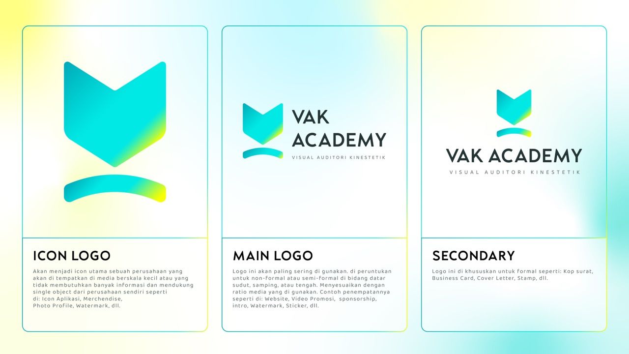
Logo development began with deconstruction of the brand name VAK. Three logo variants were developed and documented, Color variations were tested across all background types, Typography system was structured in three tiers, The key visual applied the logo shape as a full composition frame
The Result.
VAK Academy now has a complete, documented brand identity that communicates educational credibility, learning energy, and institutional confidence across every touchpoint.
We ordered a Logo and Company Profile Design, the results were very satisfying
President Director
PT VAK ACADEMY INDONESIA
VAK Academy was a reminder that education brands carry a unique weight.
Every parent who sees this logo is making a decision about their child's future. Every student who wears the merchandise is carrying an identity.
The logo cannot just look good — it has to feel trustworthy at a glance.
Getting the right balance between warmth and authority, between youthful energy and institutional credibility, required more iteration than almost any other category.
When the gradient teal settled onto the dark forest green in the final version, it felt exactly right — like the moment a light turns on in a dark room.
That is what the brand needed to communicate. And that is what it does.