ASSeafood
AS Seafood is a seafood restaurant that came to ARCT Studio with one clear goal: make the brand work harder. The rebrand was not just aesthetic — it was strategic. Every visual touchpoint was redesigned to drive sales, build trust, and increase brand awareness, from the logo and menu to the delivery truck wrap and neon box signage.
Solving the Complexity.
AS Seafood had an existing identity that lacked the visual authority to compete in the F&B market. The restaurant needed a brand that could convert at every touchpoint — on the street, on the menu, and online — without a complete business overhaul.
Pain Points
- Logo lacked distinctiveness and premium authority.
- No cohesive visual system across print and digital.
- Menu design didn't support the dining experience quality.
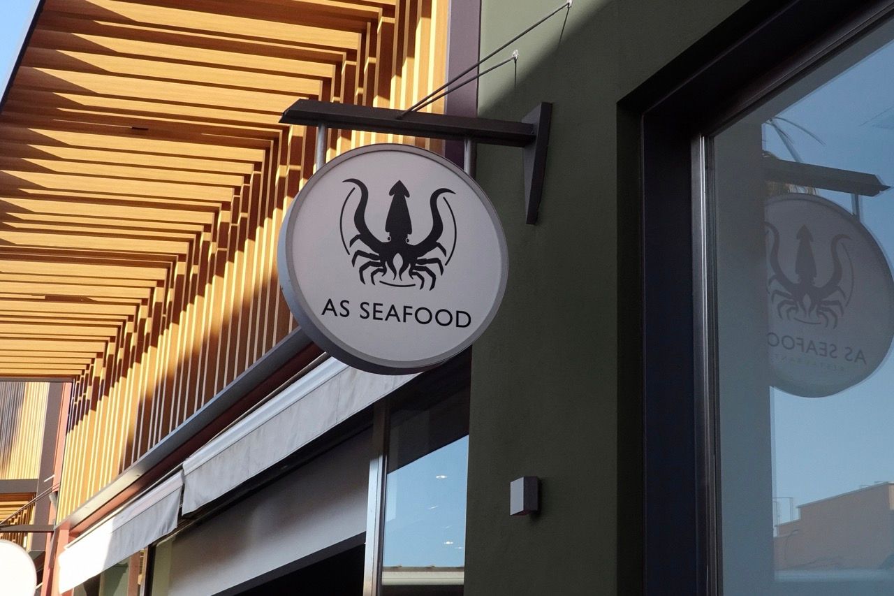
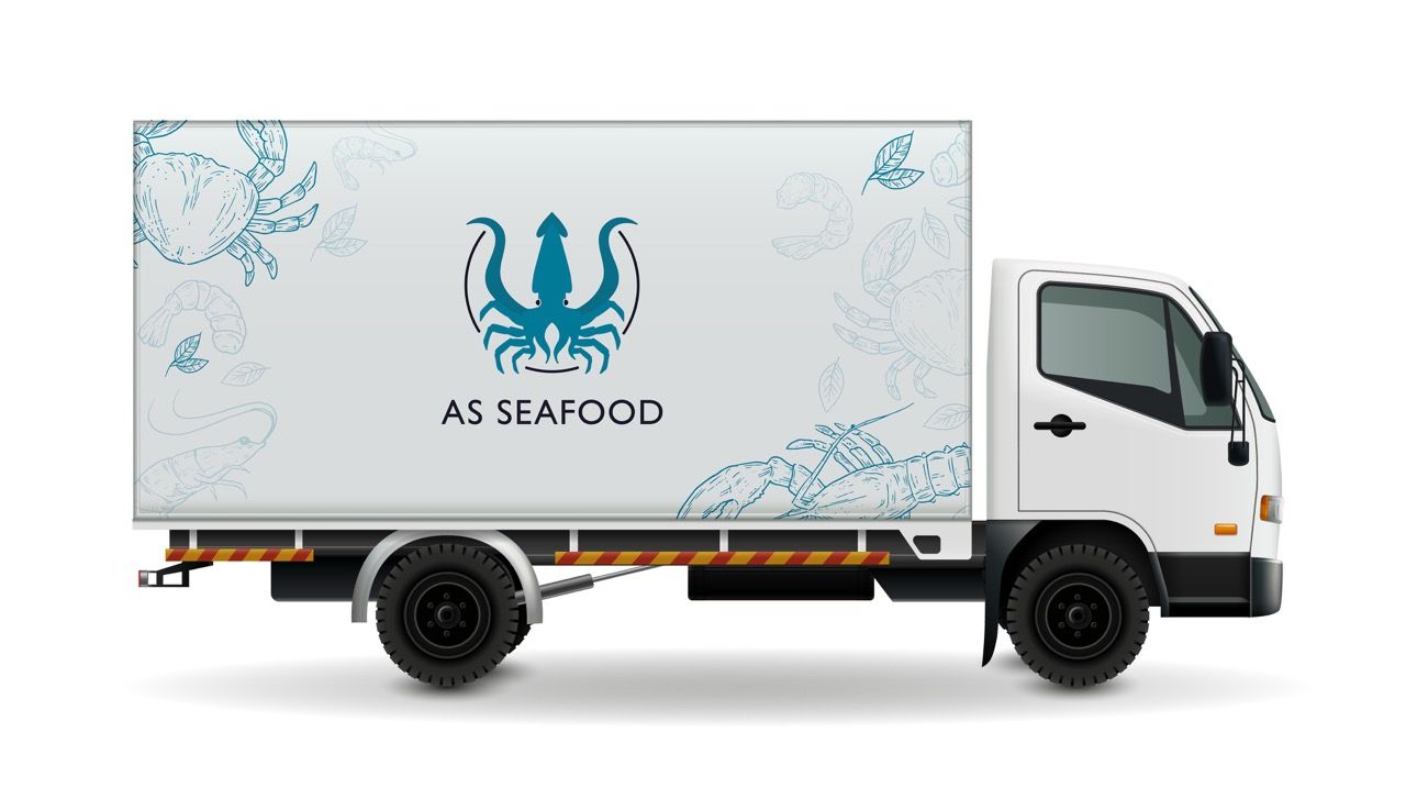
- Zero brand presence on physical infrastructure like truck and signage.
- Brand couldn't communicate freshness and trust simultaneously.
Objectives
- Redesign a distinctive logo communicating seafood expertise.
- Build a color system rooted in ocean freshness and trust.
- Design a full set of physical brand touchpoints for the restaurant.
- Create poster and menu templates ready for ongoing use.
- Produce a visual identity presentation for stakeholder alignment.
Decoding the Audience Psyche.
Generic local seafood warung and restaurants across Indonesia operate with handwritten menus and no visual identity. AS Seafood's rebrand immediately places it in a different category — premium, intentional, trustworthy — before a single dish is served.
Mid-scale seafood chains like Seafood Hoka-Hoka and regional competitors invest in branding but often rely on loud promotional aesthetics over considered identity design. AS Seafood competes with restraint — cleaner, more confident, more ownable.
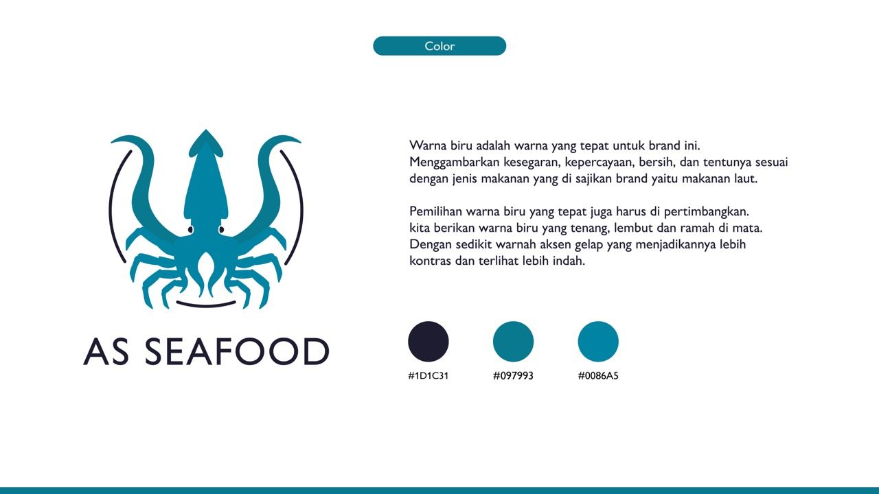
Ocean blue is not just aesthetic for seafood — it is a trust signal that communicates cleanliness, freshness, and quality before tasting.
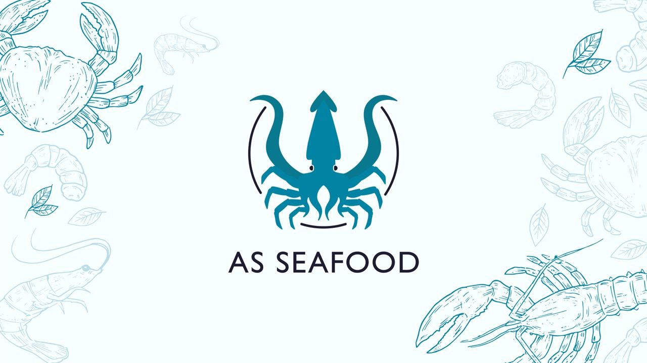
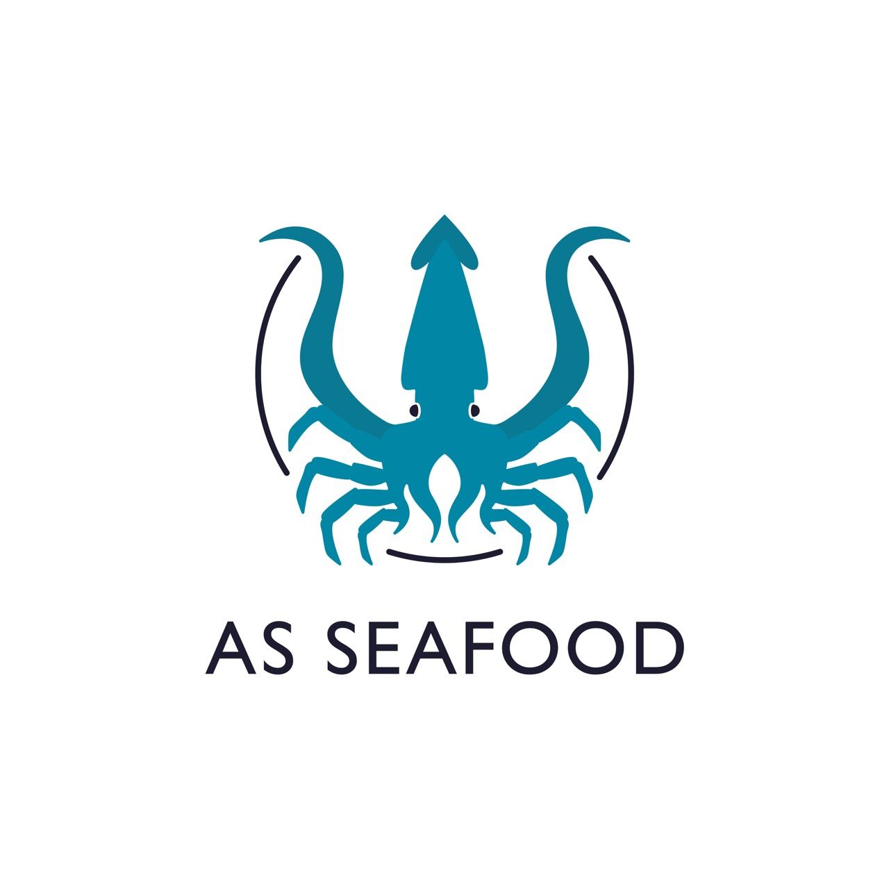
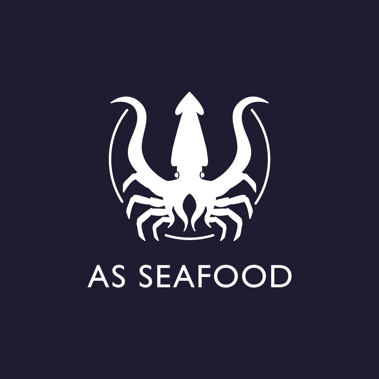
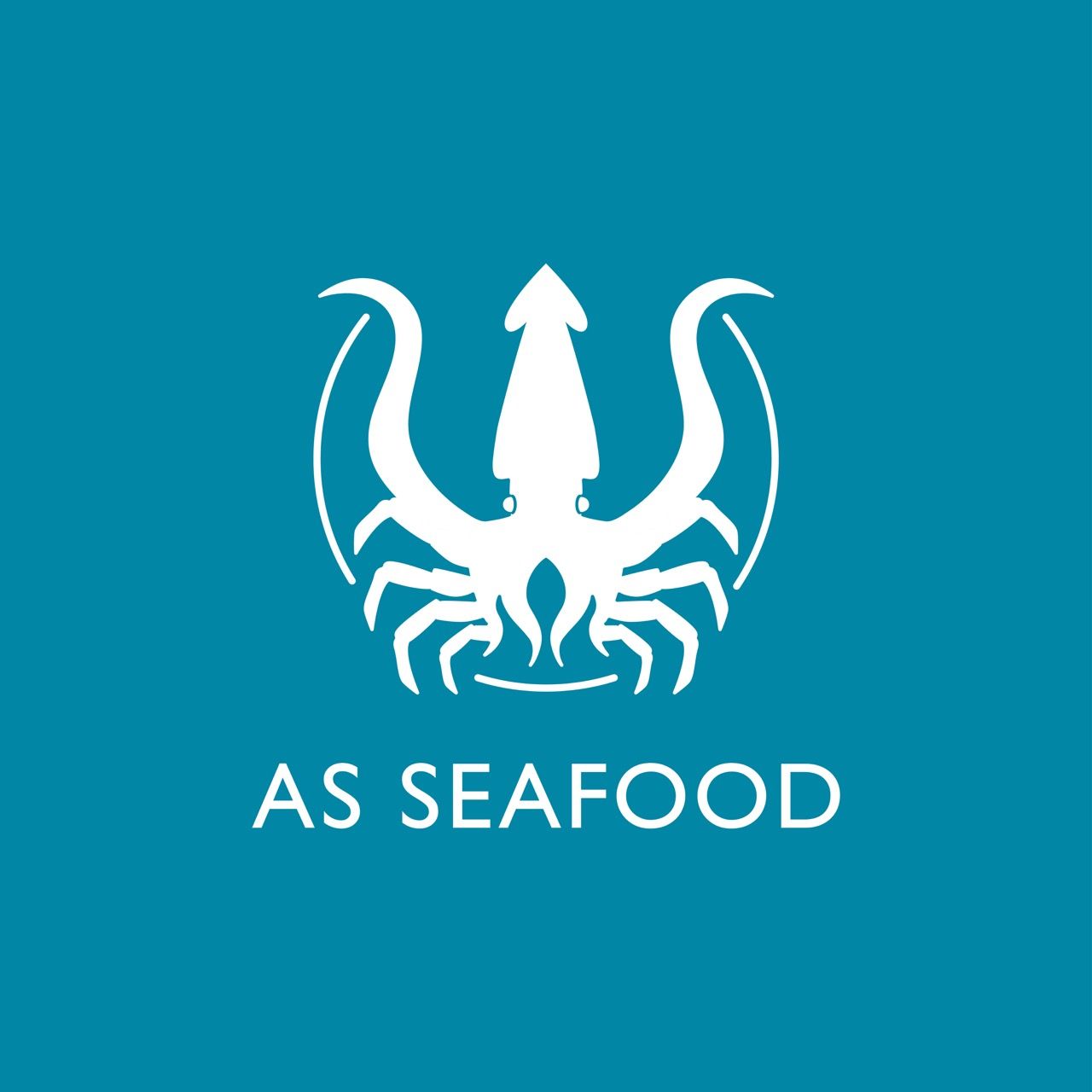
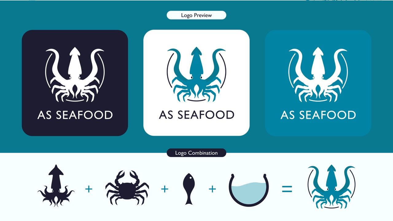
A logomark combining squid and crab in one unified silhouette communicates the full seafood range in a single icon.
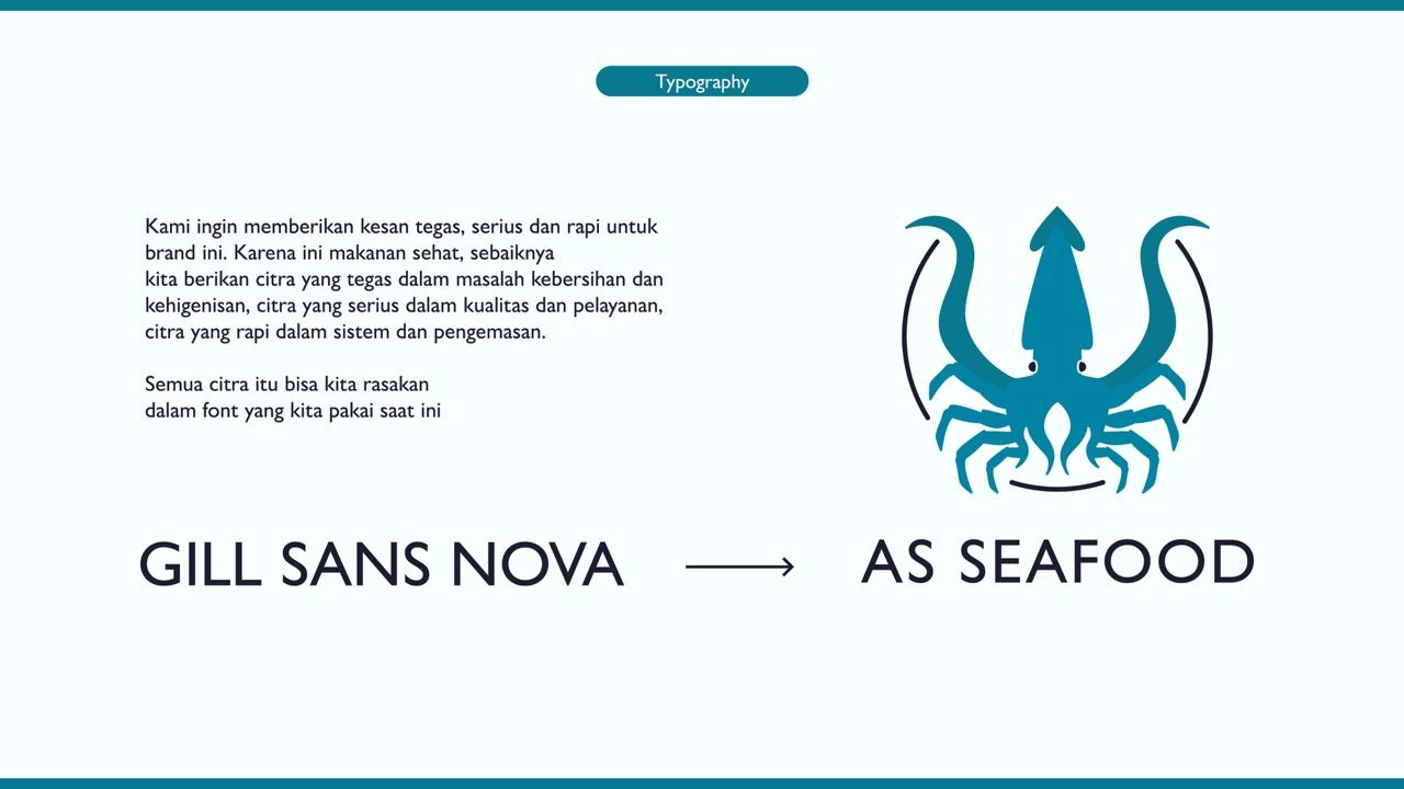
Gill Sans Nova as typography delivers firmness without coldness — the right balance for a food brand that wants to feel both clean and welcoming.
The delivery truck is a moving billboard — branded correctly, it generates more impressions per day than any static placement.
Menu design is a conversion tool, not just a list — visual hierarchy and food photography framing directly influence order value.
Crafting the Identity.
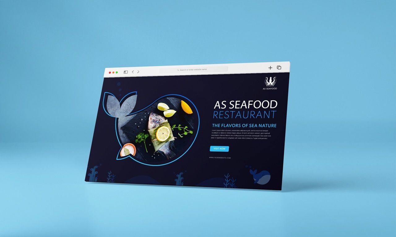
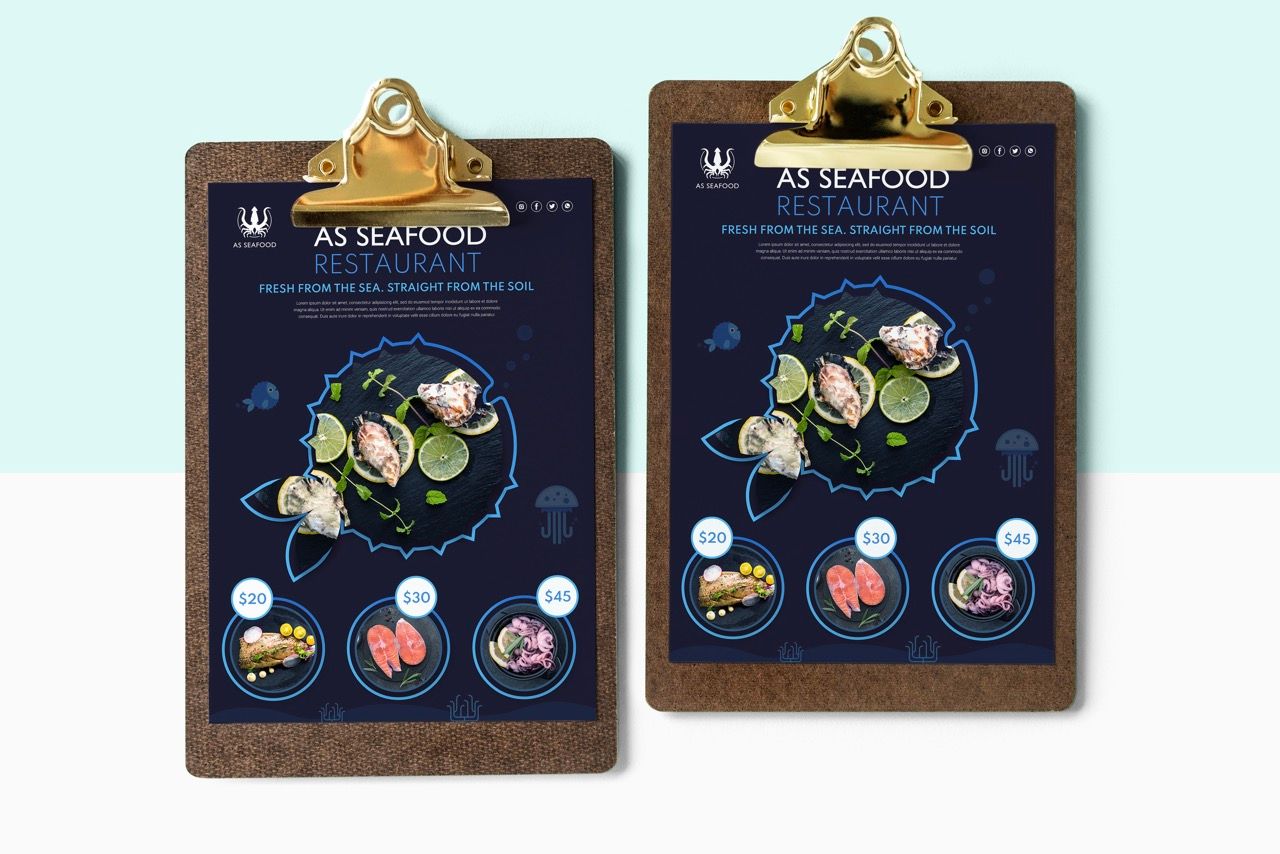
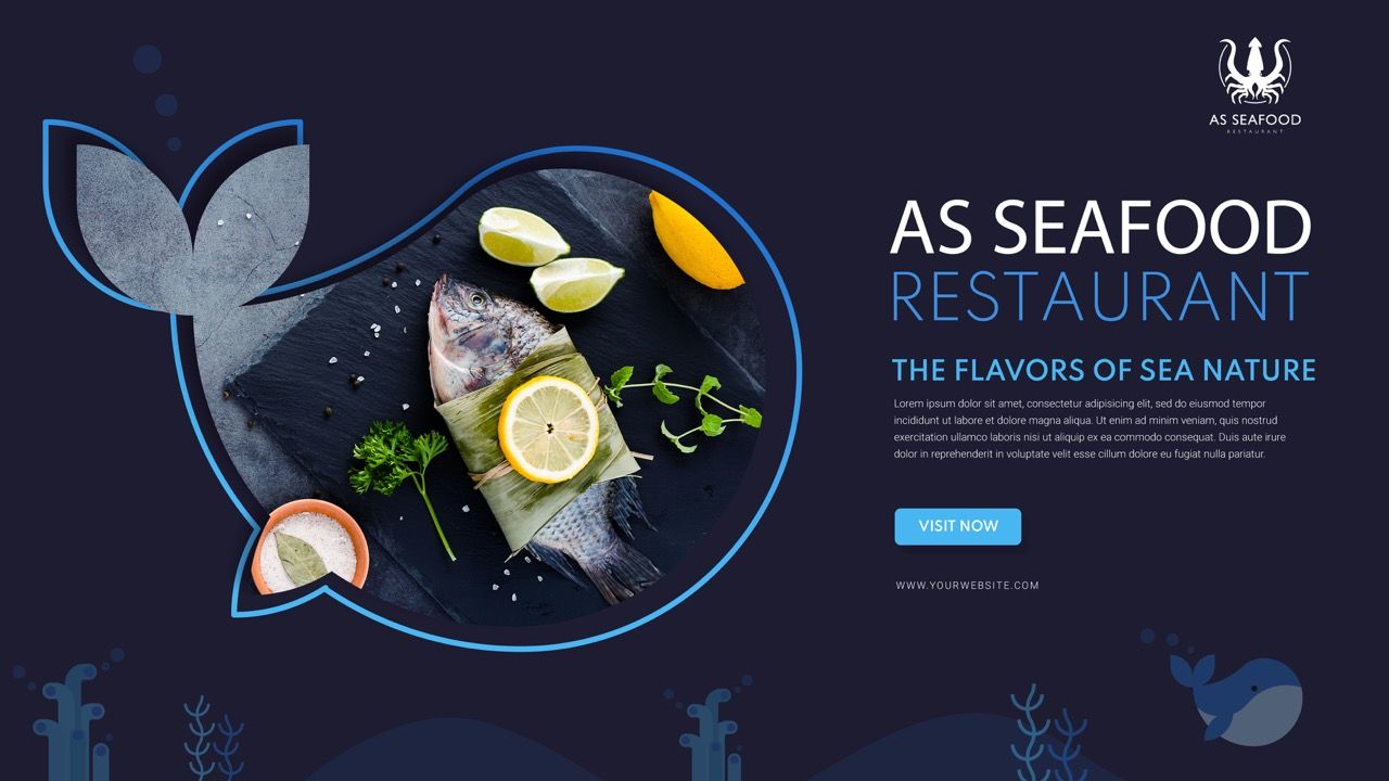
AS Seafood was rebuilt around "Fresh From the Sea. Straight From the Soil." — a brand position that communicates origin, quality, and directness. The logomark fuses a squid and crab into a single heraldic icon — symmetrical, bold, and instantly readable at any scale from apron embroidery to neon box signage. The color palette anchors the brand in the ocean: deep navy (#1D1C31) for authority and depth, teal (#097993) for freshness and energy, with a lighter teal (#0086A5) for accessibility and warmth. Gill Sans Nova carries the wordmark — clean, firm, and modern enough for digital, structured enough for print at restaurant scale.
The Final Execution.
Logo redesign began with the dual-creature challenge: how to combine squid and crab into one coherent icon without visual noise. Color and typography systems were fully documented with hex codes and usage rationale, The poster design applied a dark navy background with the logo, food photography framed inside a sea creature outline shape, and circular price tags for featured menu items — creating visual rhythm and clear hierarchy. The poster design applied a dark navy background with the logo, food photography framed inside a sea creature outline shape, and circular price tags for featured menu items — creating visual rhythm and clear hierarchy.
The Result.
AS Seafood gained a complete, conversion-focused brand identity — premium, consistent, and built to perform across every physical and digital surface.
"Before the rebrand, people came for the food but didn't really remember the brand. After working with ARCT Studio, everything changed. The neon sign outside brought people in just from walking by. The truck started getting comments. And when customers saw the menu, they said it felt like a proper restaurant. That's exactly what we wanted — a brand that does the selling before we even speak."
Owner
AS Seafood Restaurant
AS Seafood was a reminder that rebranding is not about redesigning a logo.
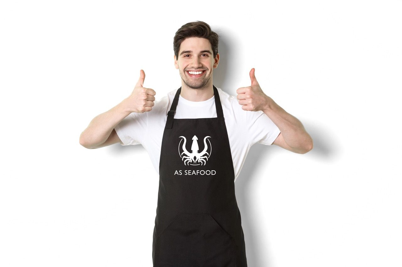
It is about identifying every surface where the brand touches a human being — the apron a staff member wears, the truck passing through the neighborhood, the menu a customer holds while deciding what to order — and making sure each of those moments communicates the same thing.
When every touchpoint is consistent, the brand stops being a design project and starts being an experience.
That is when it converts.