HollowOfSorrow
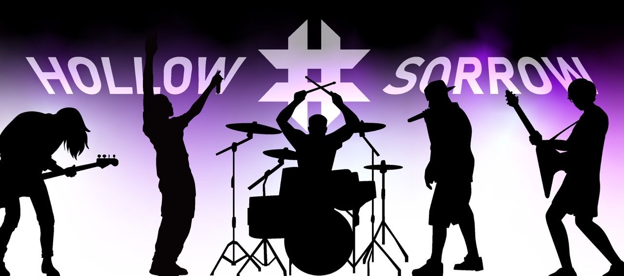
Hollow of Sorrow is an Indonesian rock band entering a scene that is loud, crowded, and visually indistinct. ARCT Studio took on the full creative responsibility of their debut — from zero brand identity to a complete visual ecosystem covering logo, merchandise, album artwork, motion graphics, promotional campaign, photography art direction, and an experimental interactive website. What began as a branding project evolved into world-building. The goal was not to make a band look professional. It was to make them unforgettable before a single listener had heard them play.
Solving the Complexity.
The Indonesian rock scene rewards familiarity. Most bands operate within the same visual vocabulary — dark photography, generic logotypes, inconsistent social presence. Hollow of Sorrow had the music and the intention to be different, but no visual language capable of communicating that difference. They needed a brand that could carry the emotional weight of their sound — cinematic, dark, emotionally charged — and translate it into a coherent identity across every surface a band occupies: streaming platforms, merchandise, social media, live environments, and the internet.
Pain Points
- No existing logo, identity, or visual direction — starting entirely from zero.
- No differentiation strategy — risk of blending into the existing rock scene landscape.
- Debut launch pressure — one single to make a first impression that sticks.
- No coherent system — needed to look consistent across six or more digital and physical platforms simultaneously.
- No branded digital home — conventional band websites were not an option worth considering.
Objectives
- Design a logo with conceptual depth that works as both a wordmark and a standalone icon.
- Build a complete visual identity system that scales from 16px favicons to full-scale merchandise prints.
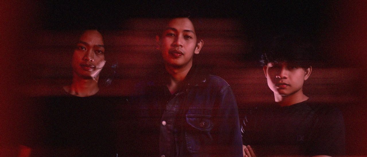
- Art-direct and concept a photo session that captures the band's visual character.
- Produce a motion graphic lyric video consistent with the brand's dark, atmospheric aesthetic.
- Create a full platform branding kit for YouTube, Spotify, and social media — every channel unified.
- Design and develop an experimental interactive website that positions the band as a creative entity, not just a music act.
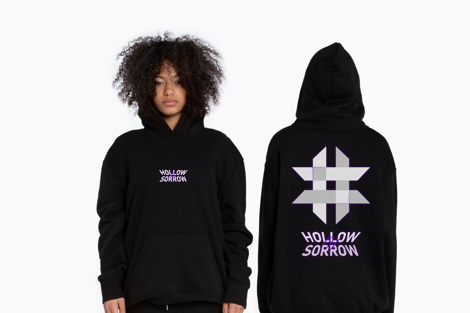
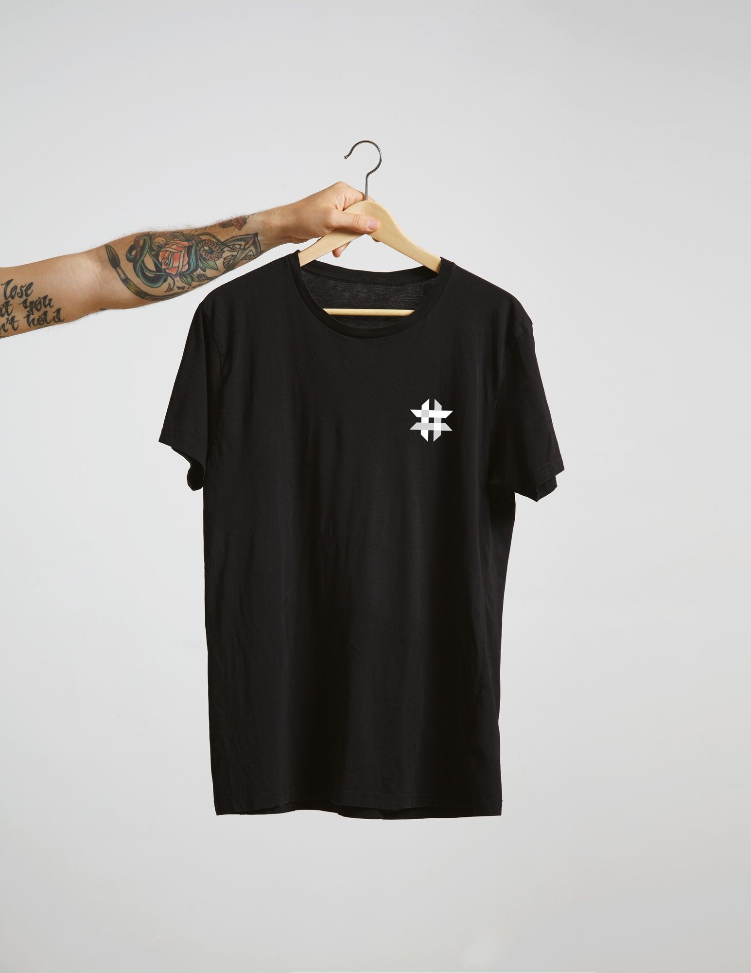
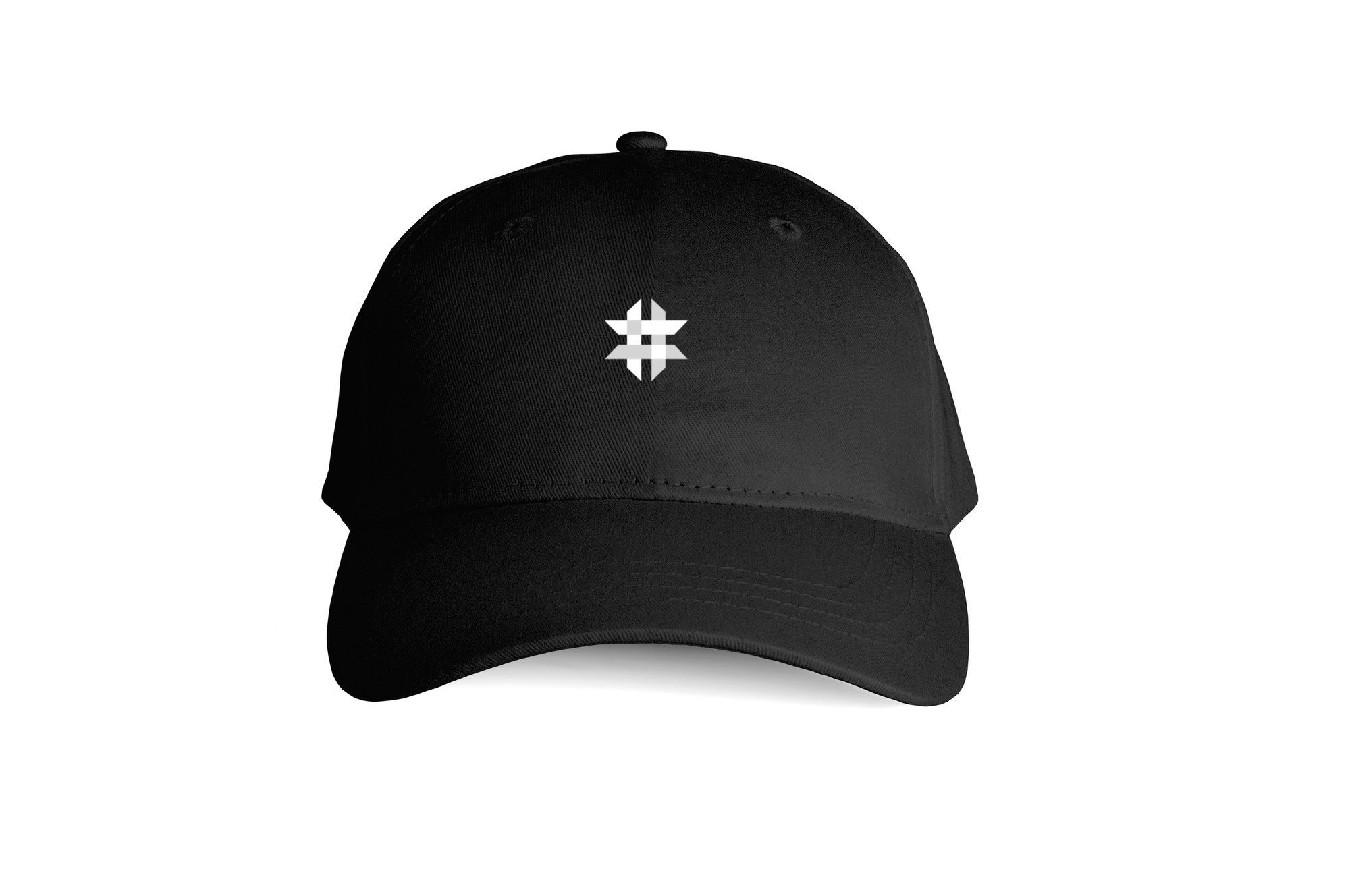
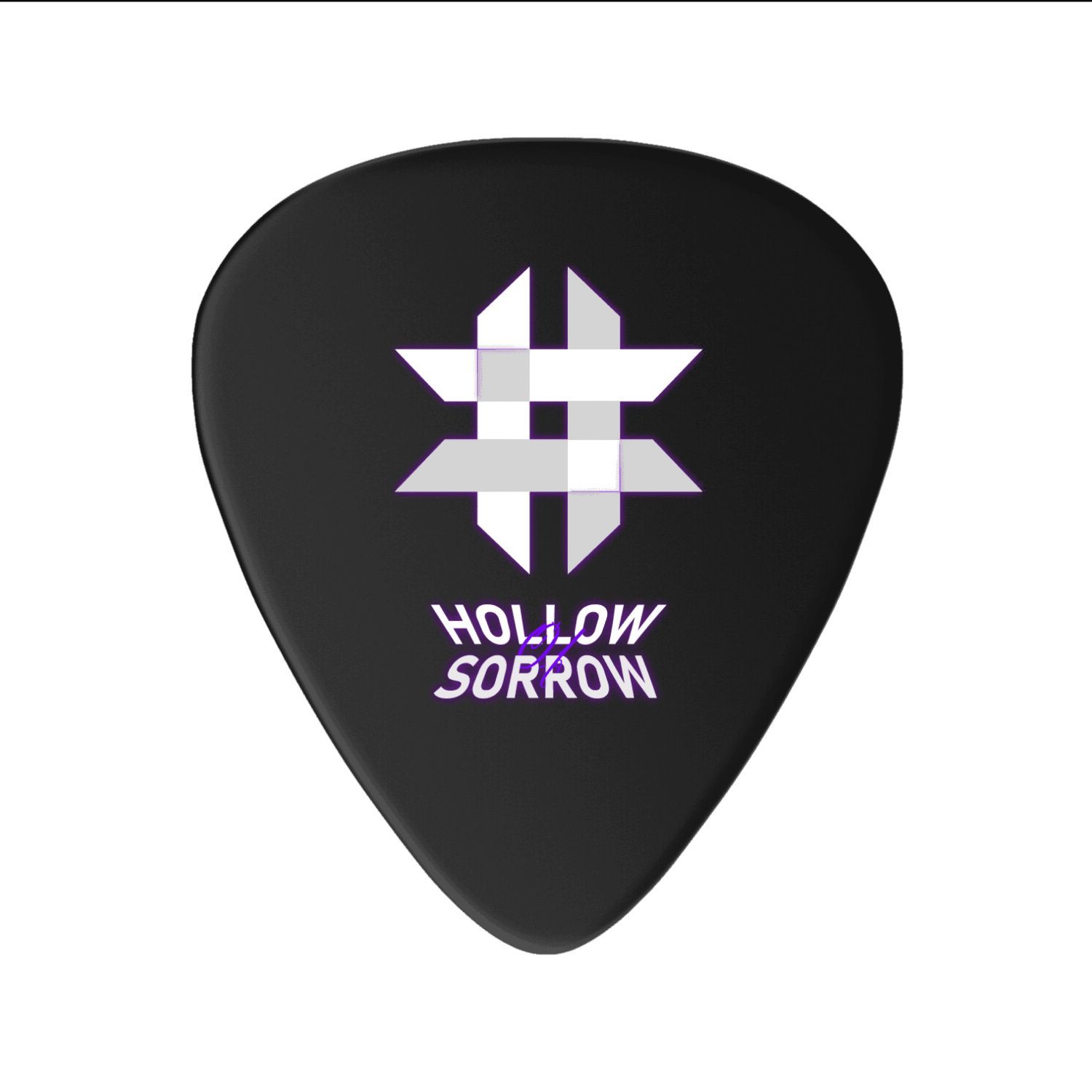
- Deliver a complete merchandise system ready for immediate production.


Decoding the Audience Psyche.
The majority of Indonesian rock and metal bands operate with minimal visual investment — band photos, generic logo treatments, and social content that prioritizes volume over quality. Visual identity is rarely treated as a strategic asset. Hollow of Sorrow's visual system immediately separates them from this default.
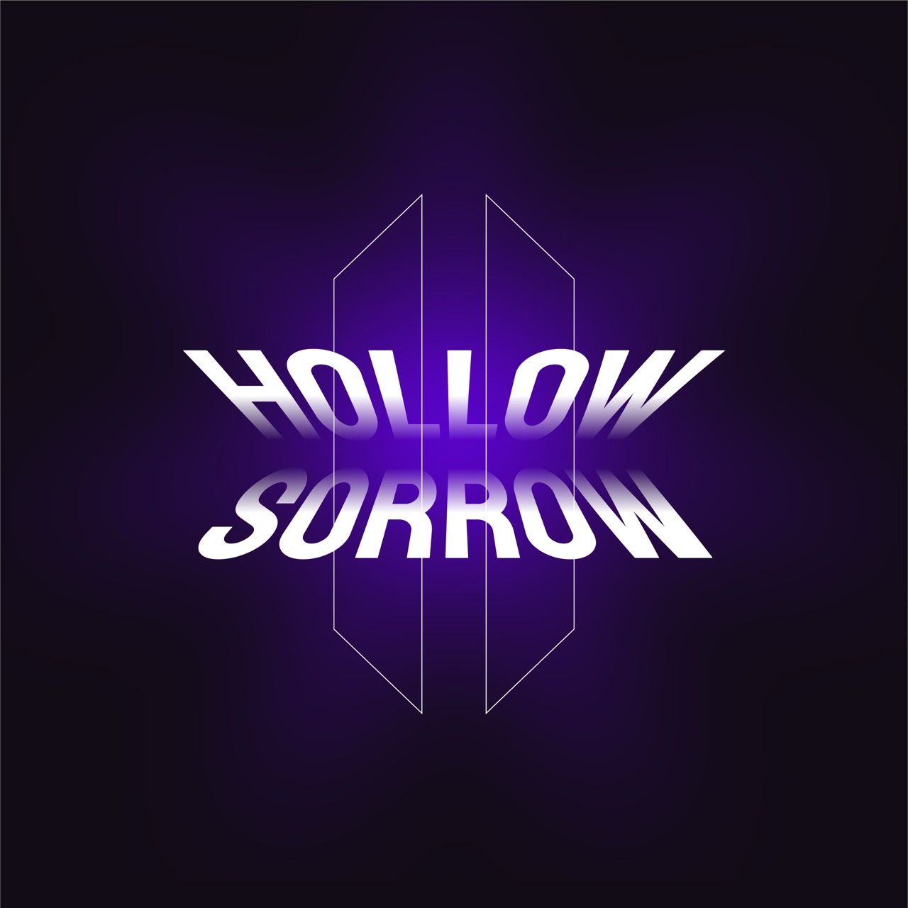
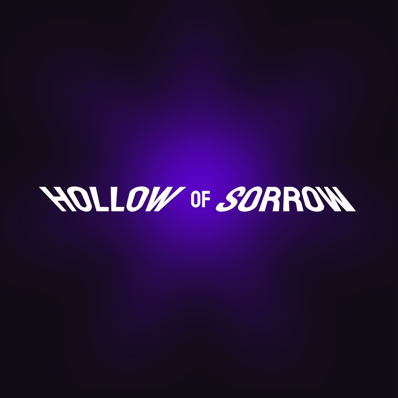
A band's logo is not a piece of graphic design — it is a flag. It needs to work on a t-shirt, a guitar pick, a phone screen, and a stage backdrop simultaneously.
The Indonesian rock scene's visual homogeneity is not a problem — it is an opportunity. Standing out here requires less effort than most categories.
Dark aesthetics only work when they have contrast and intention. Without a precise lighting logic — the purple glow, the geometric clarity of the mark — dark quickly becomes muddy and unreadable.
The experimental website was not a creative indulgence. It was strategic: create a digital touchpoint so unusual that audiences share it without being asked to.
Every deliverable in a music brand launch is a campaign asset. Merchandise is not merchandise — it is moving media that the audience wears into public spaces.
The most powerful measure of a brand's success is not a metric — it is a spontaneous reaction. When people consistently say "this is actually good" without context, the brand is doing its job.
Crafting the Identity.
Hollow of Sorrow was built around a single creative thesis: a world that pulls you in and does not let you go. Every visual decision was made in service of that idea.
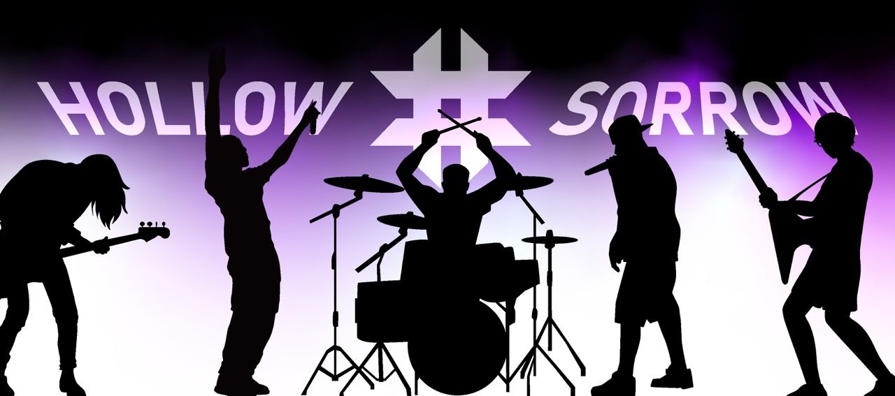
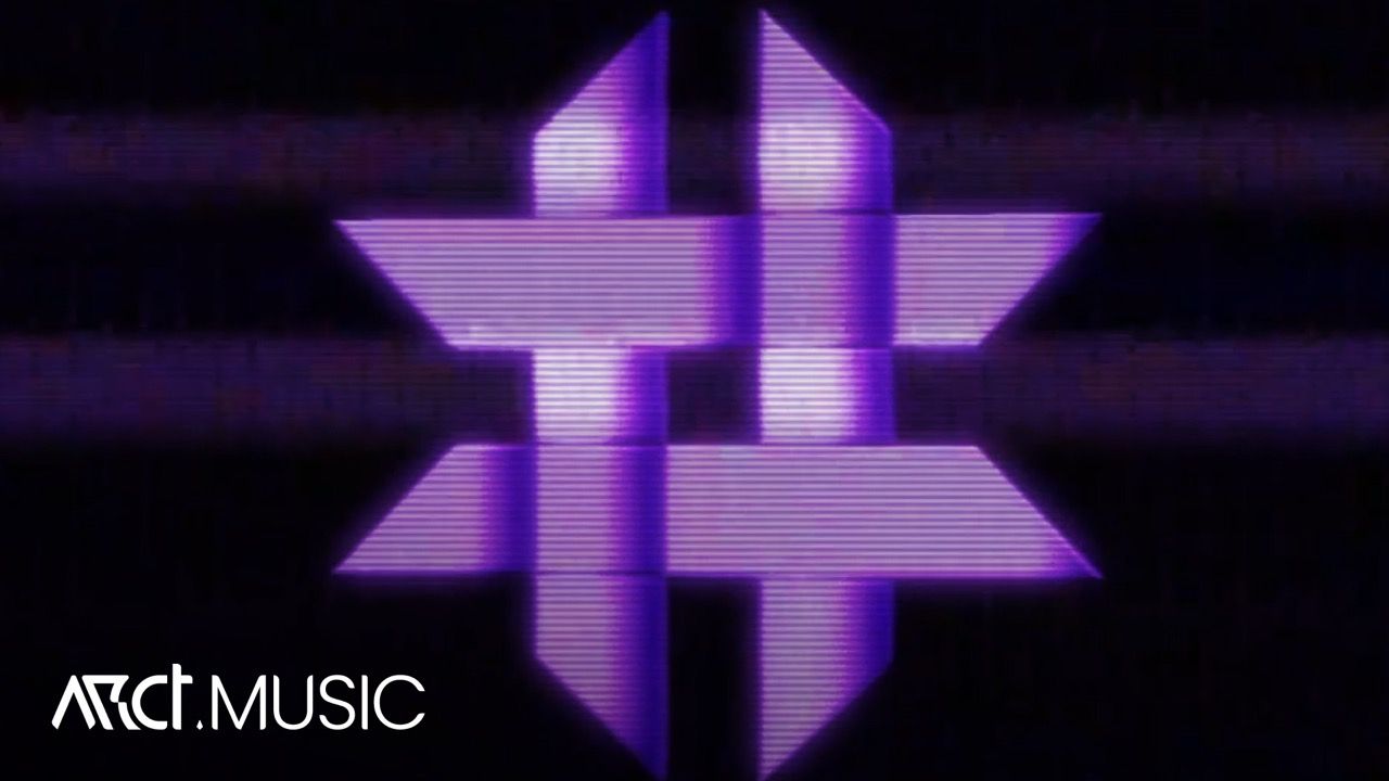
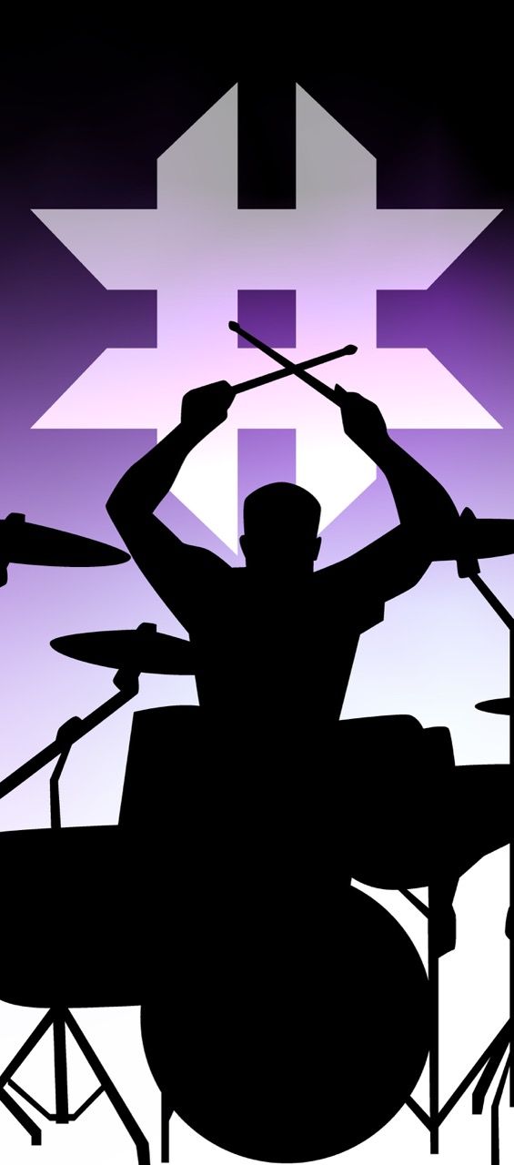
The logomark fuses two geometric systems into one unified form — the hashtag grid and the eight-pointed star. The hashtag carries cultural resonance with digital community and connection. The star radiates outward, implying something emerging, something with force behind it. Together they form a symbol that reads as both structured and explosive — controlled tension. The mark holds its weight at any scale and carries the brand's emotional register without requiring the wordmark to be present.
The Final Execution.
Website Result : https://hollowofsorrow.webflow.io/
Lyric Video Result: https://www.youtube.com/watch?v=r3b_aKKBkdI
Thumbnail youtube
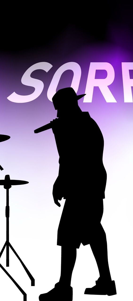
Hoodie Merch
Banner
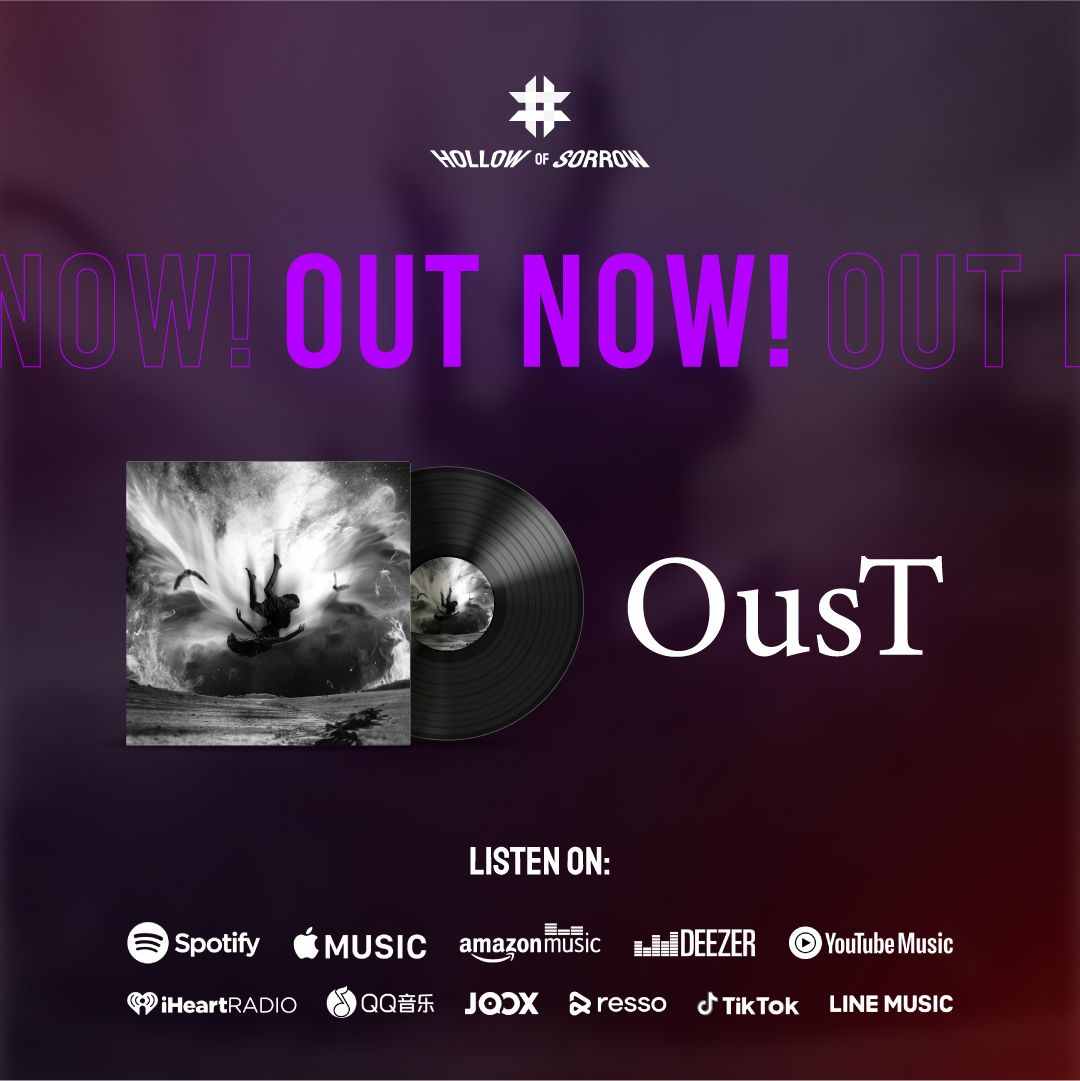
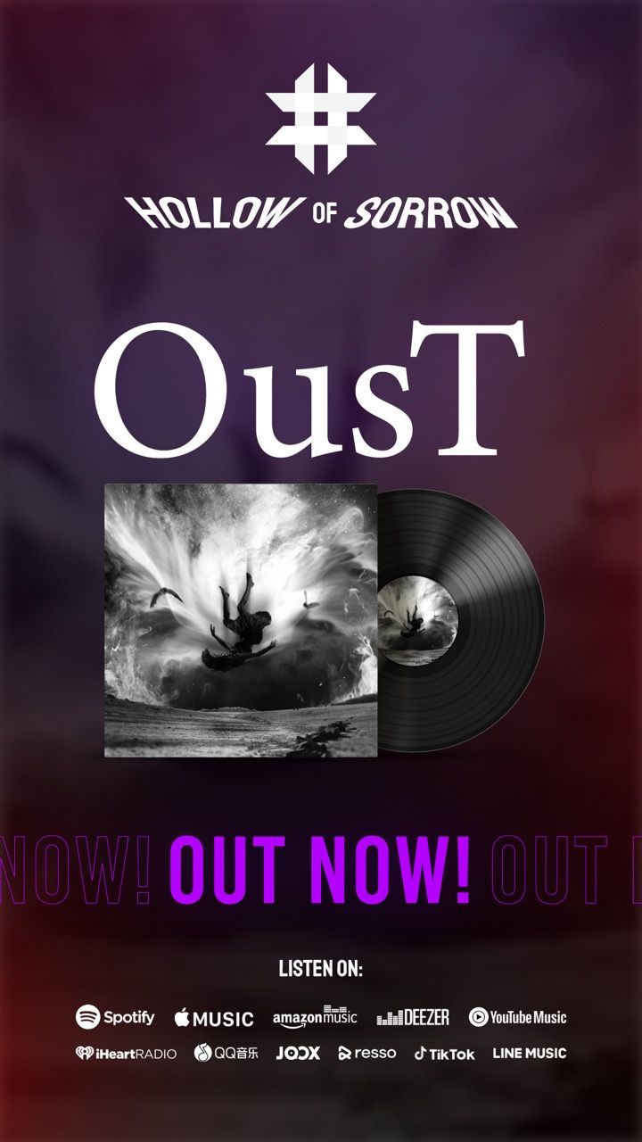
Teaser OusT
The Result.
"We came in knowing what we wanted to sound like. We didn't know what we wanted to look like. ARCT Studio gave us a world — not just a logo. Every single thing they made felt like it came from the same place, the same vision. When the website launched, people started sharing it just to show other people. That's when we knew it worked."
Hollow Of Sorrow
Band
Hollow of Sorrow was a test of creative conviction.
Music branding is seductive in the wrong ways — it invites decoration, it rewards visual drama for its own sake, it forgives inconsistency because "it's art." None of those defaults were acceptable here.
The band trusted us with their debut. That is not a design brief — that is a significant creative responsibility. The first impression of an artist is often the one that defines them for years. We were making that impression.
The decision to pitch the experimental Windows desktop website was not obviously safe. It was strange. It was time-intensive. It required convincing. When it launched and audiences started sending each other the link without being asked — that validated not just the decision, but the approach. Creative risk taken with strategic intent is not risk at all. It is precision.
The other lesson: restraint is the most powerful tool available in dark aesthetics. Every time we were tempted to add something, removing it instead made the work stronger. The void is part of the brand. The silence is part of the sound.