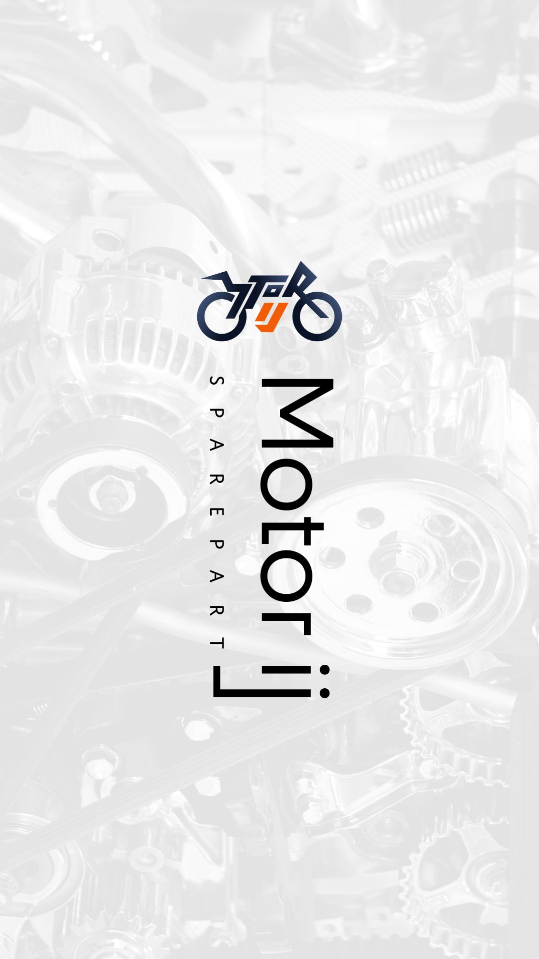
Motor-IJ
Motor IJ is a motorcycle spare part shop specializing in Yamaha N-Max components. ARCT Studio built their complete visual identity from scratch — logo, color system, brand guidelines, and physical touchpoints — transforming a generic local shop into a bold, professional brand ready to compete and grow.
Solving the Complexity.
Indonesia's spare part market is highly fragmented. Motor IJ had good products but no visual identity to match — appearing identical to hundreds of competitors, limiting trust, recall, and growth potential.
Pain Points
- No distinctive logo or visual identity.
- Zero brand consistency across materials.
- Brand appearance didn't reflect service quality.
- No physical branding assets available.
- No digital presence or social media system.
Objectives
- Design a memorable combination mark logo.
- Build a bold, structured color system.
- Document complete brand guidelines.
- Deliver ready-to-use physical brand assets.
- Prepare consistent social media kit.
Decoding the Audience Psyche.
Generic local spare part shops dominate the landscape with zero visual differentiation — no consistent logo, color, or promotional material. Motor IJ immediately stands out with a structured identity system.
Large online spare part platforms like KMY Parts have reach but feel transactional and cold. Motor IJ fills the gap with a personality-driven, community-friendly brand.
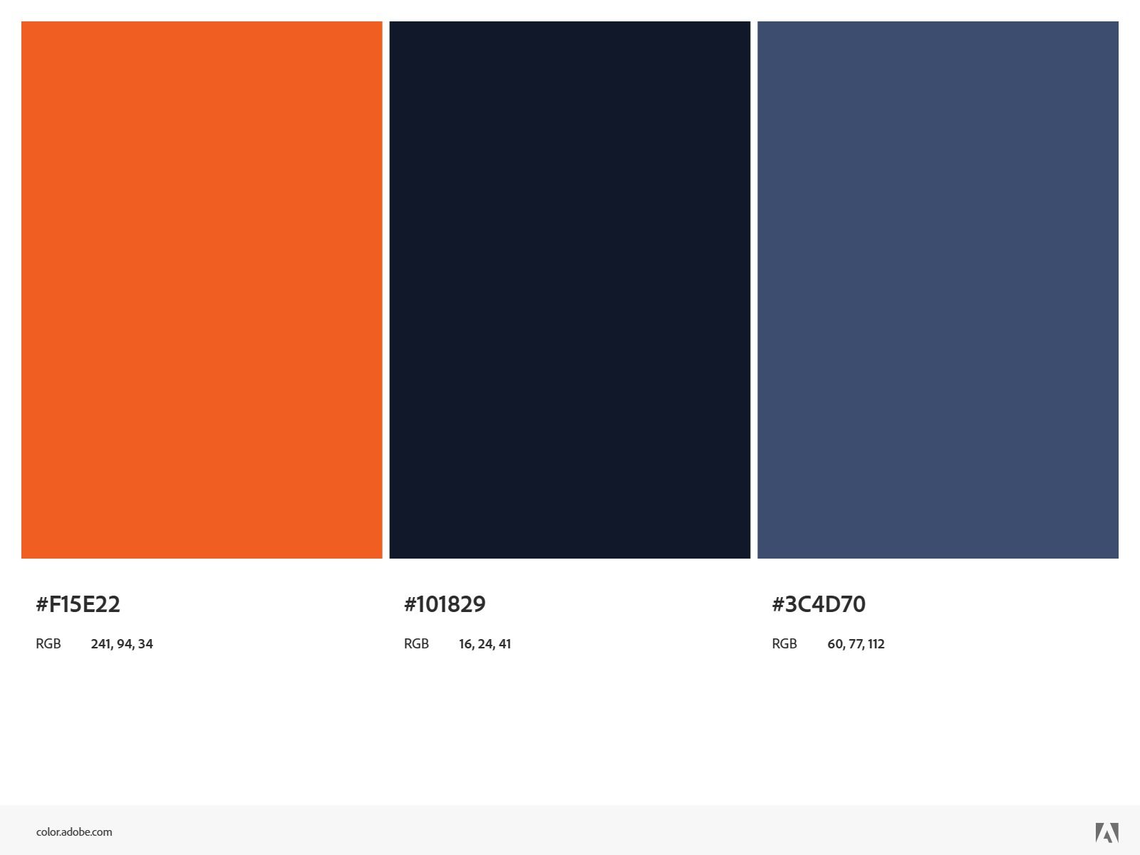
Orange signals speed and passion; Navy builds trust and professionalism together.
A logo readable in one second wins in the automotive market.
Documented brand guidelines prevent visual inconsistency as the business scales.
A pitch deck helps owners sell design decisions to partners confidently.
Crafting the Identity.
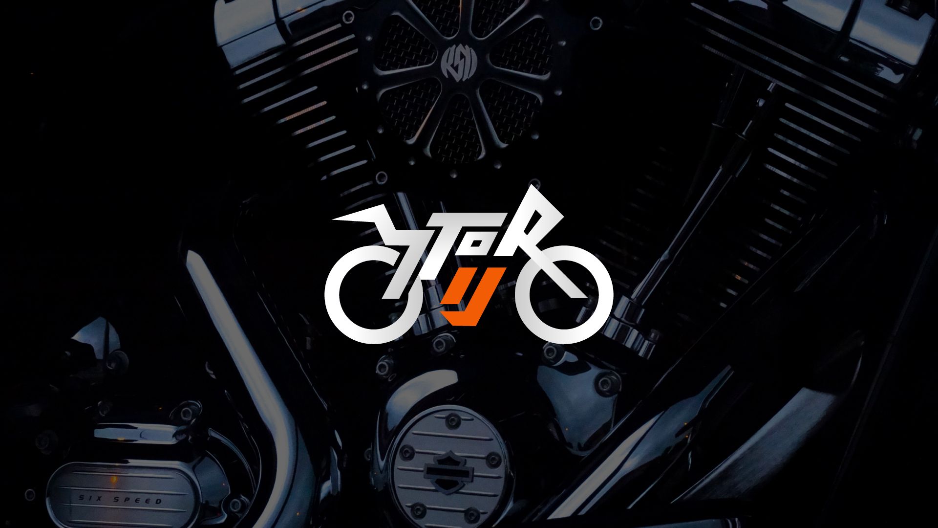
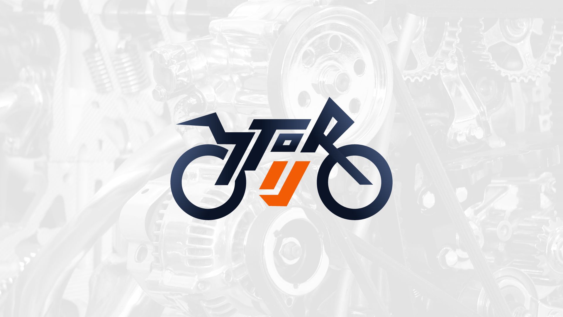
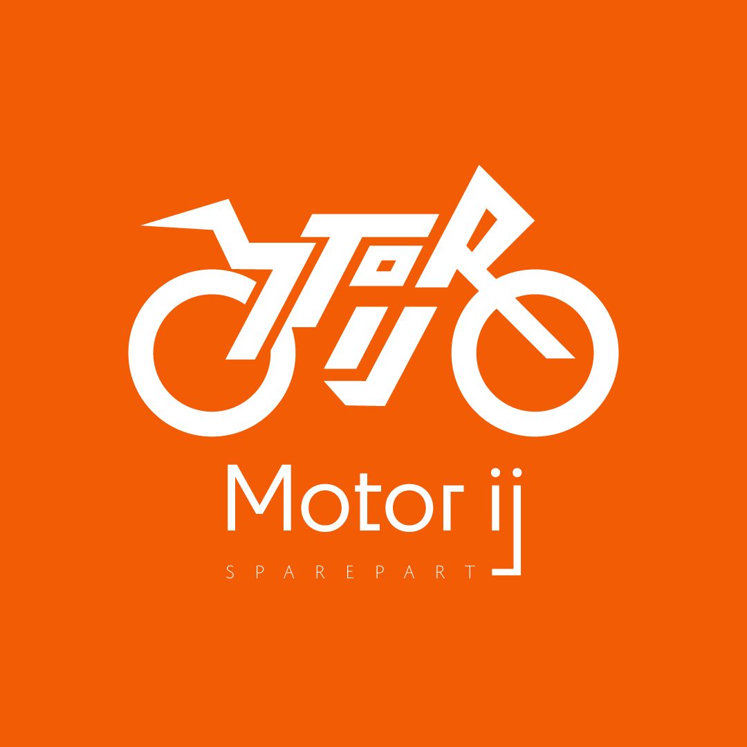
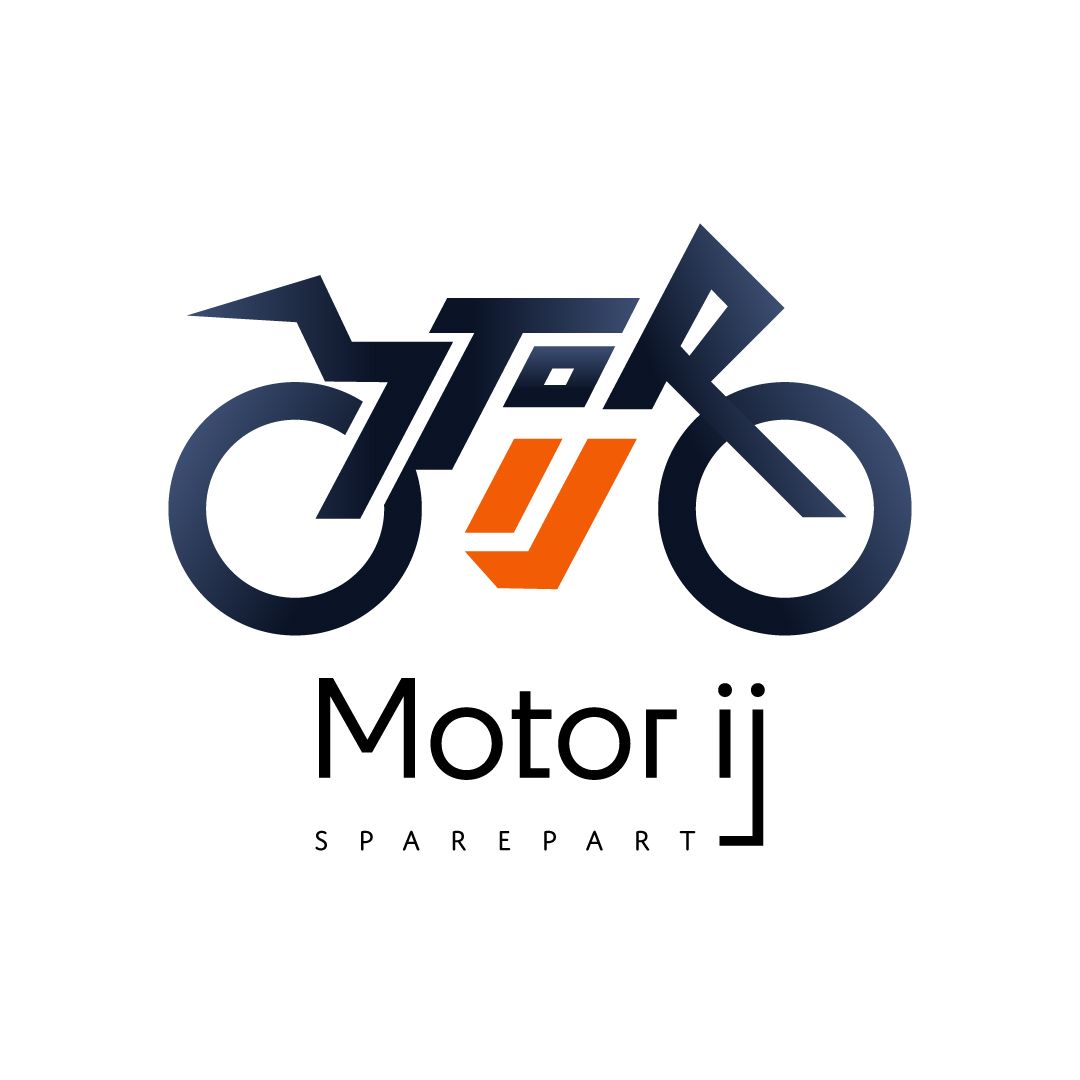
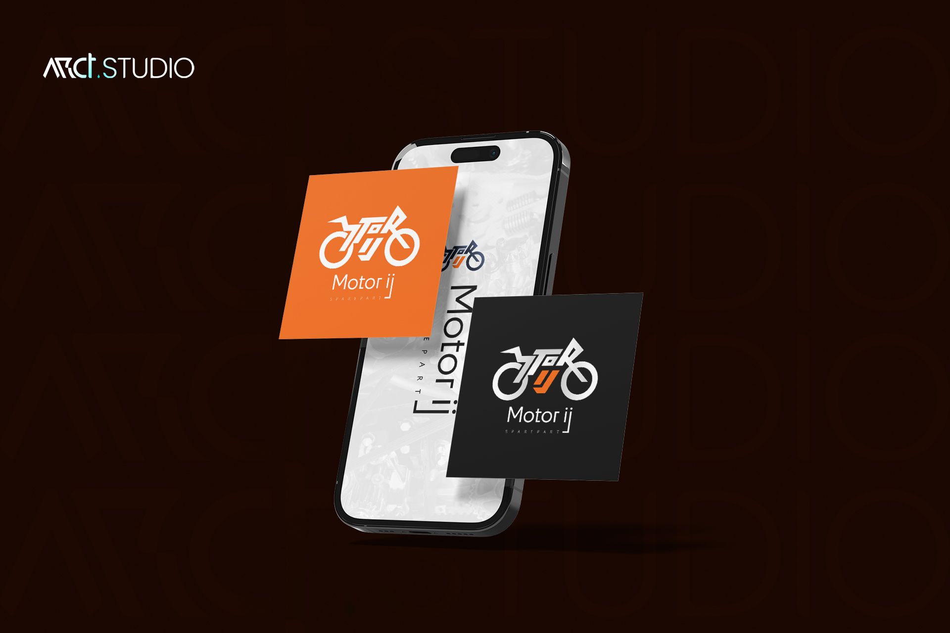
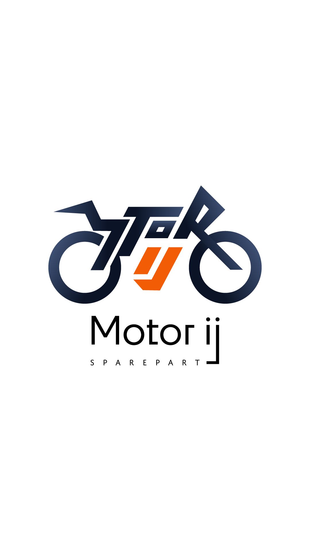
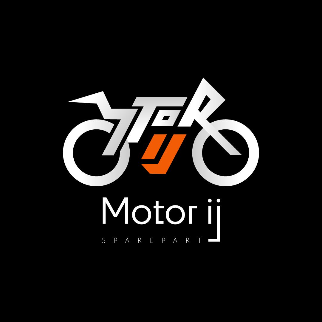
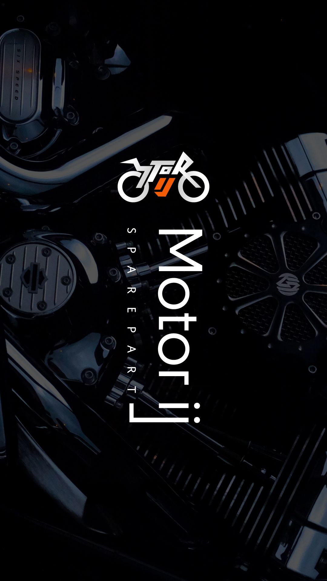
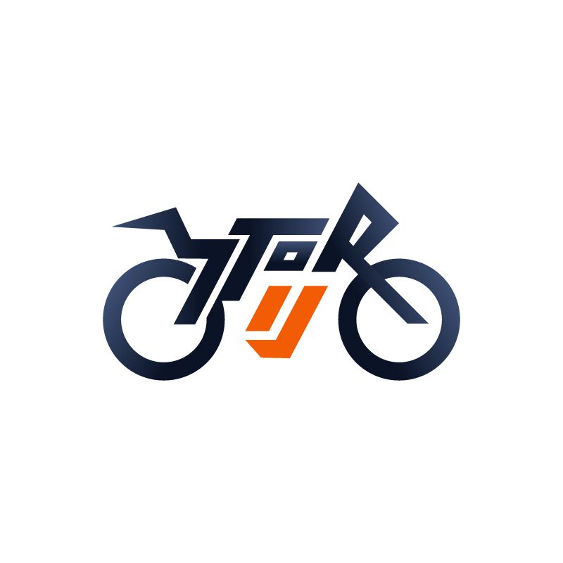
Motor IJ was designed around "Motorsport Meets Professionalism." The combination mark integrates a stylized motorcycle silhouette with the lettermark "IJ" embedded as the engine block — two bold orange diagonal stripes functioning simultaneously as letter forms and a visual spark of energy. Orange (#F15E22) carries passion and speed. Dark Navy (#101829–#3C4D70) grounds the brand in trust and reliability. Typography uses Domus Tittling — geometric, technical, and precise.
The Final Execution.
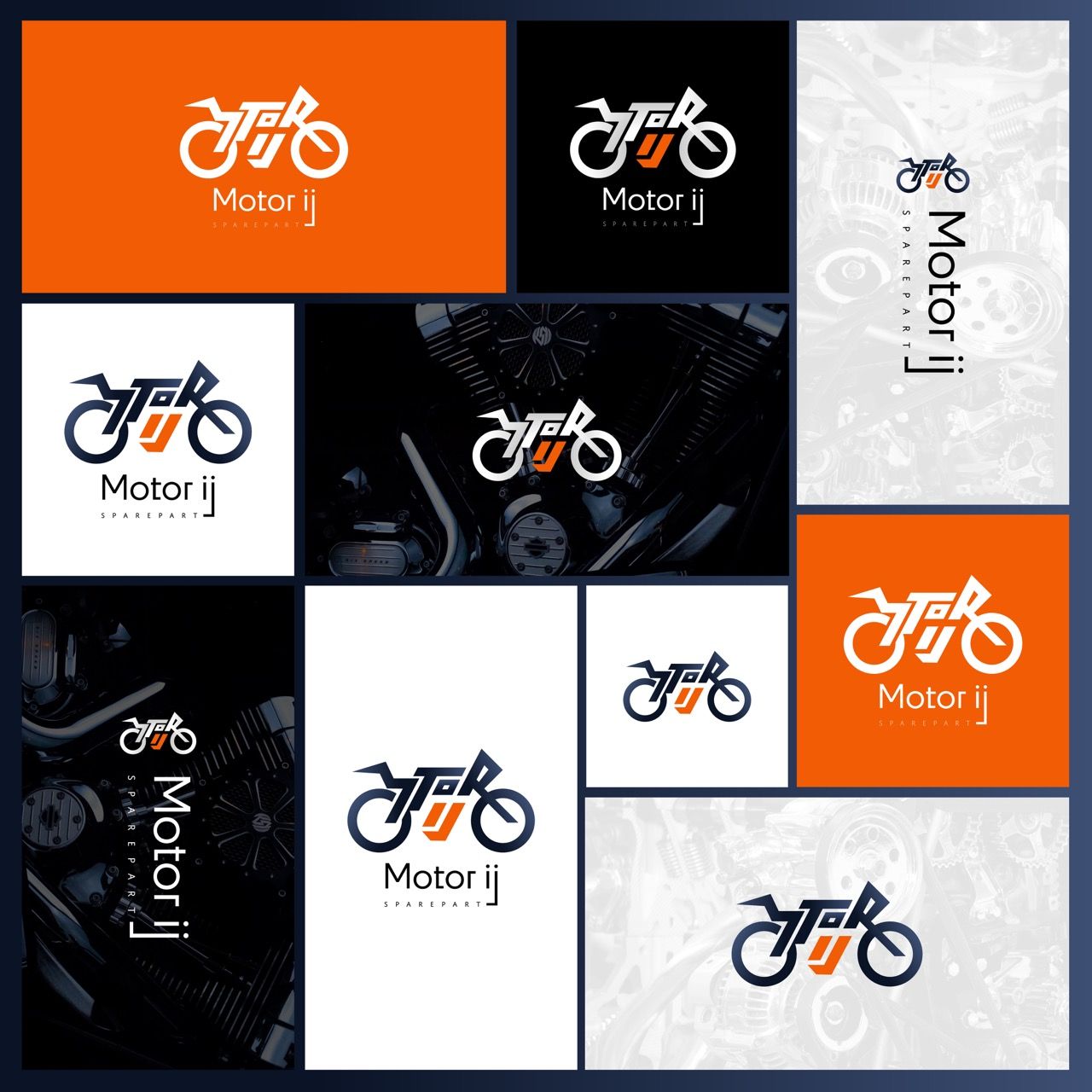
Research began with competitive moodboarding to define a bold, mechanical aesthetic. Logo sketches were refined into vectors and tested for versatility. Color and typography systems were documented with hex codes and scales.
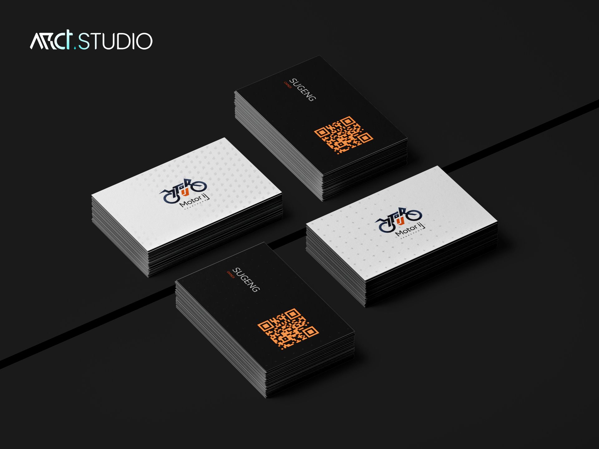
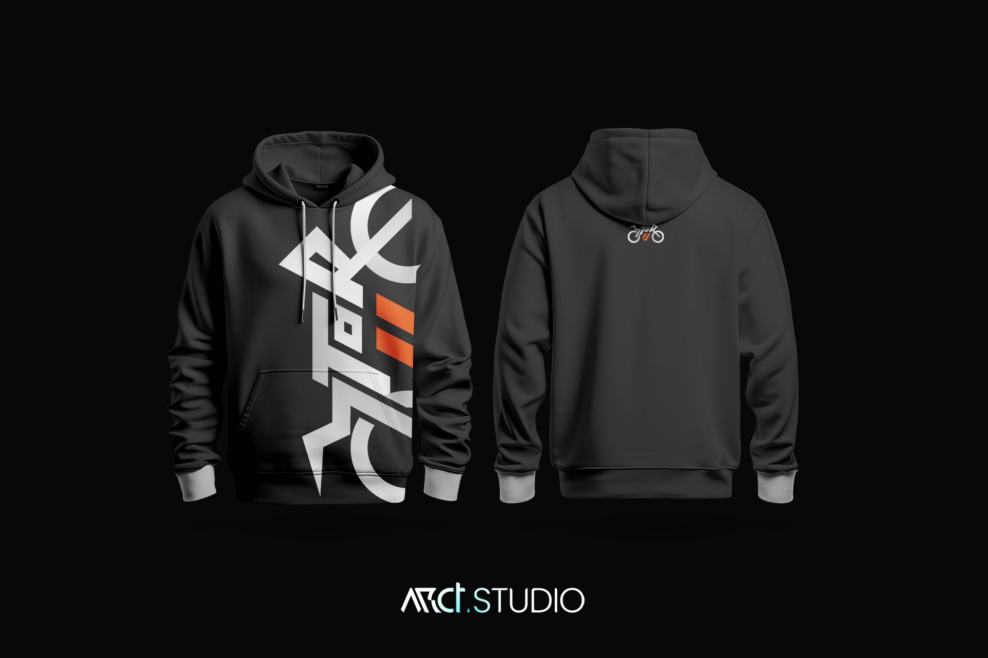
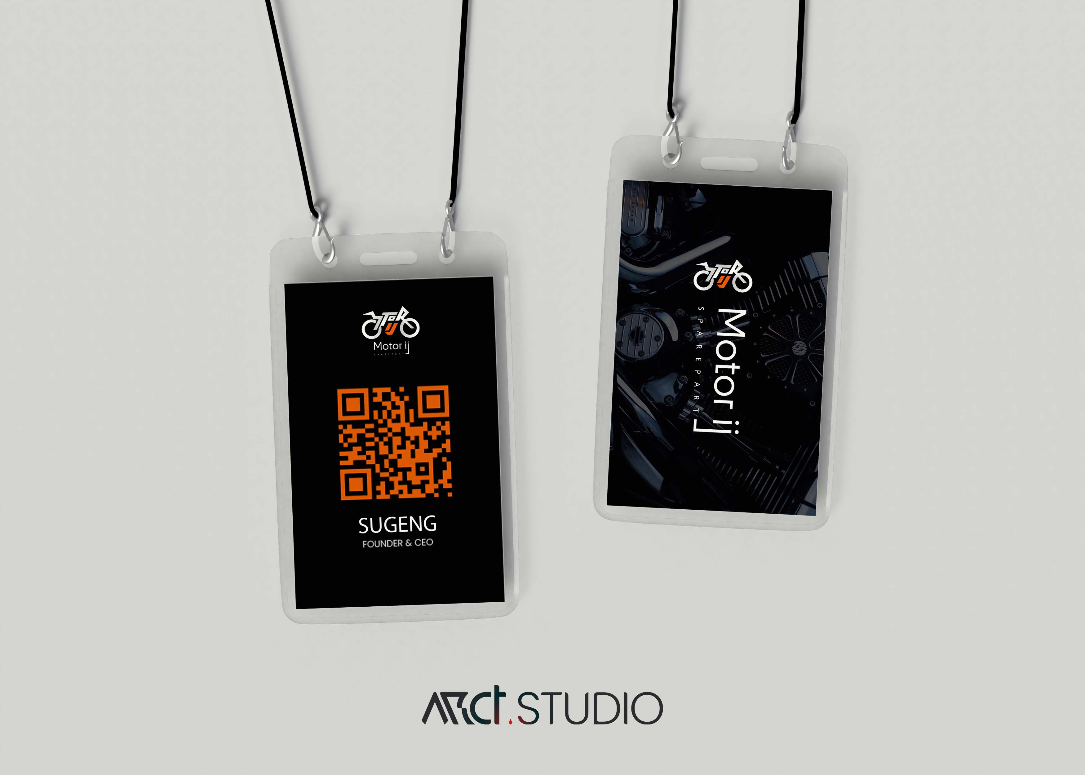
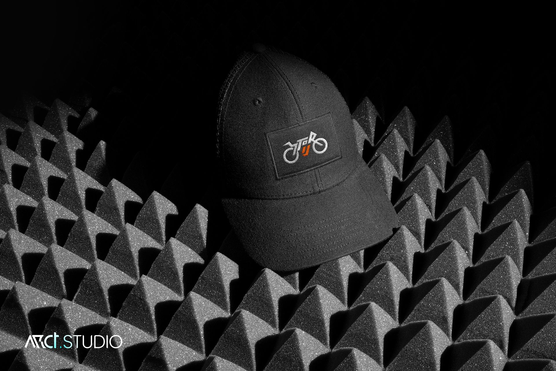
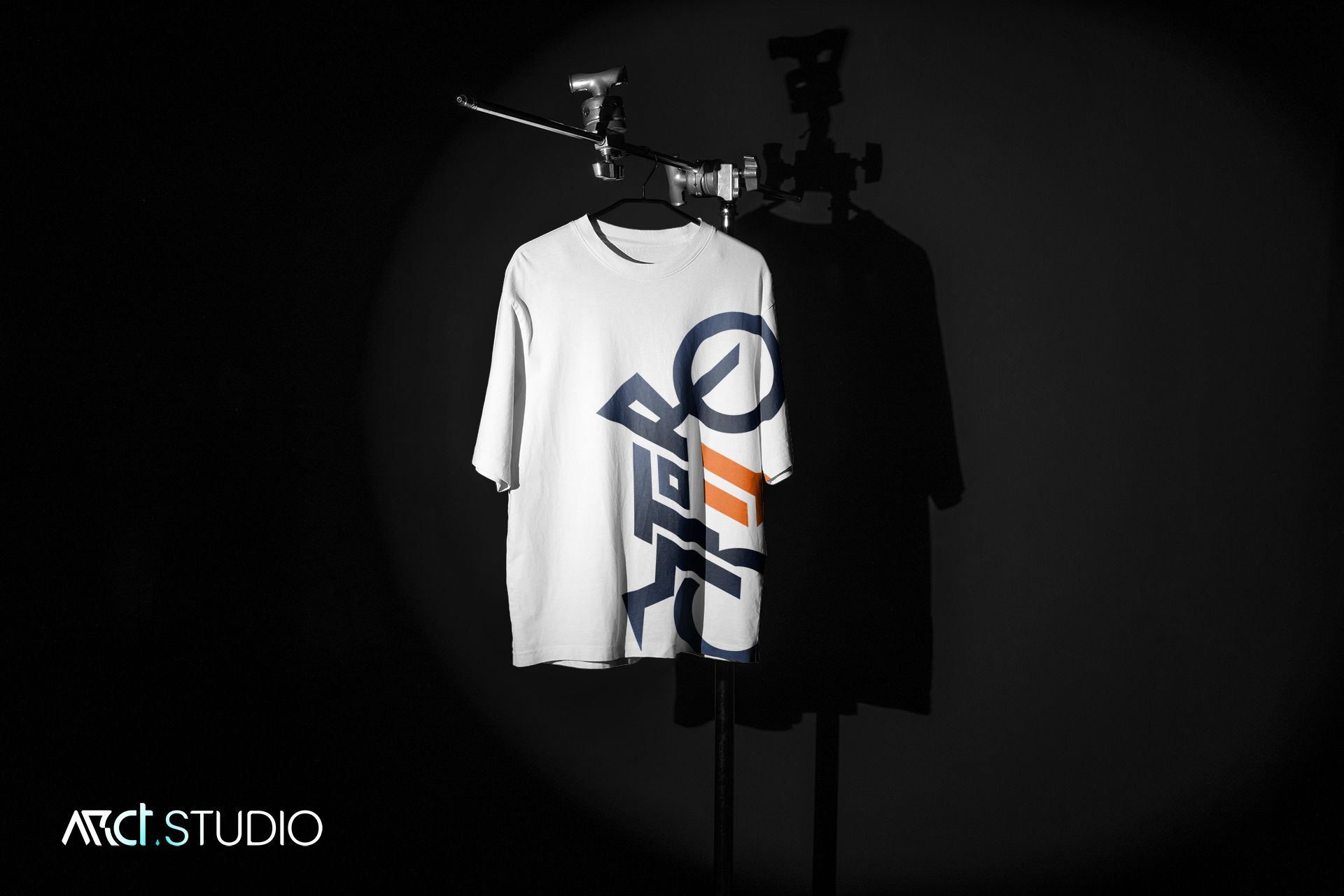
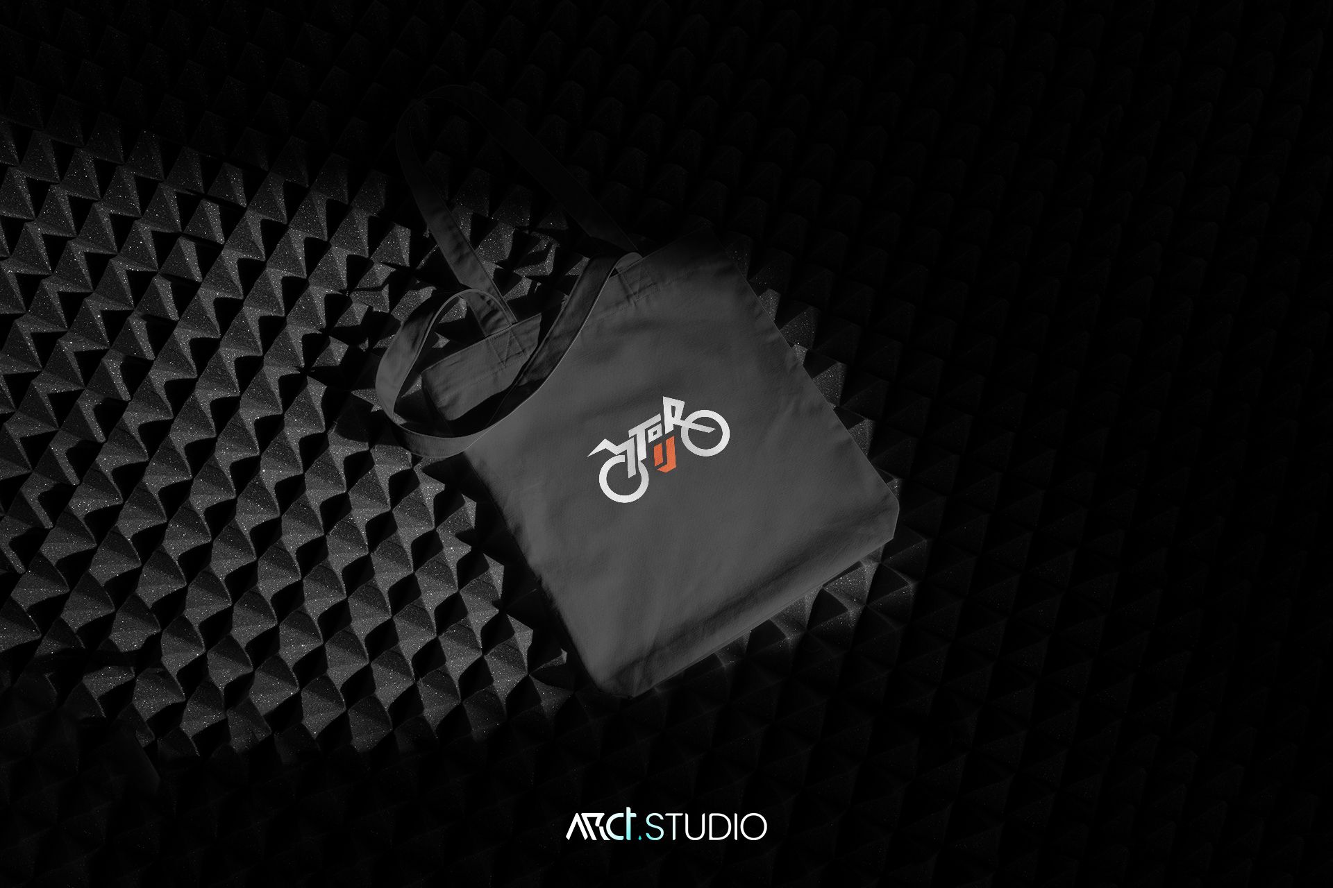
Brand was applied across business cards, ID cards, and hoodie graphics. The project ended with a six-page pitch deck summarizing the brand’s philosophy and visual system.
The Result.
Motor IJ transformed from zero visual identity to a complete, professional brand — distinctive, consistent, and immediately usable.
I never thought a logo could change how people see my business. After ARCT Studio built our brand, customers started treating Motor IJ differently — more serious, more trust. The hoodie alone started so many conversations at community events. Best investment I made for this shop
Sugeng
Founder, Motor IJ
Motor IJ proved that branding for small businesses isn't about lowering standards — it's about finding one strong idea and executing it with full precision.
When the founder wore the Motor IJ hoodie to his motorcycle community, the design came alive.
That moment is what the work is for.