SukaCNC
SukaCNC is a CNC manufacturing service in Sukabumi offering precision plasma cutting and router cutting across metal, wood, and composite materials. ARCT Studio led a full rebrand — building a sharper identity system that reflects industrial precision, elevates market positioning, and gives the brand a consistent visual language across print, digital, and promotional materials.
Solving the Complexity.
SukaCNC had established services but a fragmented visual identity that failed to communicate precision and professionalism. Competing in a manual-referral-dominated industry, the brand needed a visual upgrade to attract wider industrial and retail clients.
Pain Points
- No strong or recognizable brand identity.
- Visual inconsistency across all print materials.
- Brand didn't reflect precision manufacturing quality.
- No structured catalog or product presentation system.
- Promotional materials felt generic and untrustworthy.
Objectives
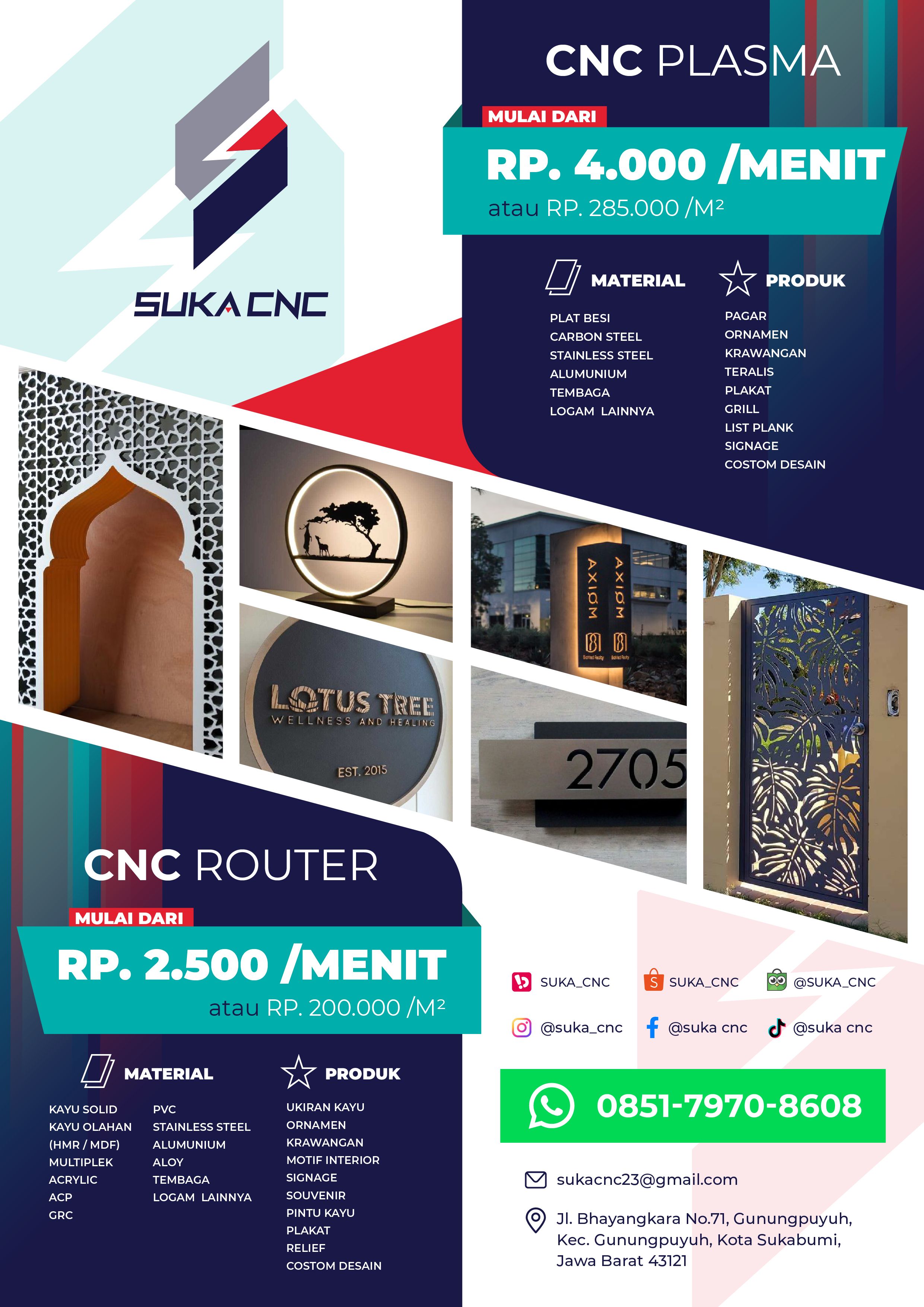
- Design a bold, industrial-grade logo system.
- Build a structured and consistent color palette.
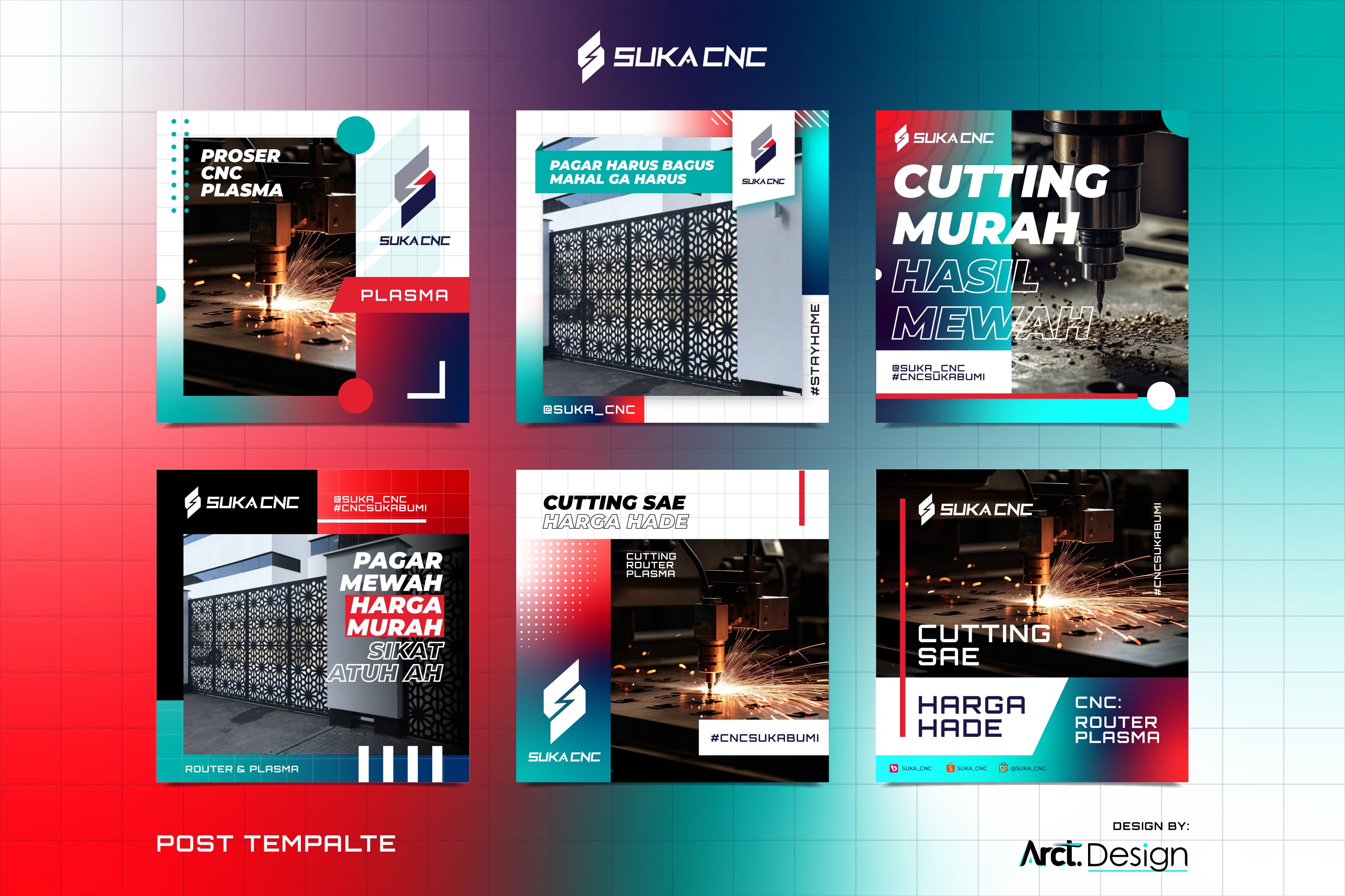
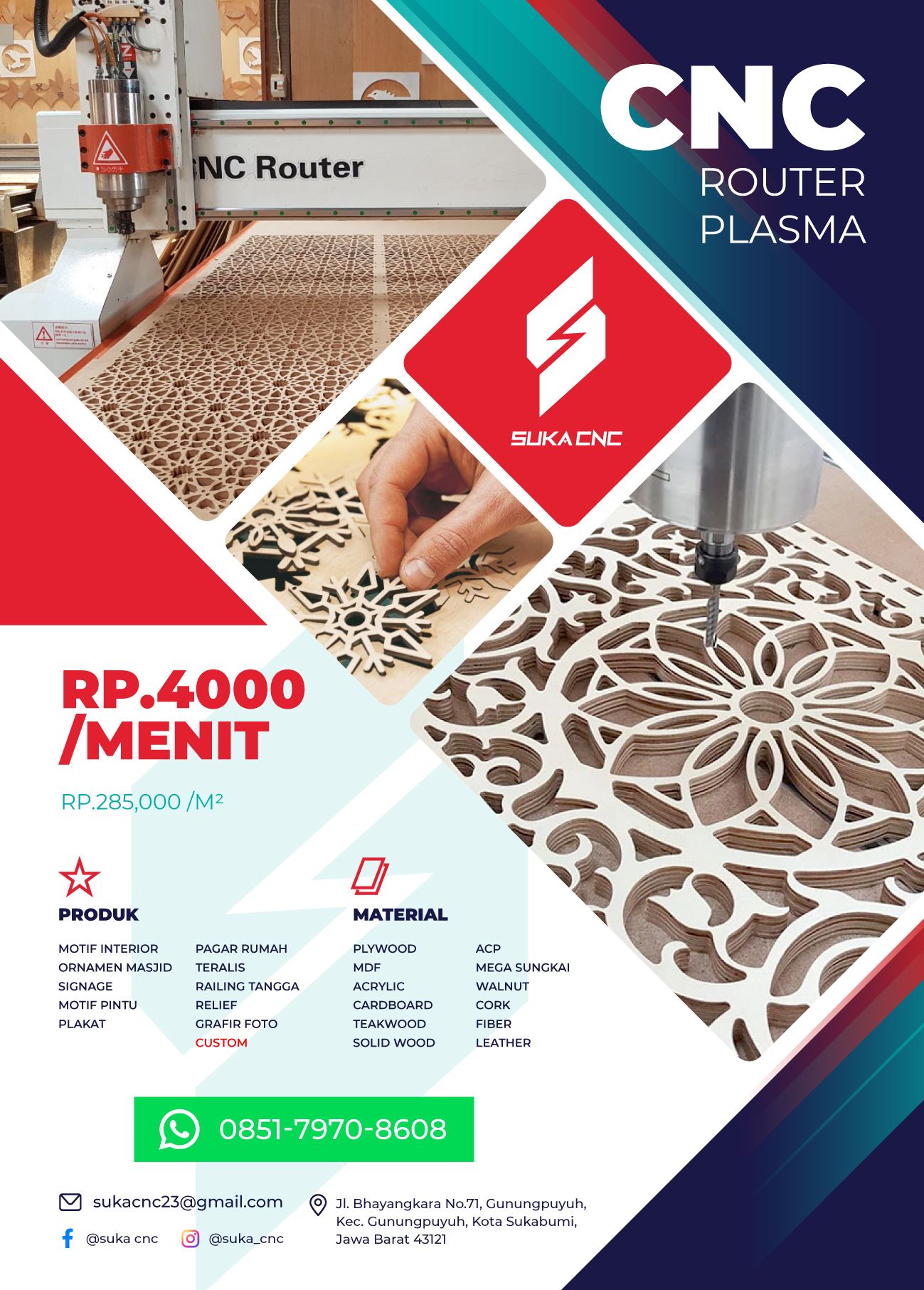
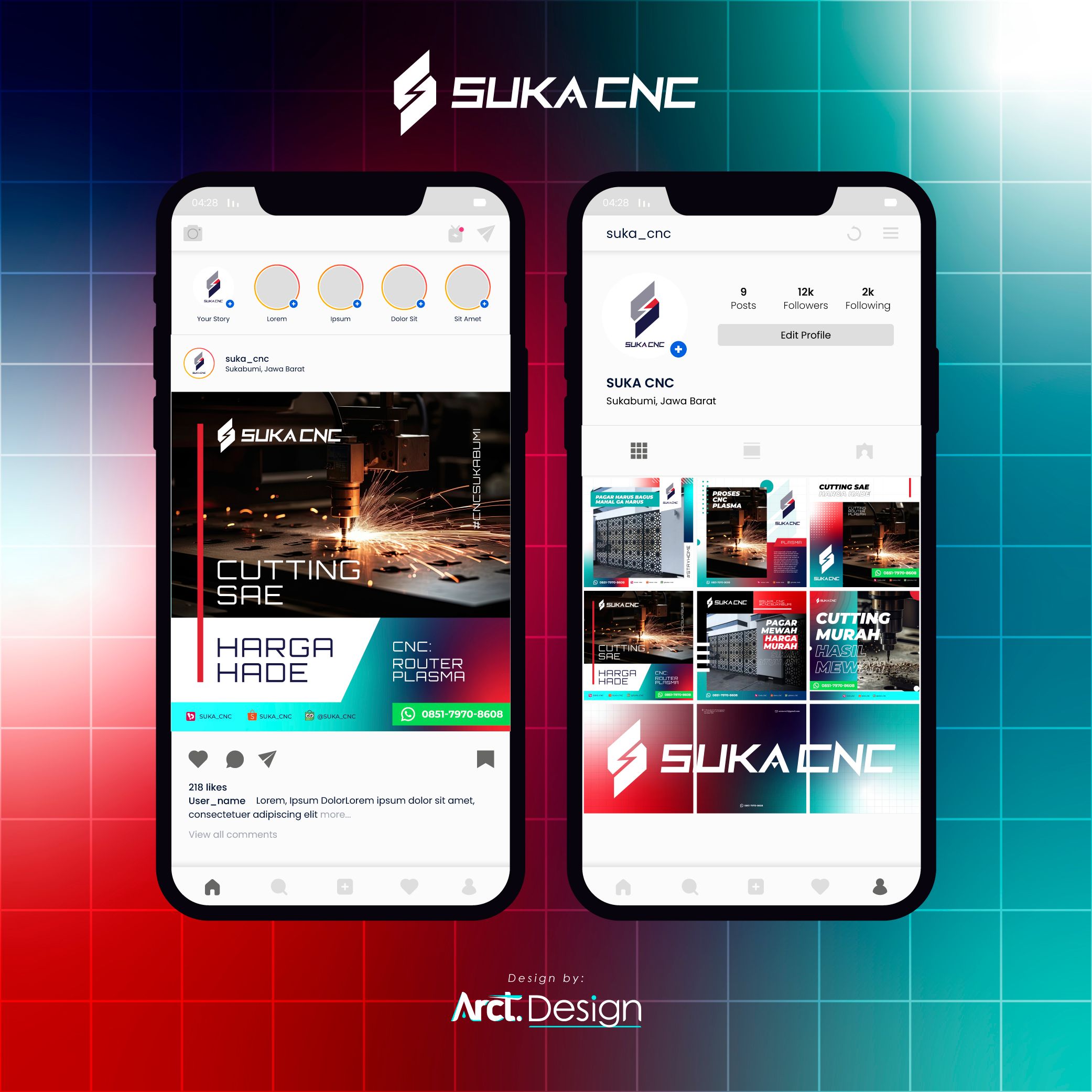
- Create a product catalog with clear visual hierarchy.
- Develop flyer templates communicating price and service.
- Deliver a complete brand asset kit for ongoing use.

Decoding the Audience Psyche.
Local CNC workshops in Sukabumi and nearby cities typically operate with no brand identity at all — relying solely on word of mouth and WhatsApp groups. SukaCNC immediately gains a professional edge with a structured visual system in place.
National CNC service platforms like CNCindo present a more polished digital face but lack the personal, local identity that builds trust with small-to-mid buyers. SukaCNC can own the local premium positioning.
General fabrication and metalwork shops share the same audience but present themselves as commodity services with price-first messaging. SukaCNC's rebrand shifts the conversation from cheapest to most capable.
Precision businesses must look precise — visual sloppiness kills industrial trust instantly.
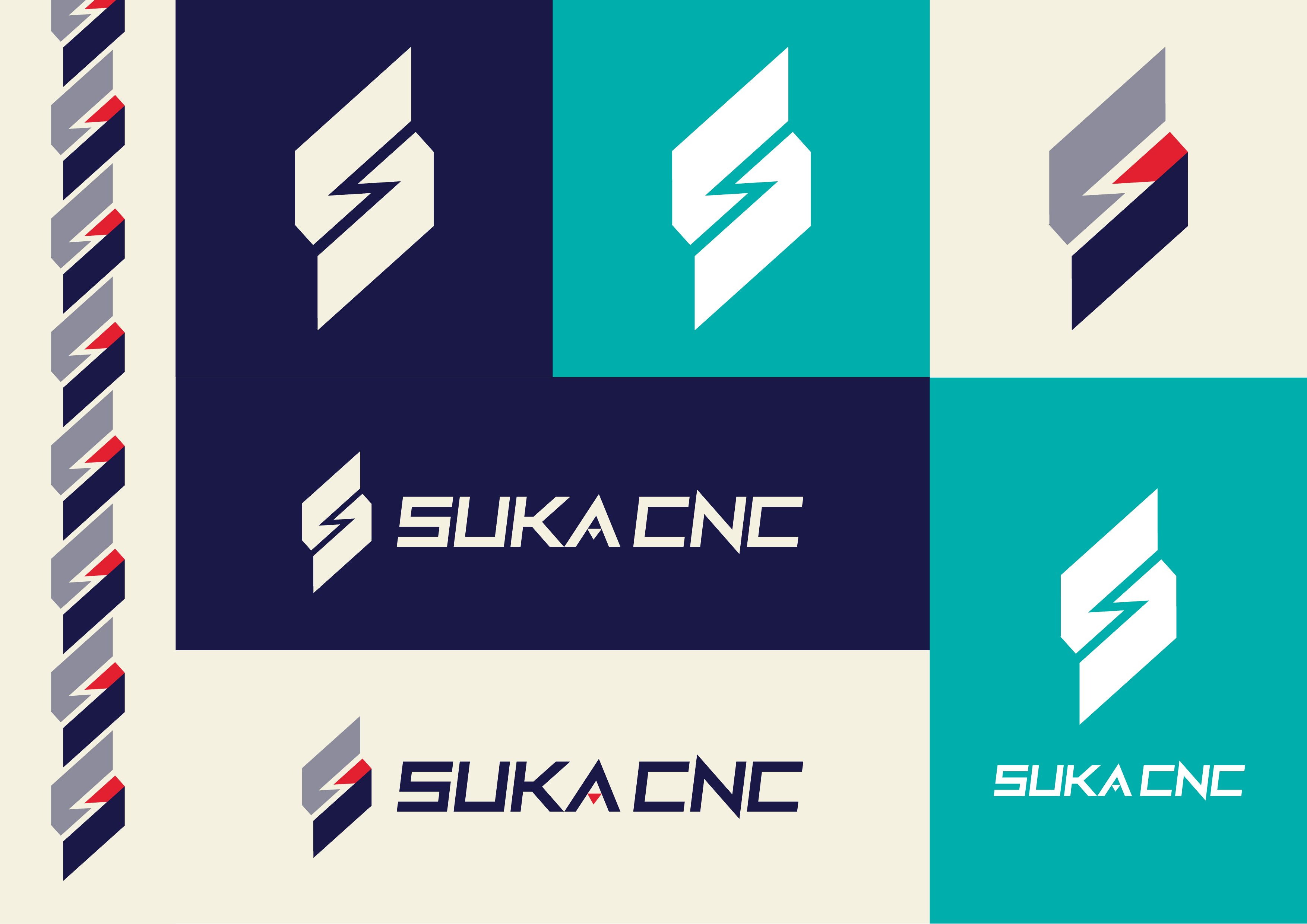
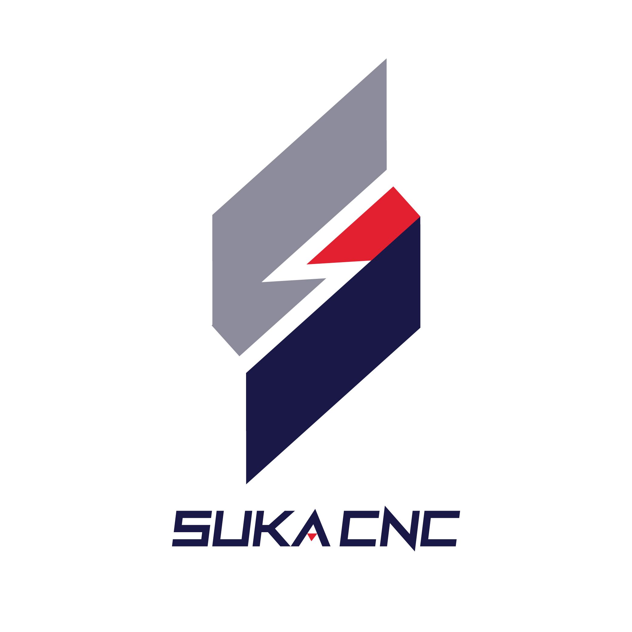
The letter S doubling as a lightning bolt communicates speed and cutting energy.
Teal and navy in manufacturing signals innovation without sacrificing industrial seriousness.
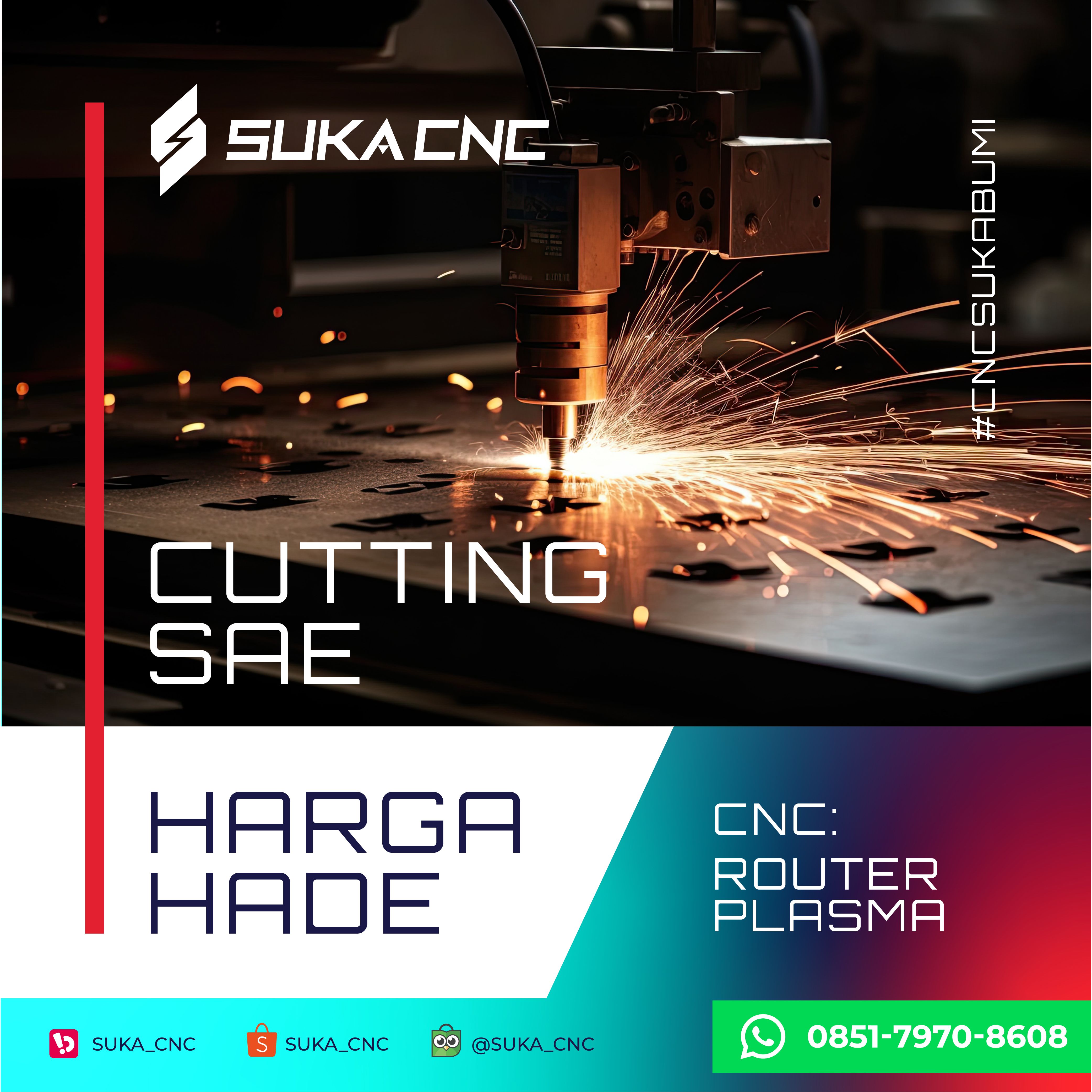
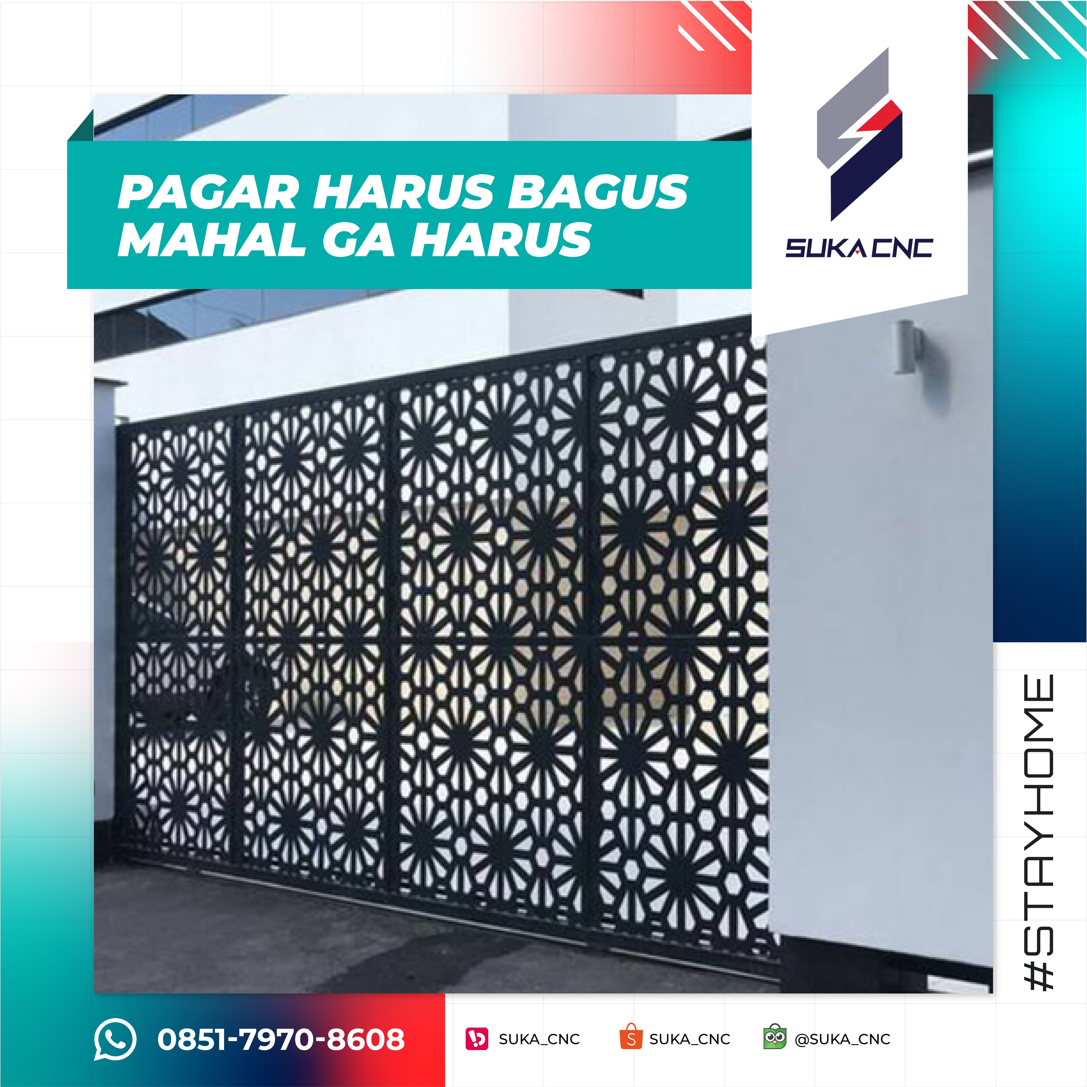
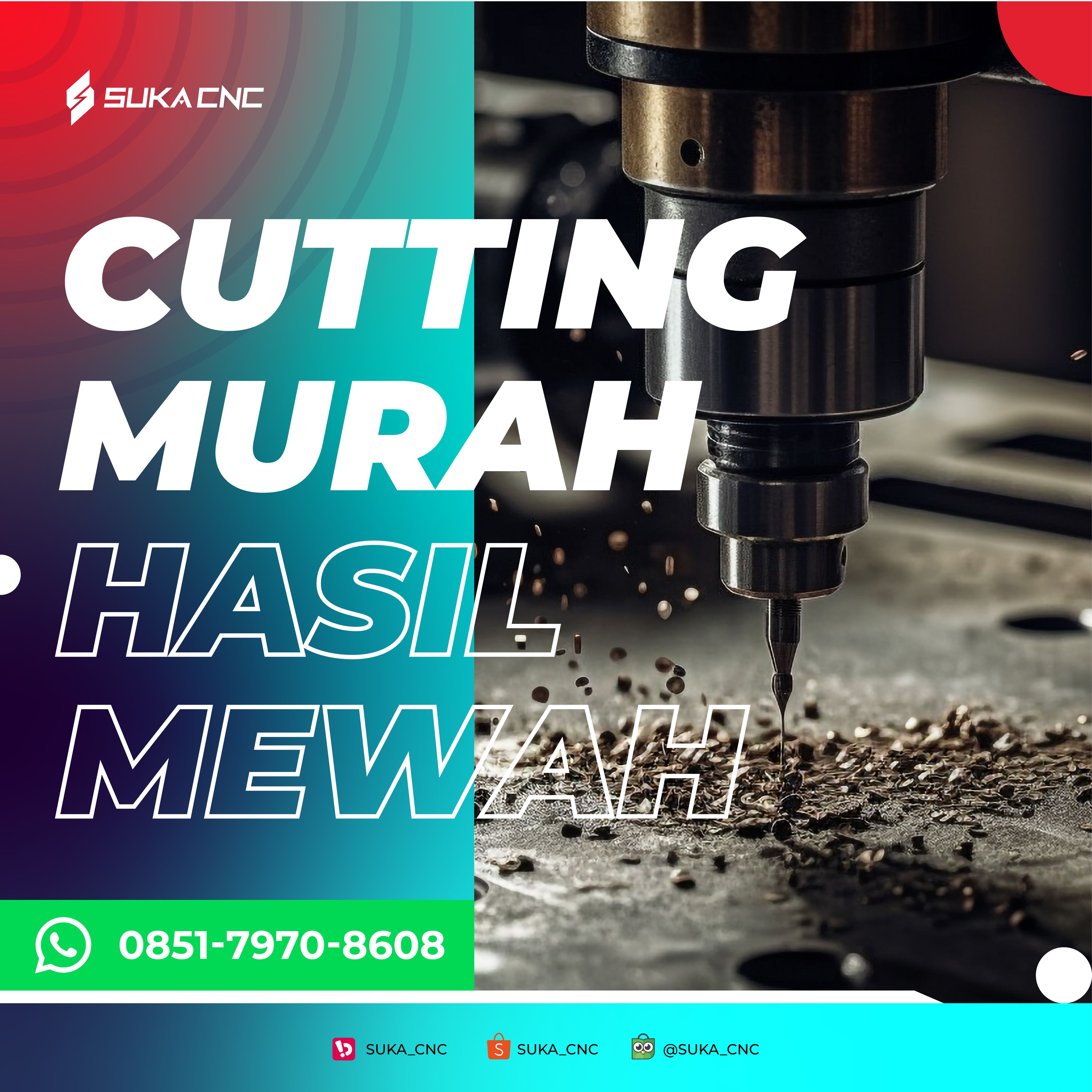
A well-designed price flyer converts faster than any verbal pitch or referral.
Catalogs aren't just product lists — they are the primary sales tool in this industry.
Crafting the Identity.
SukaCNC was rebuilt around "Precision in Motion." The logomark transforms the letter S into a bold geometric form split by a lightning bolt — representing the cutting action of CNC machines. Gray and navy form the structural body; red provides the spark of energy and cutting force. The system is sharp, industrial, and immediately readable across all formats. Every brand element was designed to communicate one thing: this is a business that cuts with accuracy and works with discipline.
The Final Execution.
ArcStudio has helped us since we first started our business. From the logo, flyers, catalogs, and initial templates, ArcStudio helped us with everything.
This has been incredibly helpful because ArcStudio knows exactly what we need. Highly recommended 😎👍
The Result.
SukaCNC transformed from an unbranded workshop into a credible, professional manufacturing brand ready to compete regionally.
Before this rebrand, people only found us through word of mouth. After ARCT Studio redesigned everything — the logo, the flyers, the catalog — we started getting inquiries from clients we had never met before. They said they found us on Instagram and we looked professional. That was the difference
Ilham
Owner of Suka CNC
SukaCNC proved that industrial brands are often the most underserved in design.
The gap between how good the product is and how it looks is enormous — and that gap is pure opportunity.
Closing it doesn't require complexity. It requires clarity, consistency, and the courage to look like what you actually are