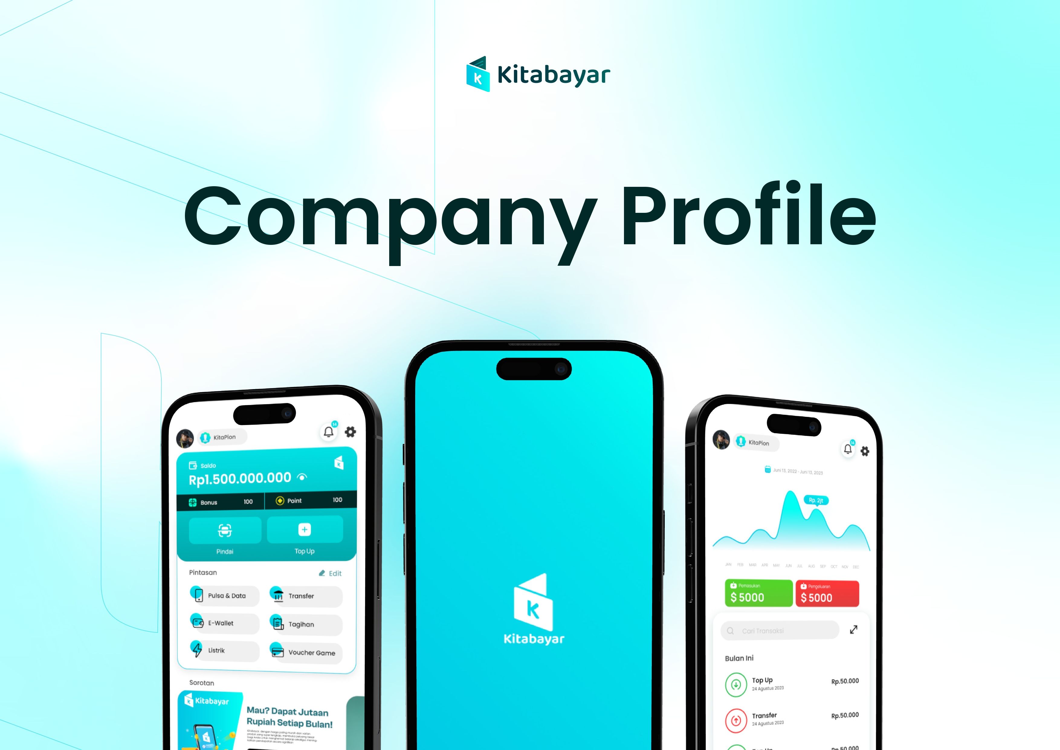
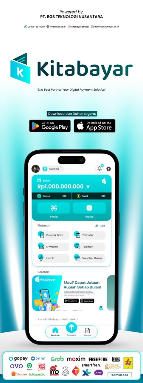
Kitabayar
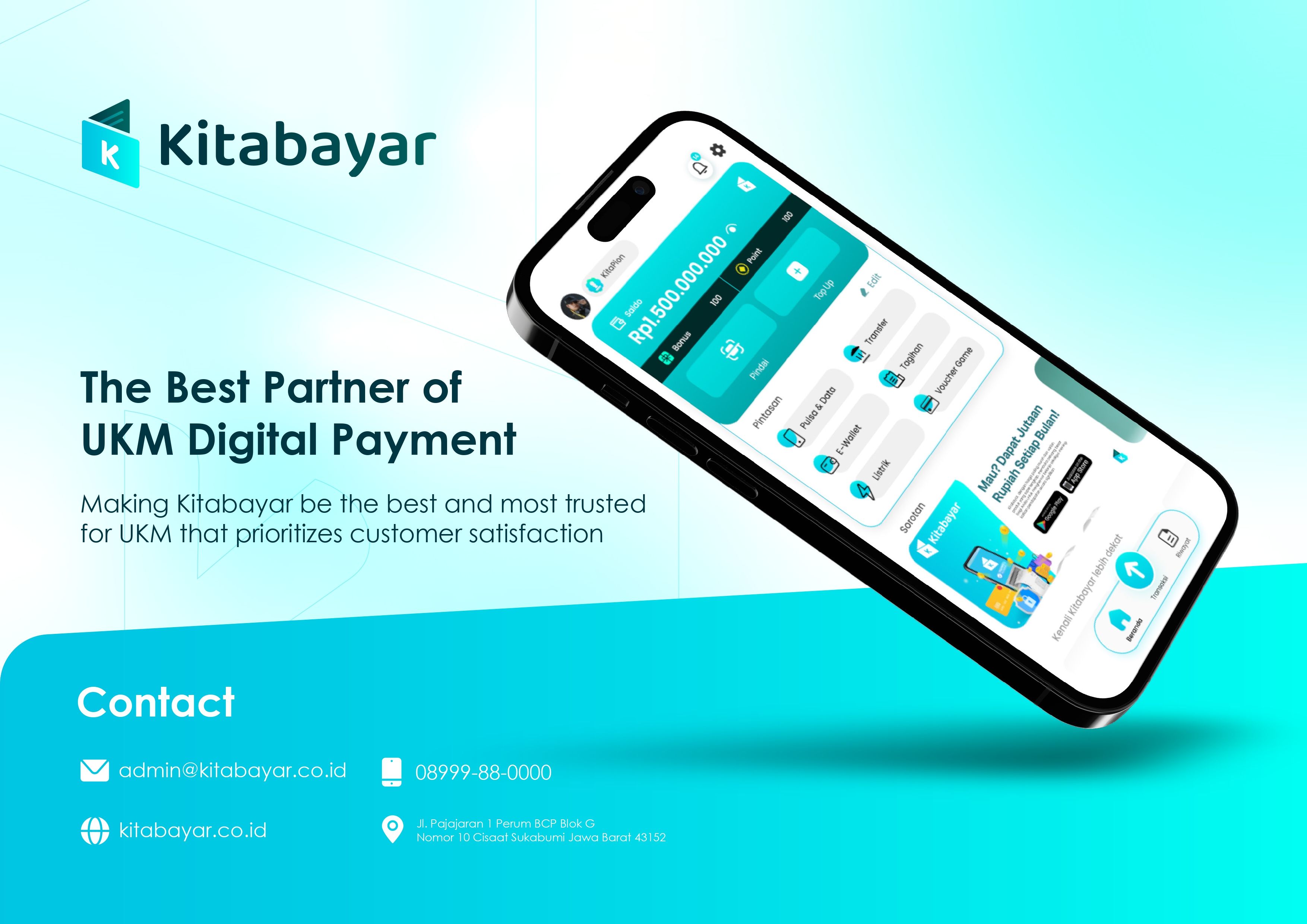
Kitabayar – a digital payment ecosystem for everyday financial transactions, primarily focused on Indonesian MSME (Micro, Small, and Medium Enterprises) players. ARCT Studio manages this project from A to Z.
Starting from developing the brand identity (logo, color, typography) to delivering a comprehensive UI/UX design that covers the entire transaction experience within a single application. This results in a digital product that ultimately appears credible, fast, and relevant to its users.
Solving the Complexity.
PT BGS Teknologi Nusantara needed a complete redesign for Kitabayar—from a brand lacking a strong visual identity to a UI that did not reflect modern fintech standards.
The main challenge: how to design a PPOB + e-wallet application that can compete with major players (GoPay, Dana, Buku Warung) while still feeling intimate and relevant to the MSME segment—warung merchants, resellers, and small business owners with varying levels of digital literacy and very specific, recurring daily transaction needs.
Pain Points
- User flow is too long, making transactions slow for MSMEs
- The old appearance does not build trust, giving an amateurish impression
- No custom shortcuts, all merchants are subject to the same structure
- Notifications are not optimal, users miss important information
- Weak brand identity, making it difficult to build loyalty and trust with users and business partners
Objectives
- Strong, modern, and trustworthy brand identity as the foundation of Kitabayar’s digital ecosystem
- New, user-centered UI/UX prioritizing speed and ease of transactions
- Custom shortcut feature, favorite transactions available in just 1–2 taps
- Scalable design system, ready for handoff, ensuring long-term consistency
- Interactive prototype ready for user testing and direct investor pitching

Decoding the Audience Psyche.
- Primary: Indonesian MSME actors—warung merchants, resellers, owners of small-to-medium physical and online stores who routinely use PPOB services (phone credit, electricity bills, water, internet, transfers) every day as part of their business operations.
- Secondary: Individual users looking for a more affordable and flexible all-in-one digital payment solution compared to conventional e-wallets.
Speed is essential, extra steps reduce transactions, and custom shortcuts are an effective solution.
Trust through design: clean colors, neat layout, and clear balance display.
A single inbox consolidates notifications, promos, and news, reducing mental burden.
A Design System is a must; component documentation reduces long-term development costs.
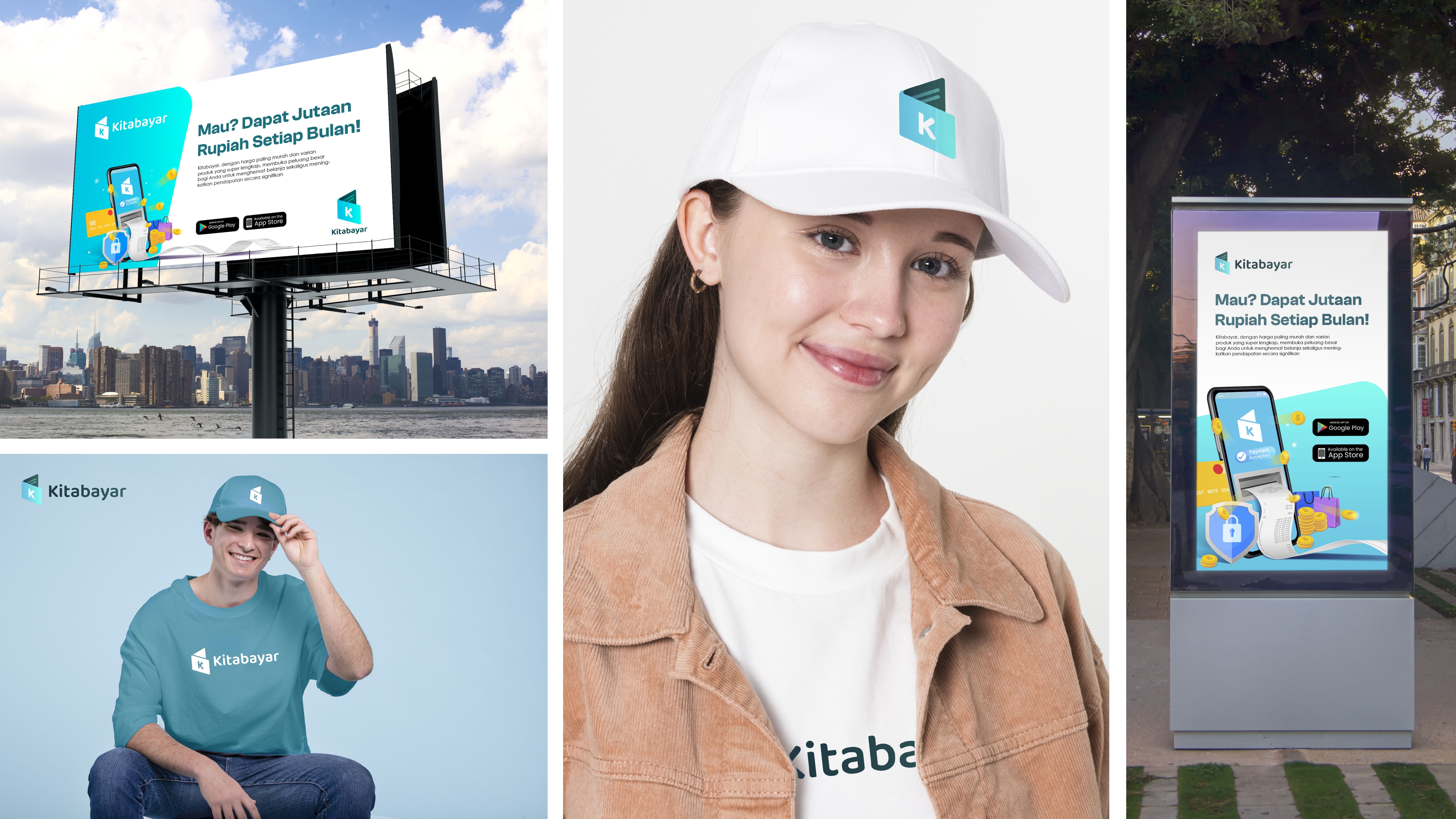
Crafting the Identity.
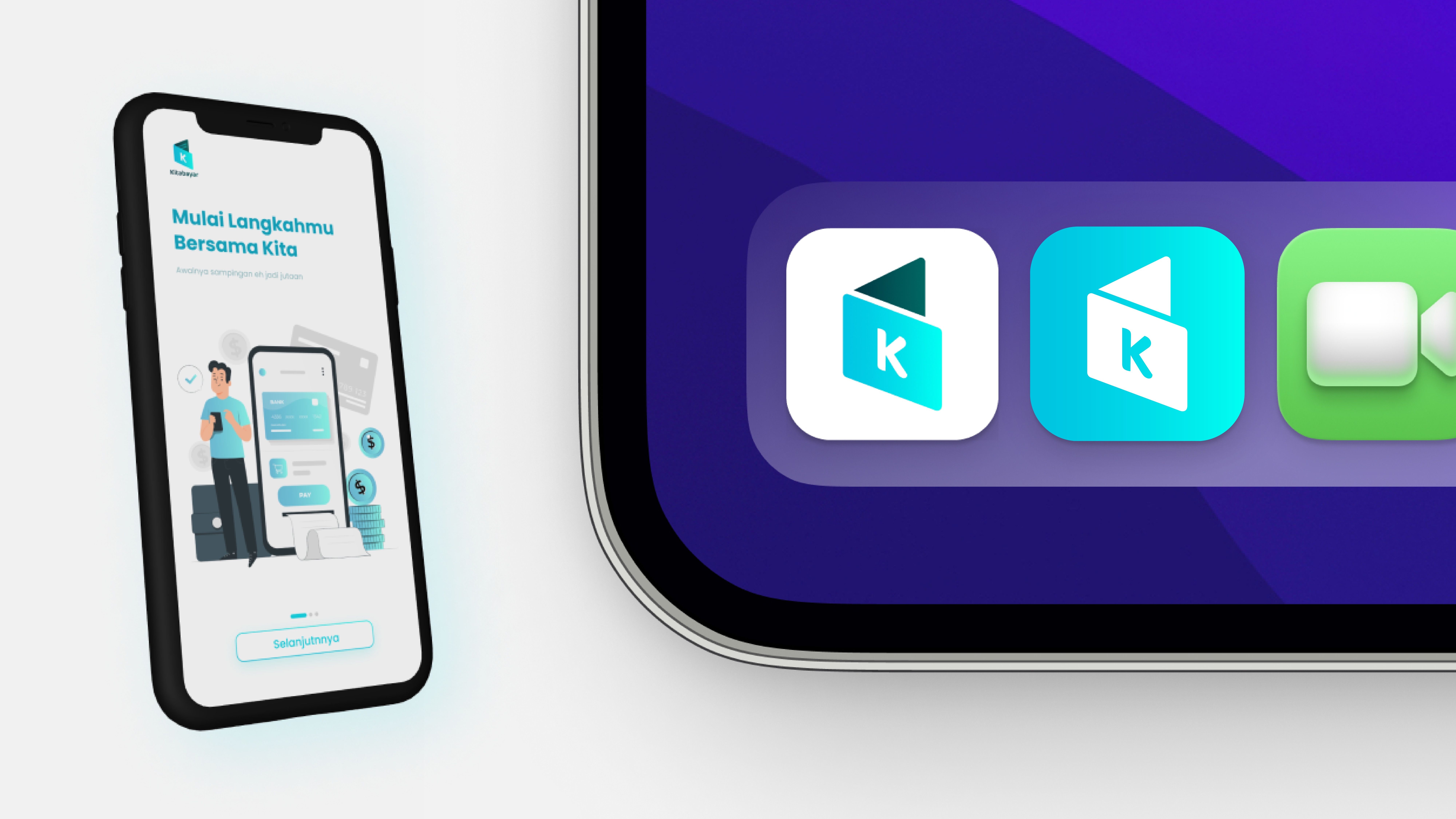
Kitabayar is redesigned as a “Digital Payment Companion” for MSMEs—not just an e-wallet, but a personal and efficient daily transaction control center.
Core design concepts:
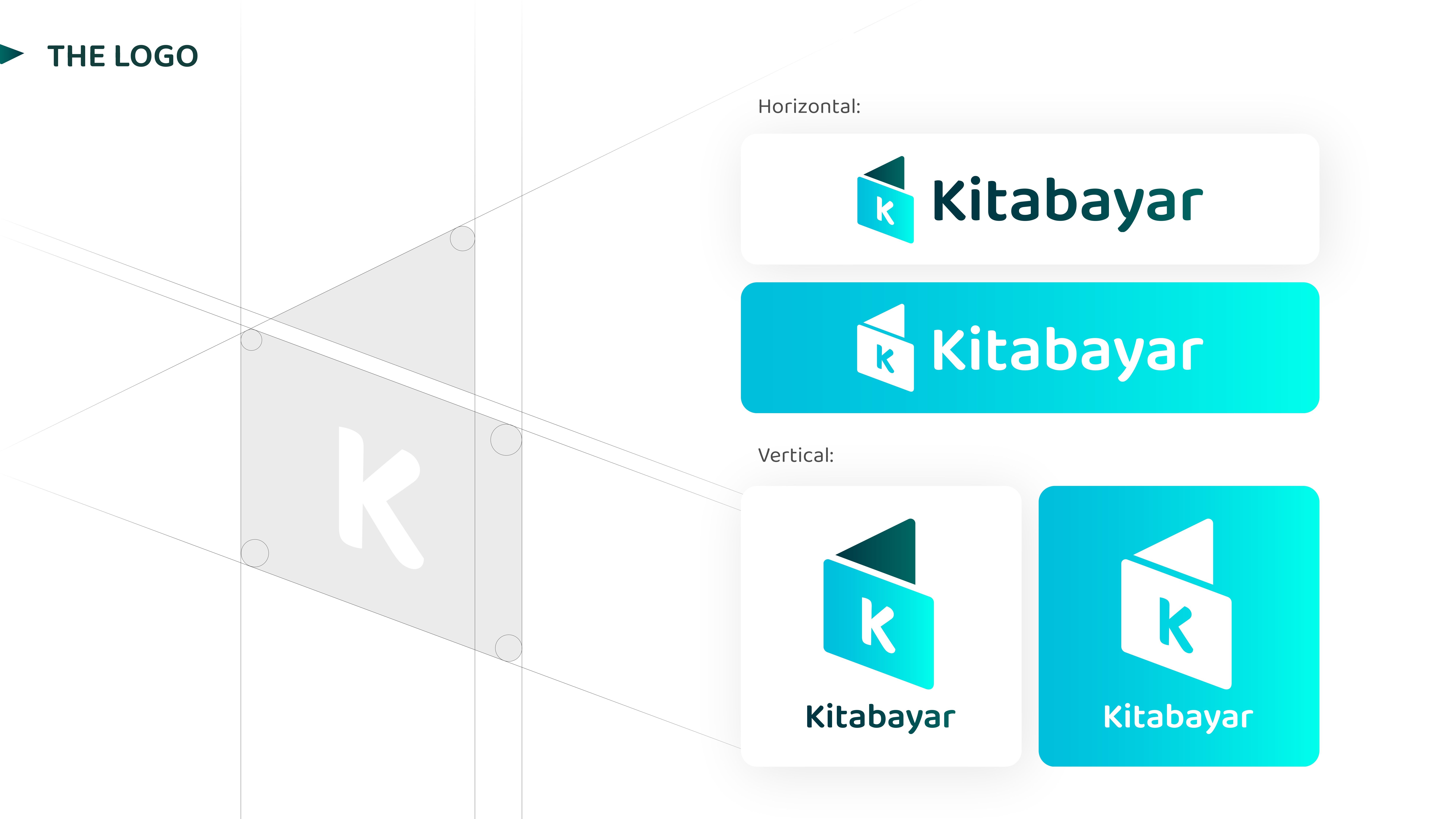
- LOGO: An open book/wallet shape with the “K” lettermark and a teal gradient—representing “transparent and open payment records.” Two elements (book + directional triangle) reflect “record” and “action/transaction.”
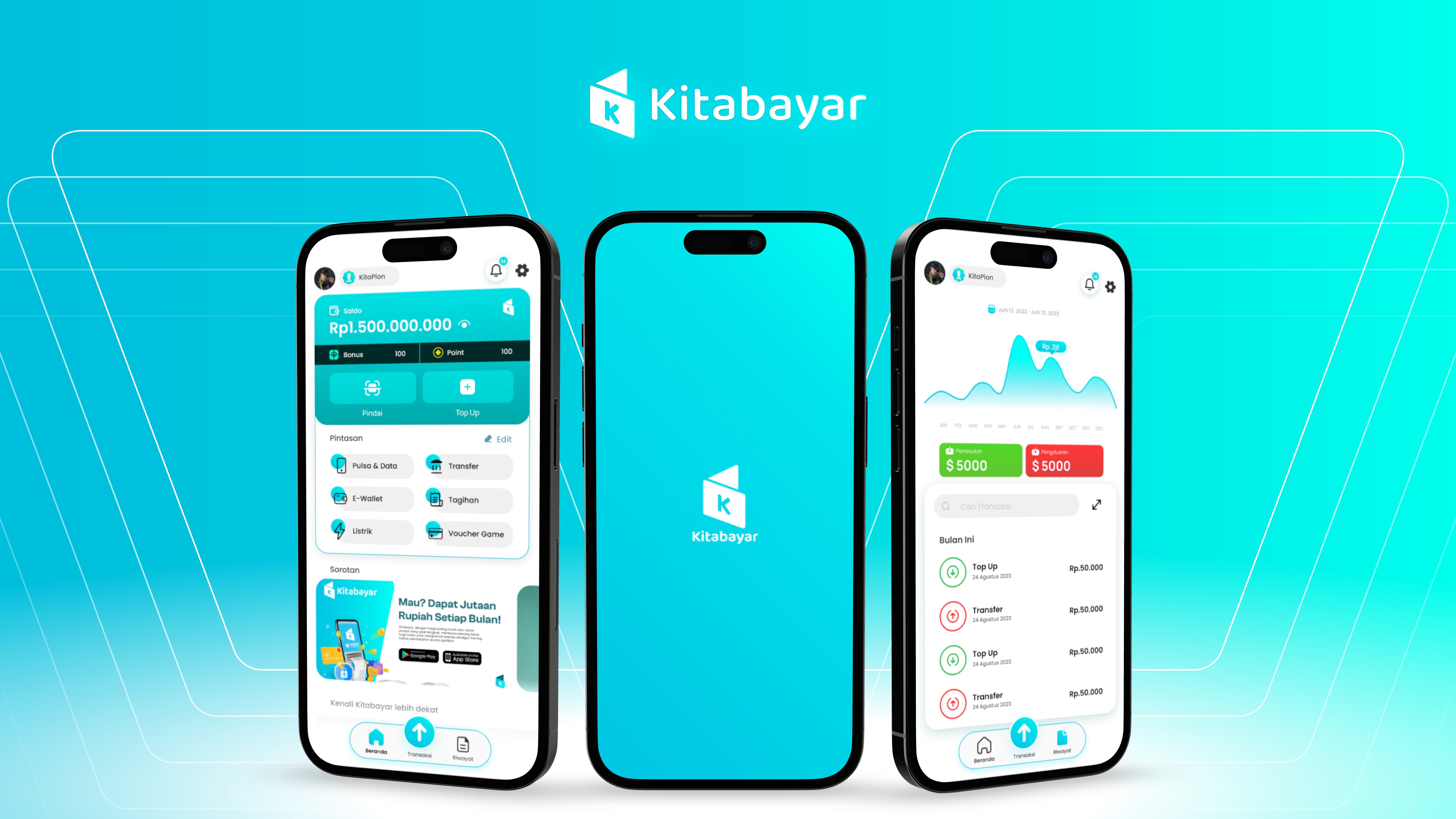
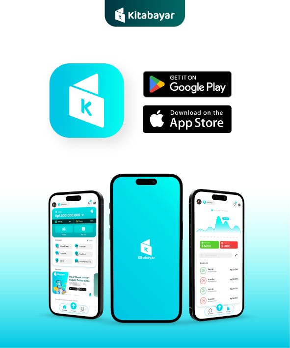
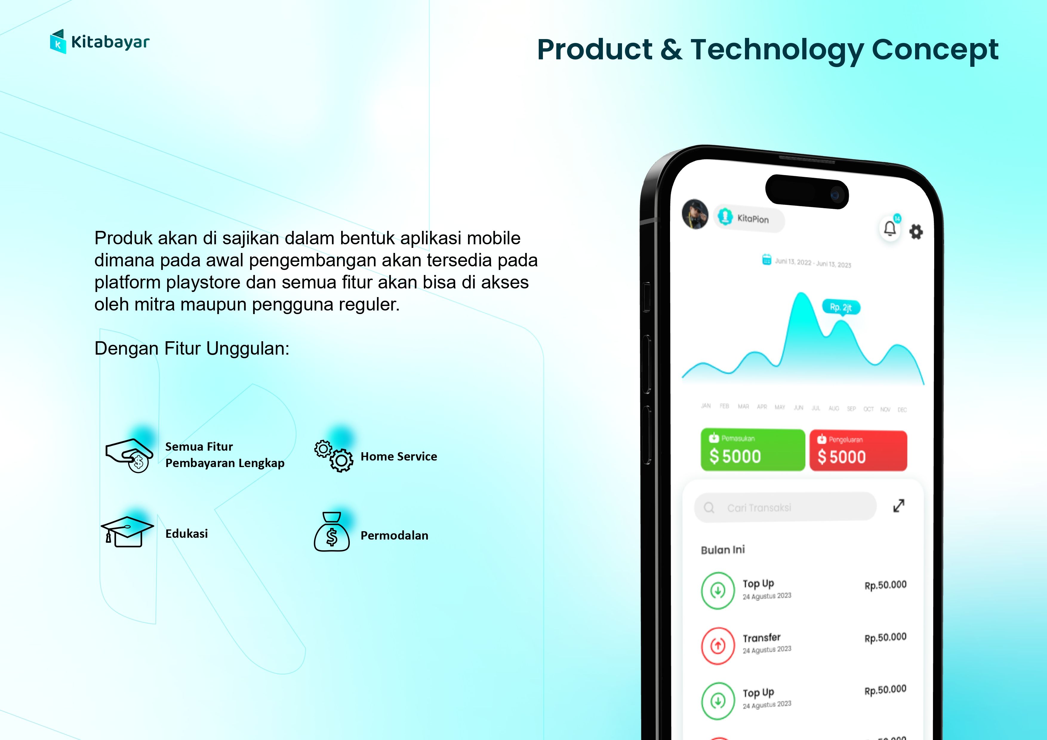
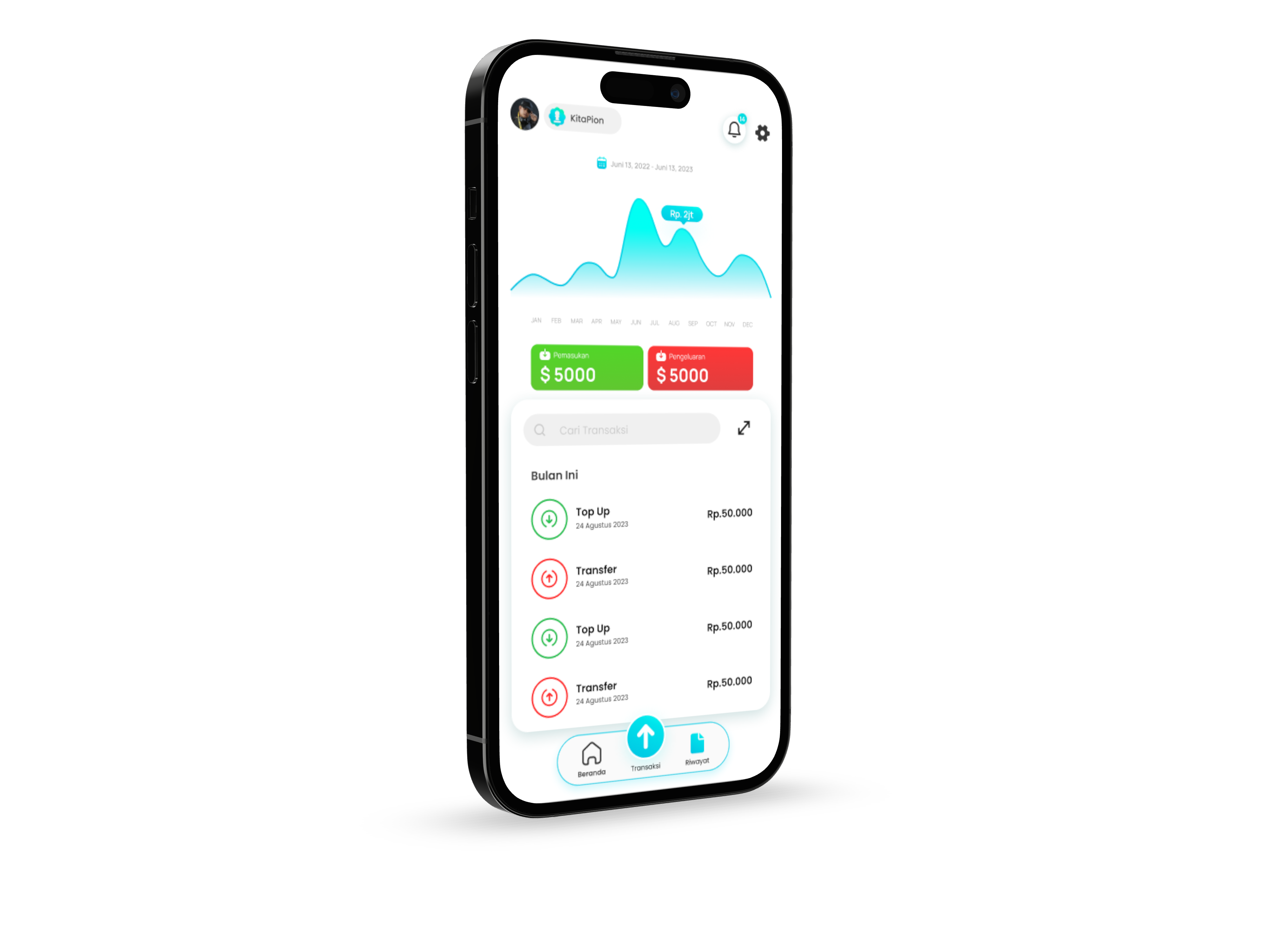
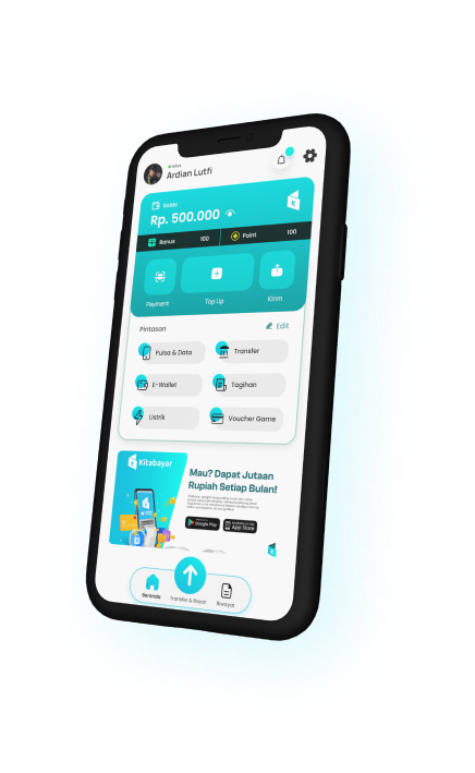
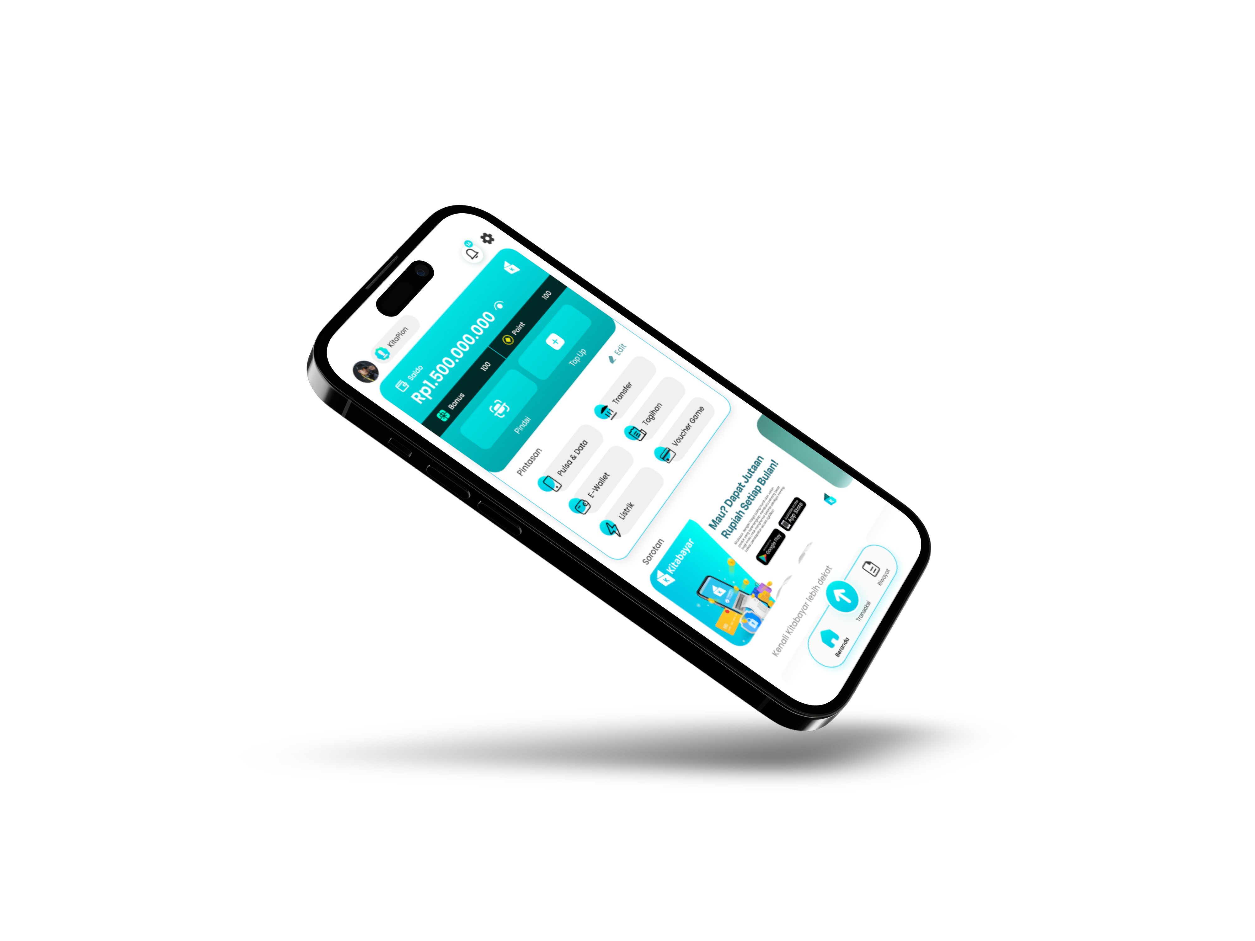
- UI HOMEPAGE: Balance is prominently displayed in the hero card with Bonus & Points visible—building a sense of ownership. Two main CTAs (Scan & Top Up) are placed within the thumb zone for quick access.
- SHORTCUTS: A shortcut grid that is 100% customizable—merchants can rearrange products according to usage frequency. Edit mode is available in one tap.
- HIGHLIGHTS: The best promos are presented as immersive visual carousels—providing an engaging shopping experience in the midst of a transactional app.
- INBOX: A single notification center that separates Notifications, News, and Promos on one screen—zero missed updates.
- DESIGN SYSTEM: Structured color tokens, spacing, and components to ensure consistency as the app grows.
The Final Execution.
Execution proceeded within an accelerated Design Sprint framework, structured into 3 phases:
PHASE 1 — DEFINE, INSPIRATION & IDEATION
PHASE 2 — DESIGNING
PHASE 3 — PROTOTYPING
The Result.
Kitabayar stands out with strong branding, simple user flows, a design system, and a live app on both stores.
Absolute Best Quality! Seeing visuals this good makes me even prouder of my own efforts and more enthusiastic
Dani
CEO of Kitabayar
The Kitabayar project is a lesson in how trust is built through design—not just features. In fintech for MSMEs, every visual decision is a business decision: the wrong color makes users hesitant to store money, a long flow makes merchants switch to competitors.
The accelerated Design Sprint in this project proved that structured speed of execution does not sacrifice quality—instead, it focused energy on truly impactful decisions. And building a Design System from day one, even if it seemed “overkill” at first, proved to be a foundation that saved consistency as the product grew.