Tikkum-8
Tik·Kum 8 is a billiard sport brand entering a category where visual identity has historically been an afterthought — venues, tournaments, and clubs that rely on function over form. ARCT Studio developed a complete visual brand identity from the ground up: a geometric logomark rooted in conceptual depth, a precise color system built for high-contrast performance environments, and a typography system structured for legibility across both digital and physical applications. The result is a sport brand that looks and feels international — sharp, confident, and built to compete visually in any arena.
Solving the Complexity.
Billiard as a sport category carries a specific visual baggage — dark venues, retro signage, and brand identities that communicate hobby rather than sport. Tik·Kum 8 needed to break from that convention entirely. The brand had to communicate athletic seriousness, modern sport culture, and a forward-oriented competitive identity — without defaulting to the generic sports-brand vocabulary of gradients, motion blur, and swoosh marks. It needed to be distinctive and constructed with intent.
Pain Points
- No existing identity — brand built entirely from zero without prior visual reference.
- Category carries dated visual associations — needed to reframe billiard as a modern, competitive sport.
- Name contains both a number and a cultural reference requiring careful typographic handling.
- Identity needed to function across sport environments — jerseys, digital platforms, venue signage — all with different surface and lighting conditions.
- No color system or typographic direction — all decisions open, all requiring justification.
Objectives
- Design a logomark with layered conceptual meaning derived from the brand name's initials and sport context.
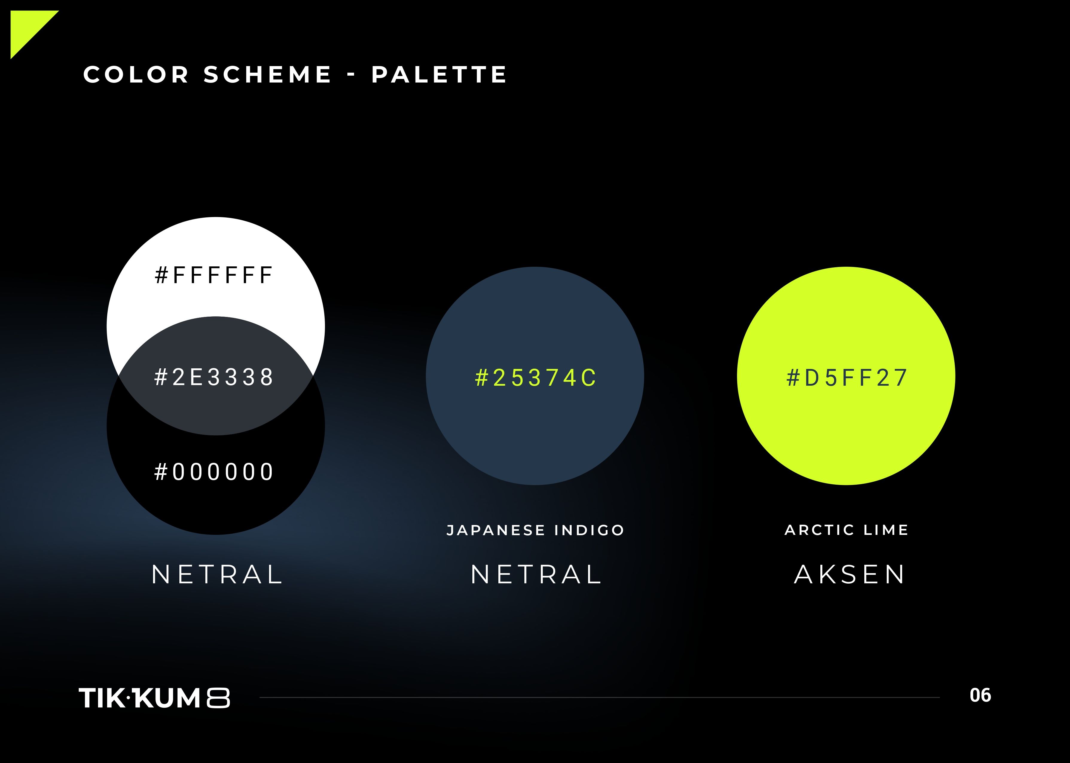
- Develop a color system capable of performing across dark sport environments and digital screens simultaneously.
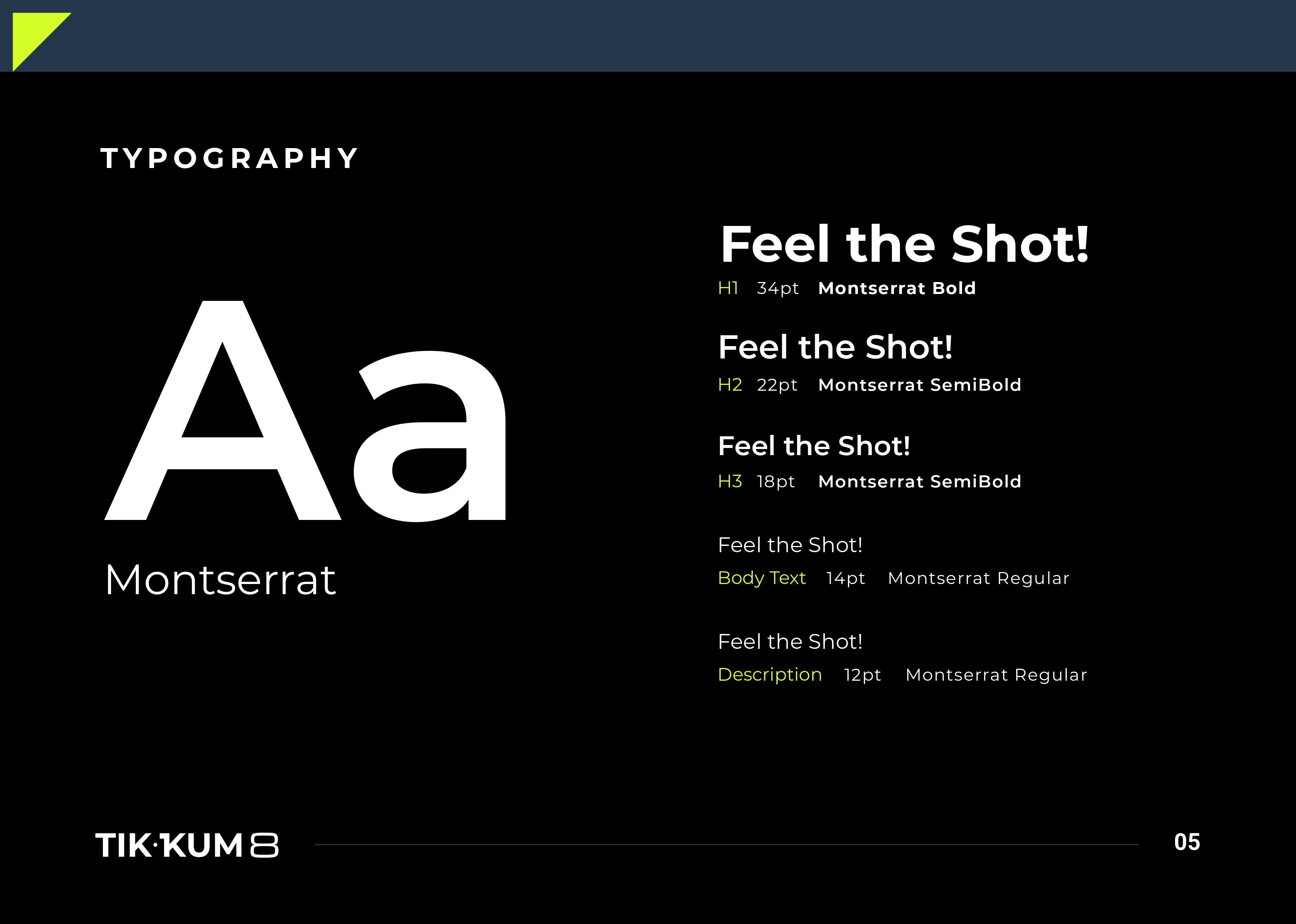
- Build a typography system structured for hierarchy across all brand communication — from headlines to body copy.
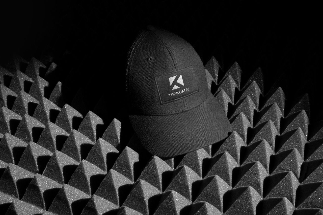
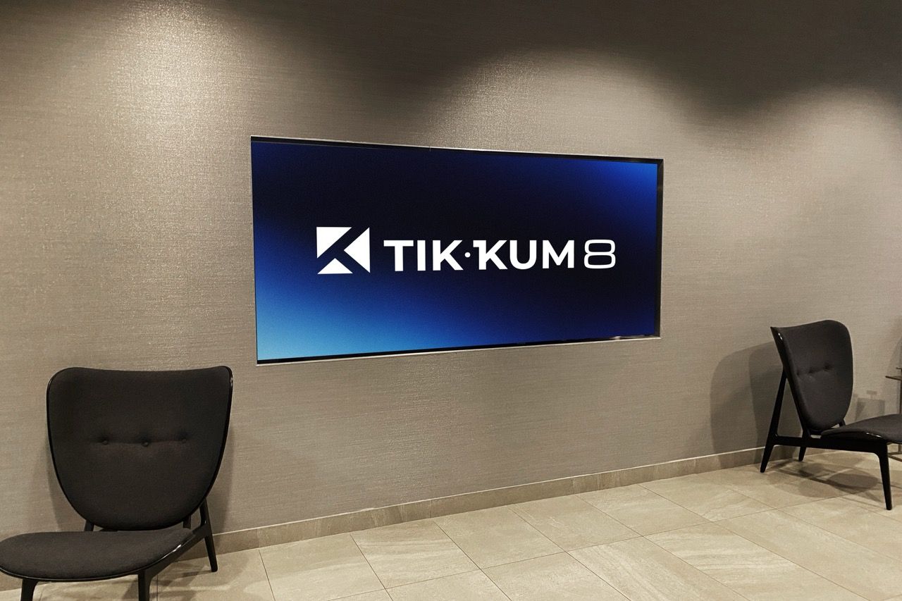
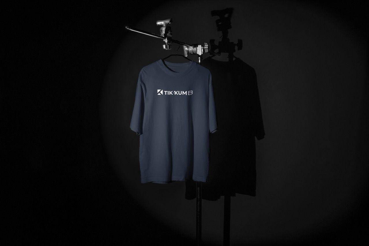
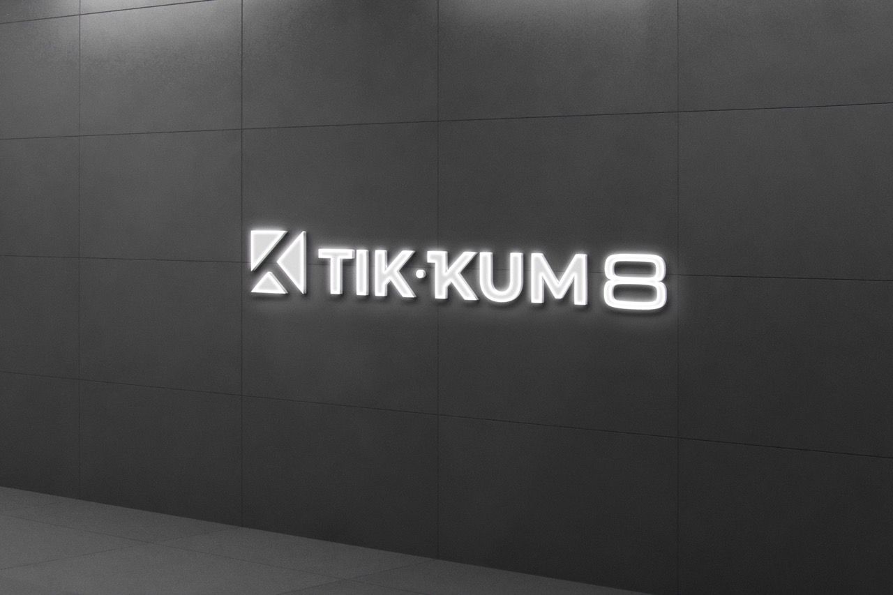
- Produce a mockup suite demonstrating the identity applied across real-world brand surfaces.

Decoding the Audience Psyche.
The billiard sport category in Sukabumi has virtually no precedent for strong visual brand identity. Most clubs and tournament brands operate with text-only or clip-art-adjacent logotypes. Tik·Kum 8 enters the category with a level of visual sophistication that has no direct local competitor to compare against — it sets the standard rather than responding to one.
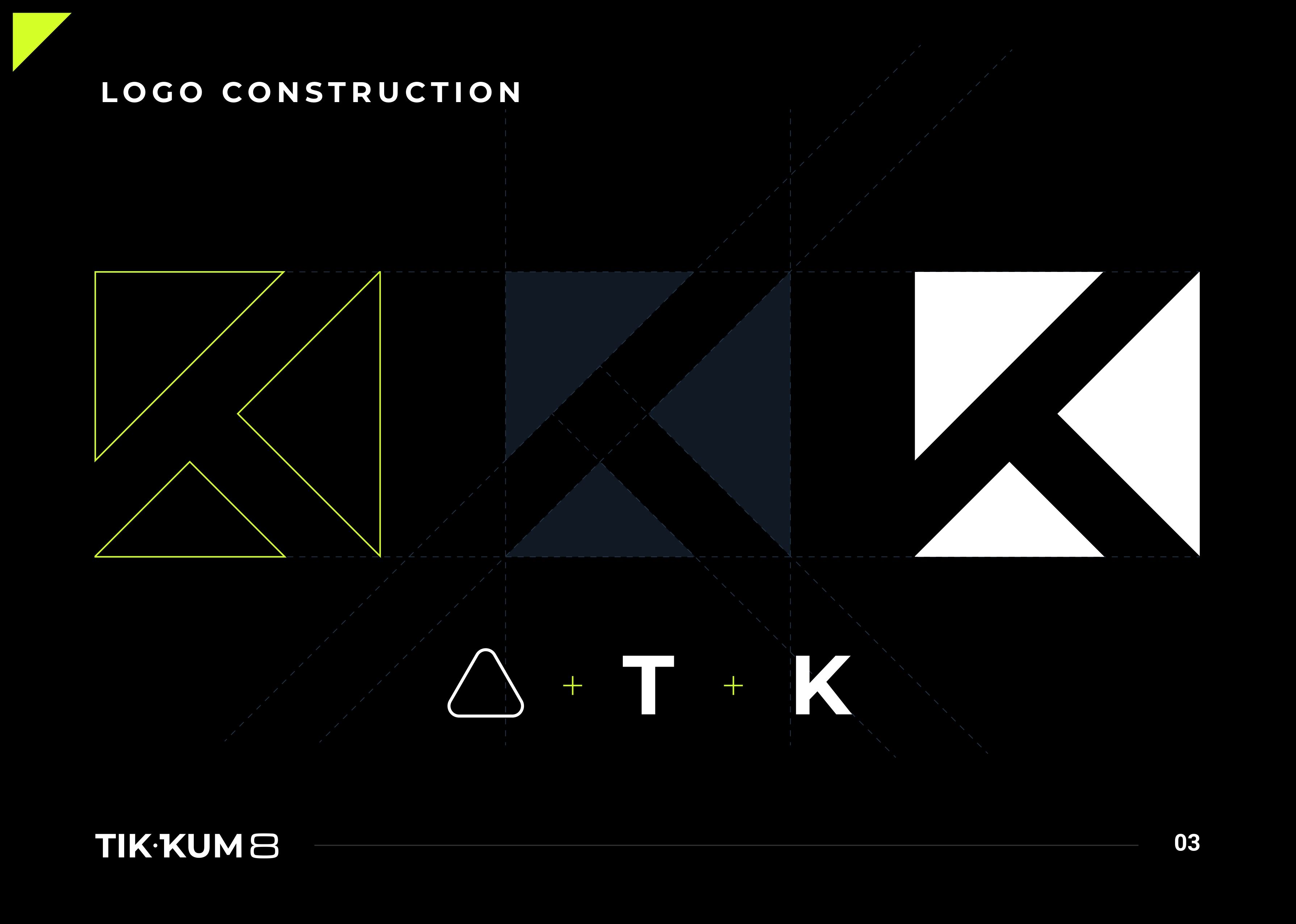
A sport logo must function as a symbol first and a wordmark second
The number 8 in billiard is not decorative
A neon accent in a dark-dominant palette does not need to be used frequently to be effective
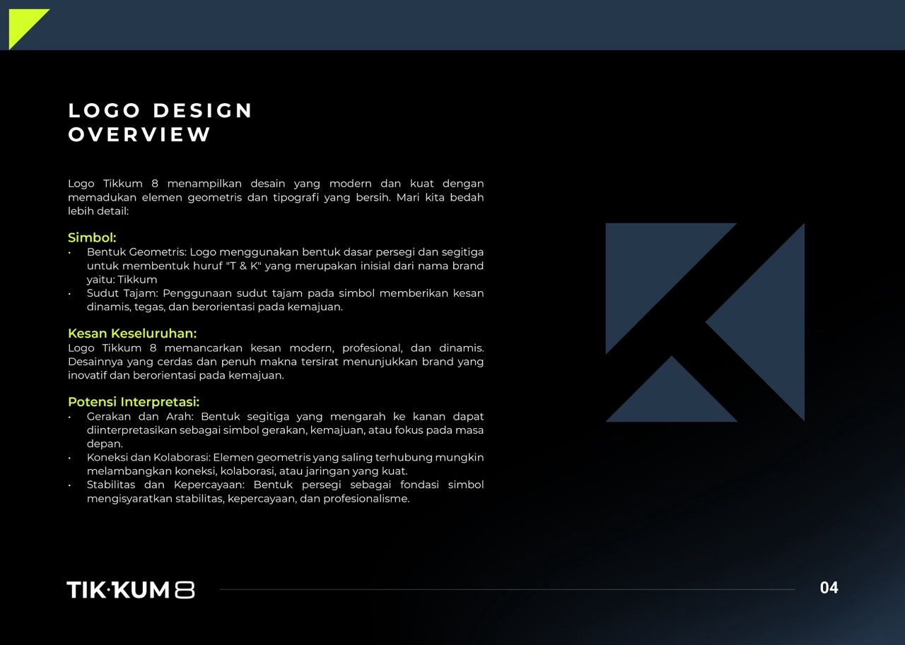
The geometric construction of the logomark — triangle + T + K
Typography in sport must be functional above all else.
Crafting the Identity.
Tik·Kum 8 was built around the idea of precision in motion — the moment before the shot, when geometry, force, and intention converge.
The Final Execution.
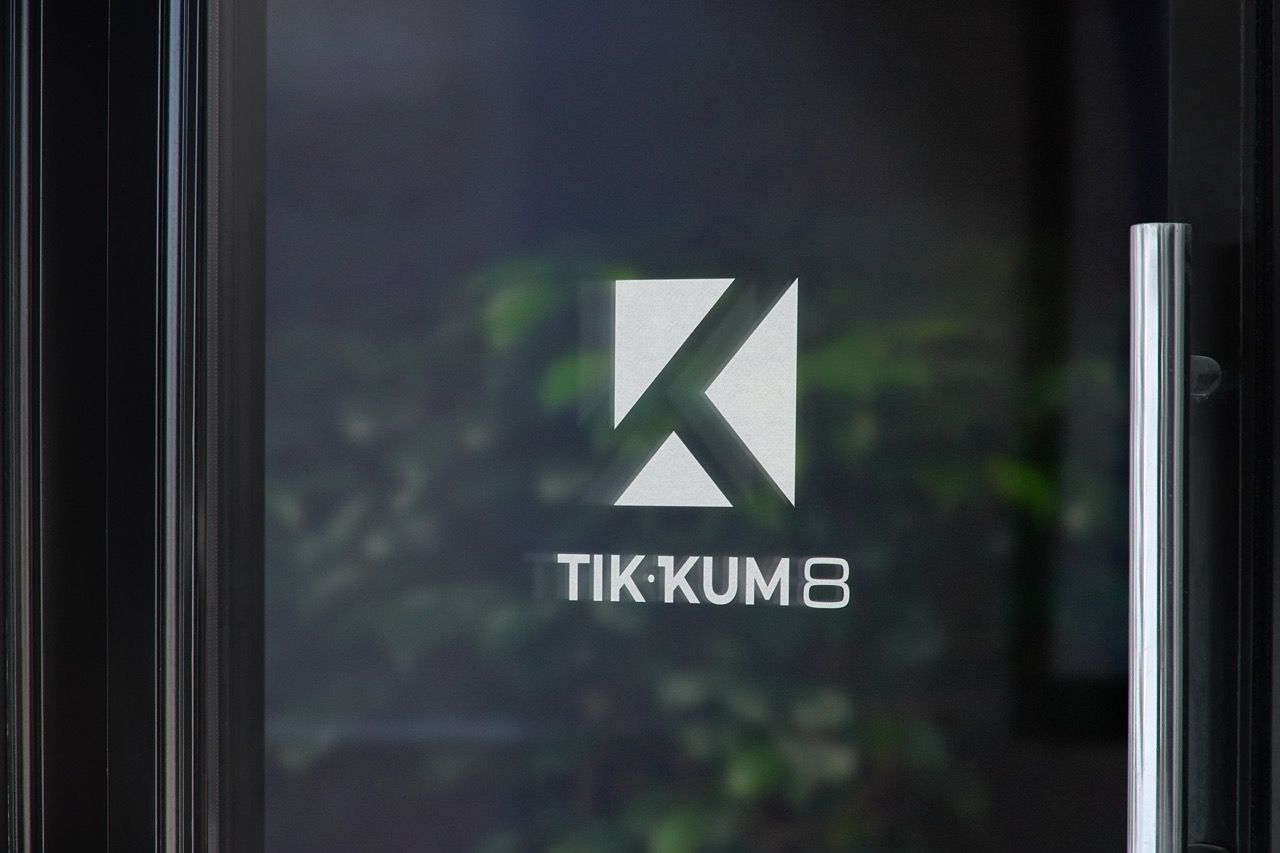
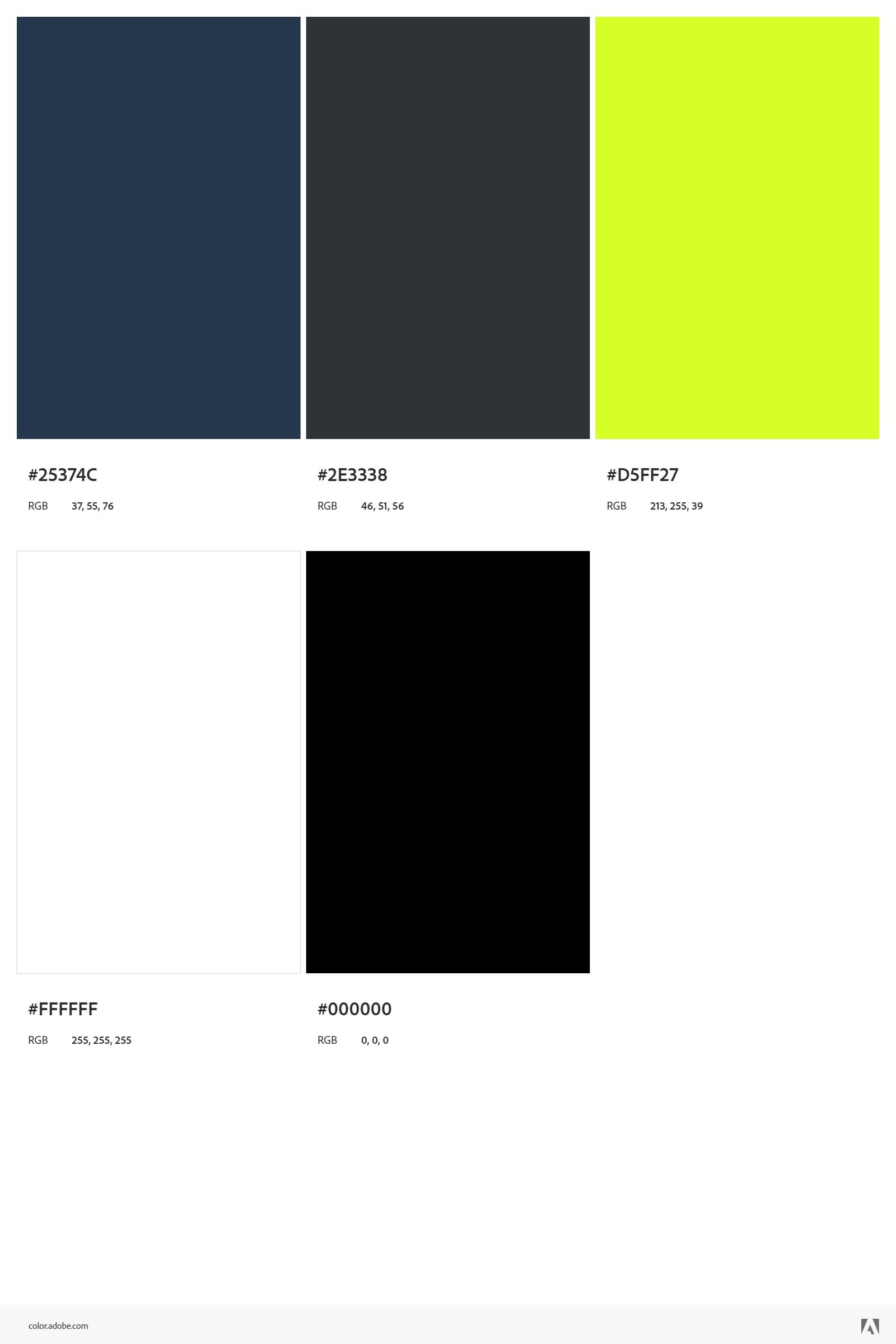
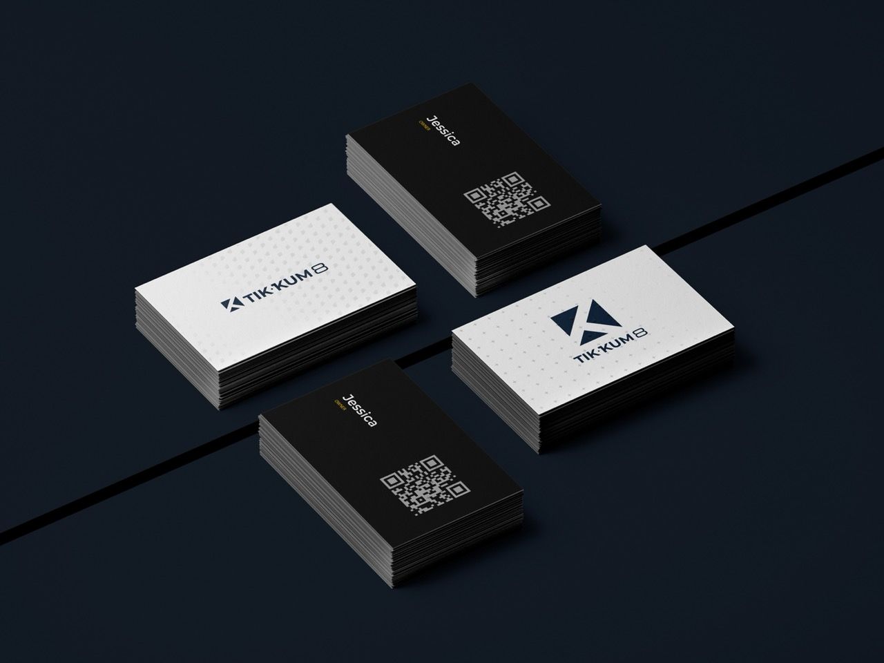
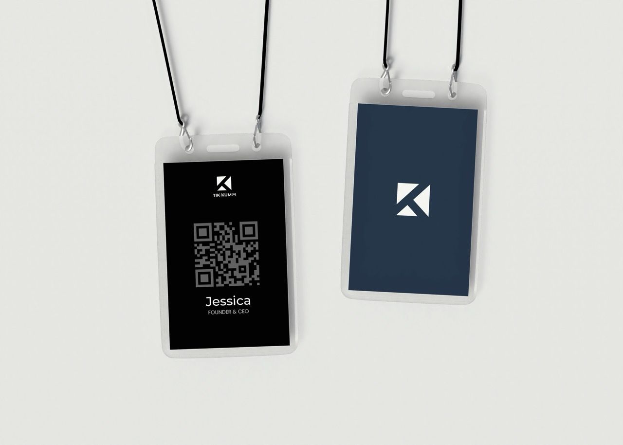
The logomark construction was developed through a strict geometric grid, Logo variants were developed as two primary expressions, The color system was specified with both hex codes and named identifiers, The typography system was structured in five tiers, Mockups demonstrated the identity applied across sport-relevant surfaces
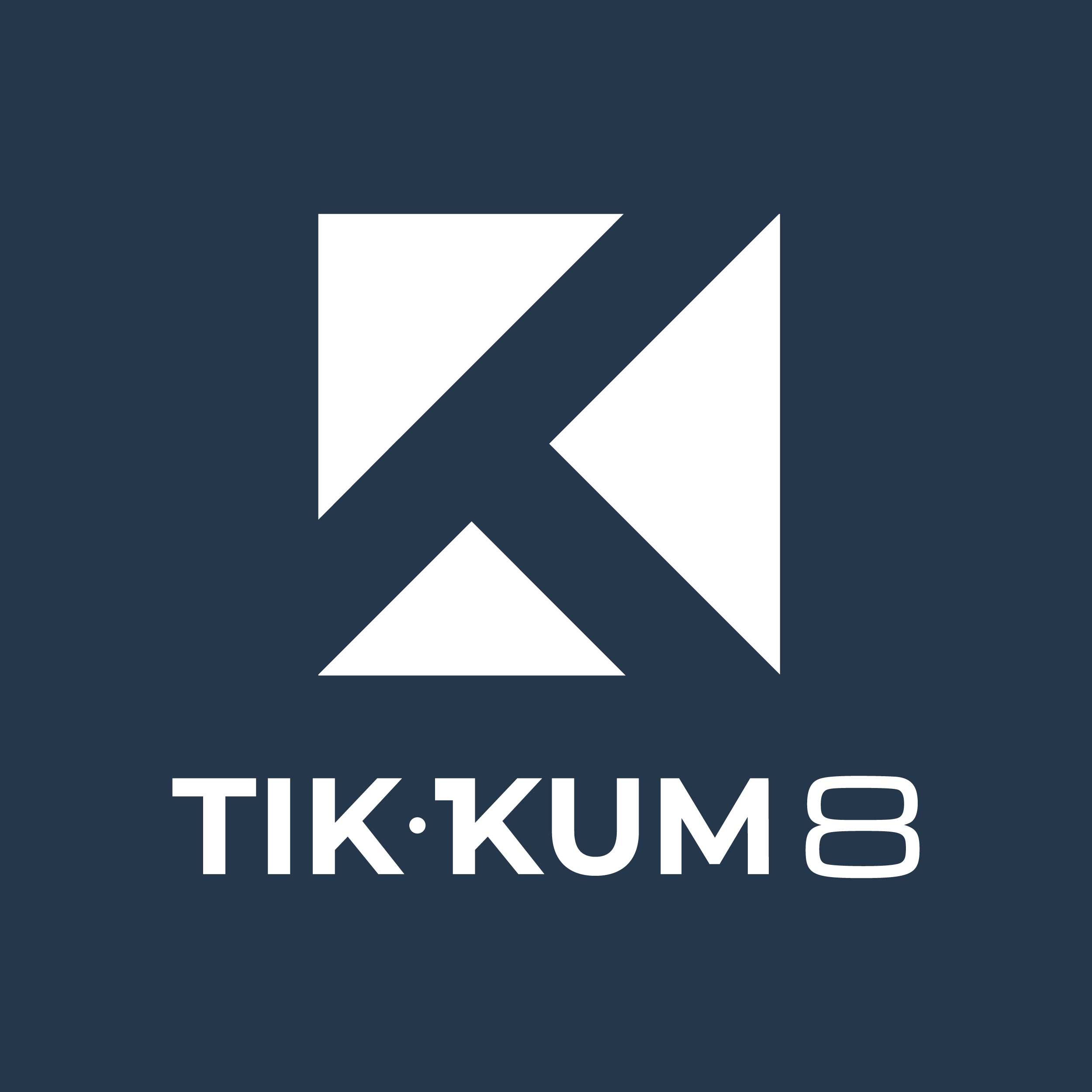
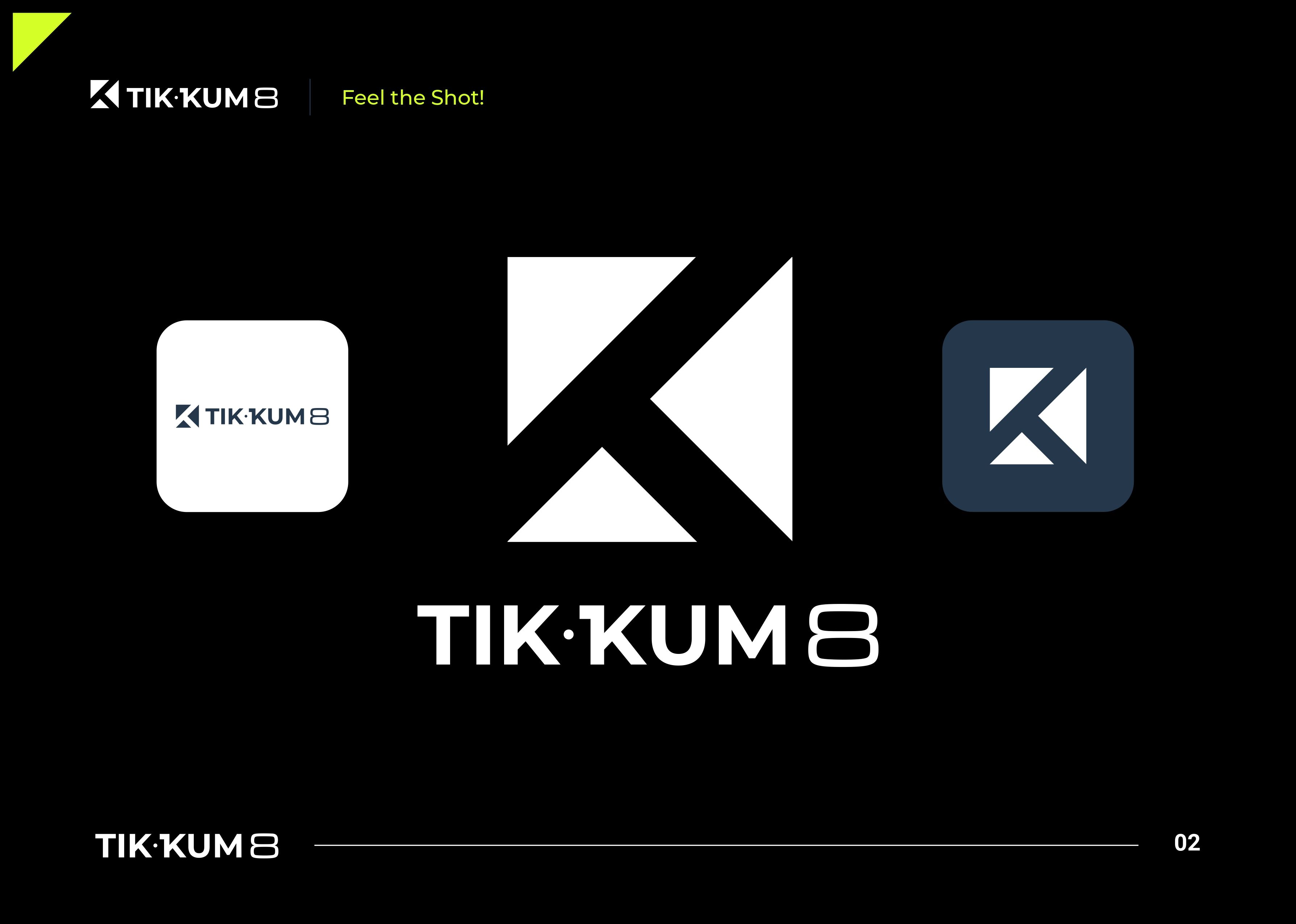
Primary Logo
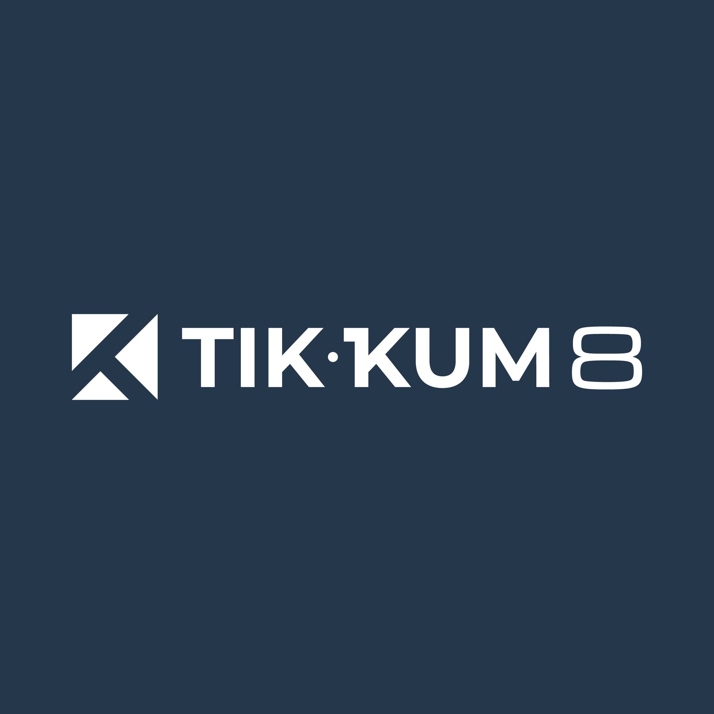
Seconday Logo
The Logo
The Result.
Tik·Kum 8 launched with a visual identity positioned at a tier above any existing billiard sport brand in the Indonesian market. The geometric mark holds its visual weight across every scale tested — from small digital icon to large-format jersey print. The color system performs in both the dark sport environments characteristic of billiard venues and in the bright digital contexts of social media and website presentation. The brand is built to grow — every system decision was made with scalability in mind, from the documented construction logic to the multi-background logo package.
"We didn't just want a logo. We wanted to look like a brand that takes the sport seriously. ARCT Studio delivered something we didn't know was possible for a billiard brand in Indonesia. When people see the mark, they assume it's international. That's exactly what we were aiming for."
Jessica
CEO - Tikkum 8
Tik·Kum 8 was a study in how much conceptual weight a geometric mark can carry when the construction logic is sound.
The temptation with geometric logos is to prioritize elegance over meaning — to arrive at a shape that looks good without being able to explain why every angle is where it is. That approach produces beautiful marks that cannot survive scrutiny or scale. The Tik·Kum 8 mark needed to hold up to both.
The decision to integrate the number 8 as a typographic character rather than as an icon was the pivotal creative choice. It resolved the tension between the brand name and the sport's visual culture without resorting to illustration. The wordmark becomes the sport reference. The mark becomes the identity statement. Neither needs to explain the other.
The Arctic Lime accent deserves its own note. A color that electric demands to be used with precision — not with enthusiasm. Every time it appears, it should feel intentional. Getting that restraint right across an entire brand system is harder than it sounds.