AllAboutSpices
All About Spices is a herbs and spices brand based in Canggu, Bali — operating in one of Indonesia's most visually competitive F&B markets, where the customer base skews international, aesthetic expectations are high, and shelf presence is everything. ARCT Studio was brought in to refresh the brand identity and build a packaging system capable of communicating the brand's core promise — natural, handcrafted, premium — across multiple product categories. The result was a cohesive visual ecosystem covering logo, three packaging expressions, product-specific structural design, and branded touchpoints including beverage cups and catalog.


Solving the Complexity.
Canggu is not a forgiving market for underdeveloped branding. The area's customer base — a mix of expat residents, wellness-oriented tourists, and design-literate locals — responds instinctively to visual quality. A brand selling herbs, spices, and homemade bakery products needs to look as clean and intentional as the products themselves. All About Spices had the right product and the right location. What it needed was a visual identity system that could communicate purity, craft, and premium positioning at a glance — on a box, on a cup, on a shelf.
Pain Points
- Existing logo lacked refinement — insufficient to compete in Bali's premium F&B visual landscape.
- No packaging system — products were presented without a cohesive brand expression.
- No graphic element or pattern language to extend the identity across touchpoints.
- Brand did not visually communicate the natural, artisanal quality of the product.
- No multi-product packaging logic — needed to cover different categories from spice boxes to bakery items.
Objectives
- Refresh the logo into a refined botanical mark that reads as premium and natural simultaneously.
- Develop a packaging system with multiple expressions for different product tiers and contexts.
- Create a repeating graphic element and pattern language derived from the brand's botanical identity.
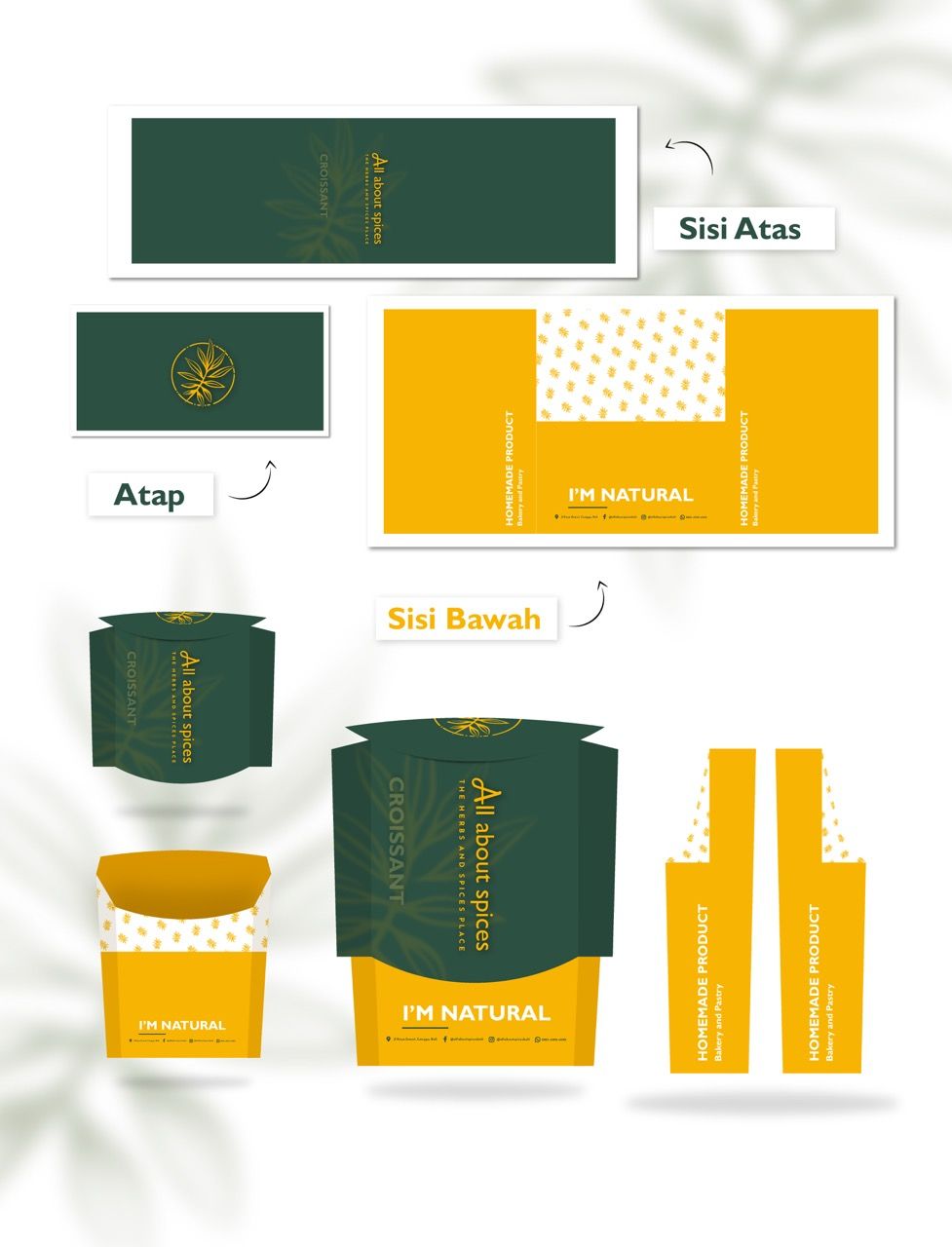
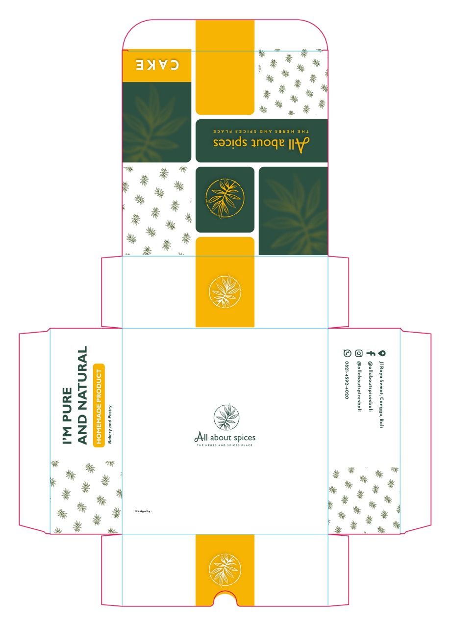
- Design product-specific packaging structures — including a dedicated croissant and bakery box.
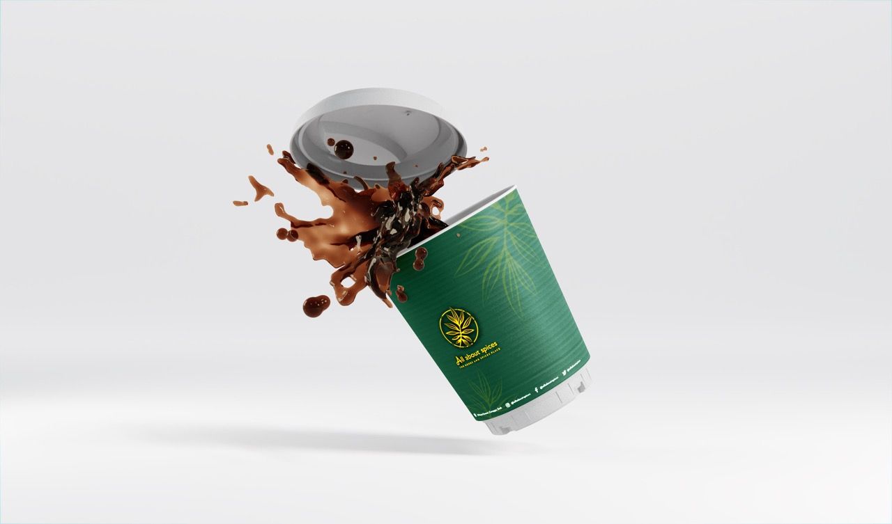
- Extend the visual system to beverage cups and catalog format.


Decoding the Audience Psyche.
The Canggu F&B market contains a high density of wellness and organic brands, many of which default to the same aesthetic vocabulary — white backgrounds, minimal sans-serif type, and generic leaf iconography. The result is a category where every brand looks clean but nothing is distinctive.
The brand needed one primary color contrast capable of working at full saturation for premium expressions and at minimal weight for clean, modern expressions
A repeating botanical pattern derived from the logomark creates brand coherence across all surfaces without requiring the logo to appear on every element
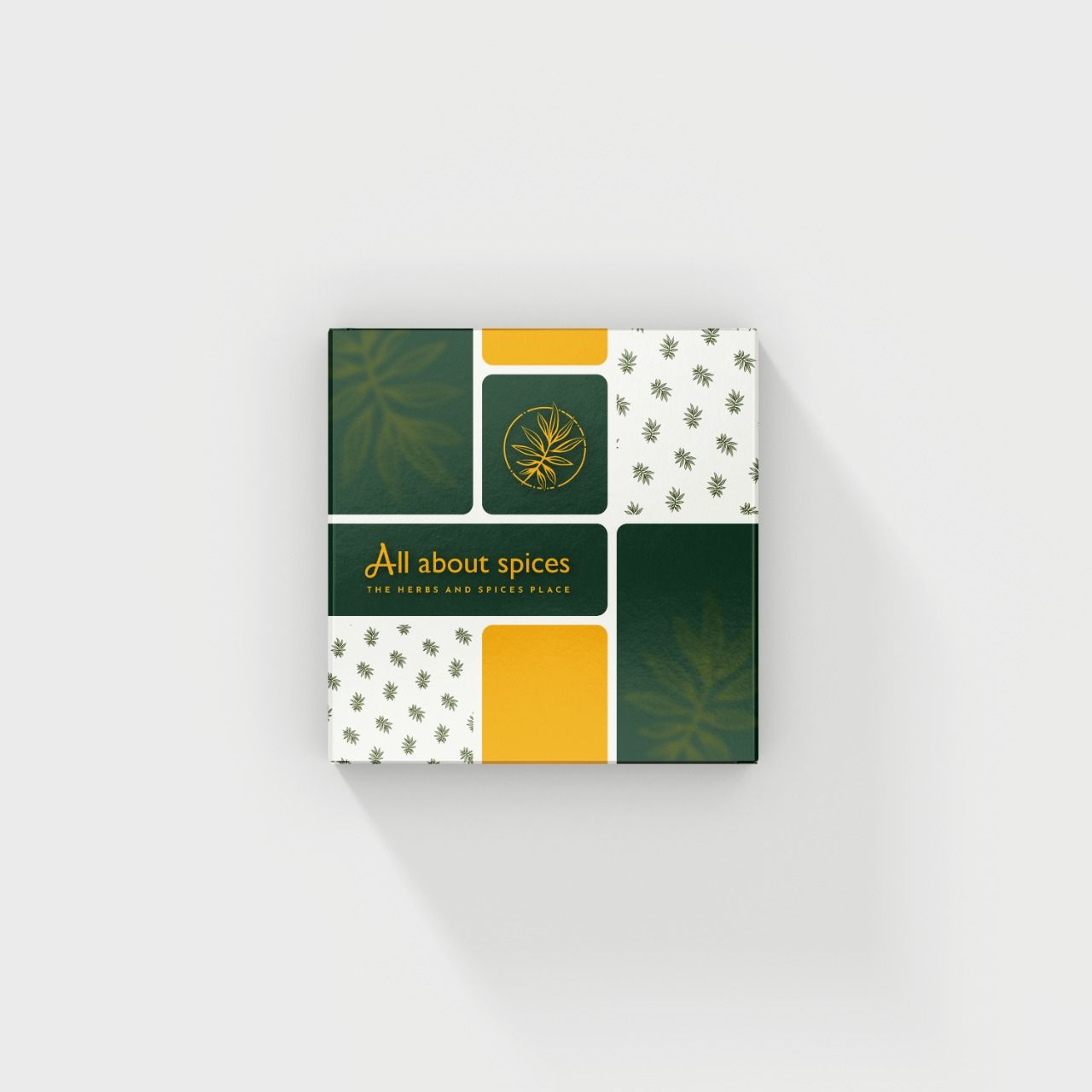
Three packaging expressions from one visual system is not excess
Crafting the Identity.
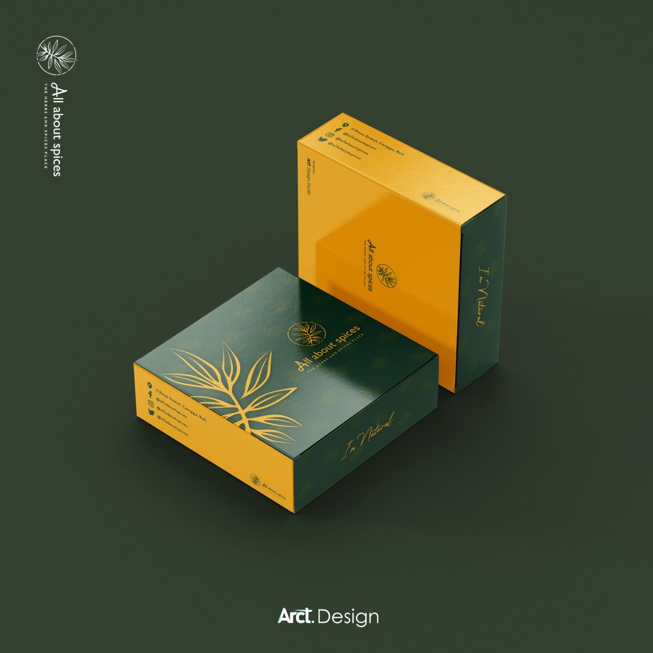
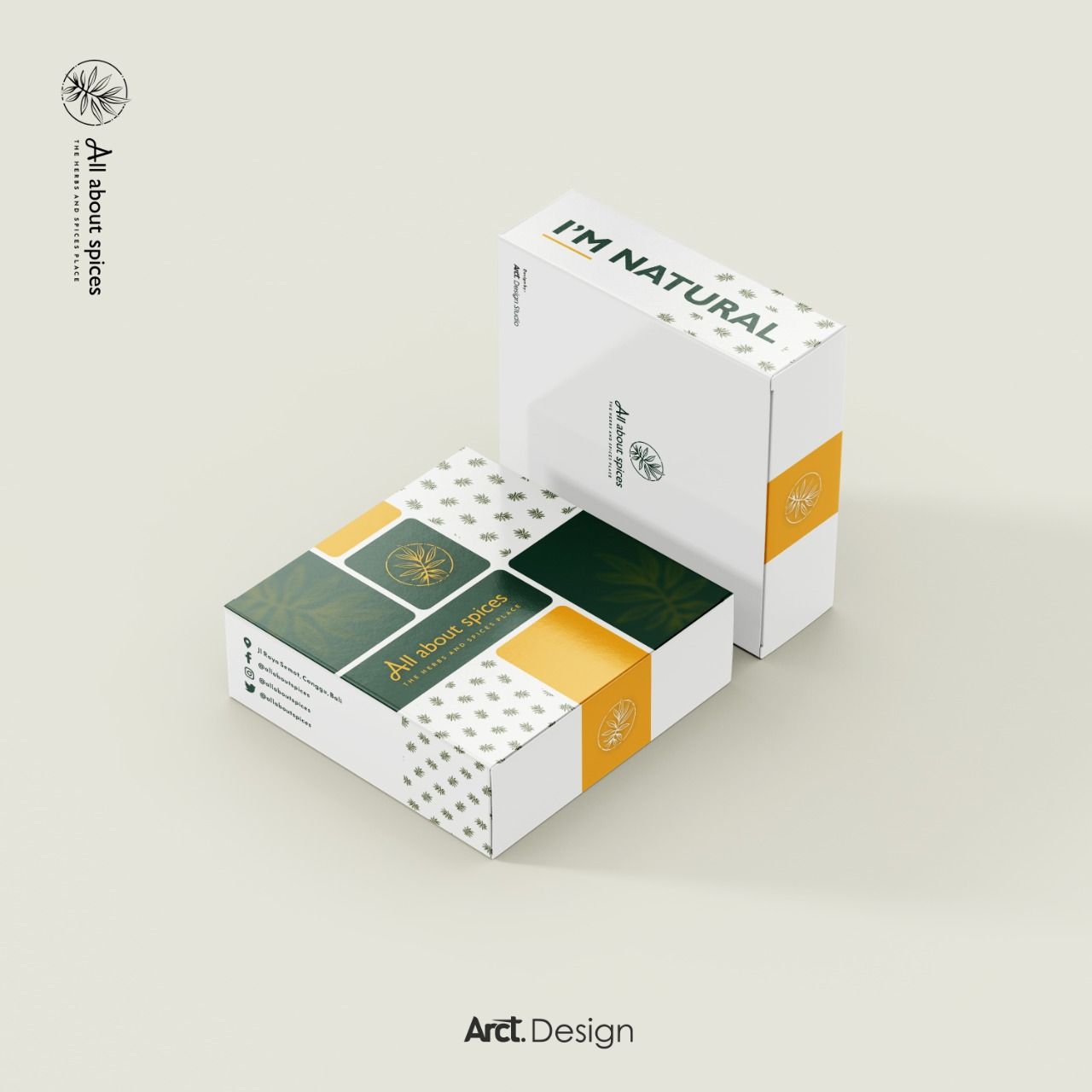
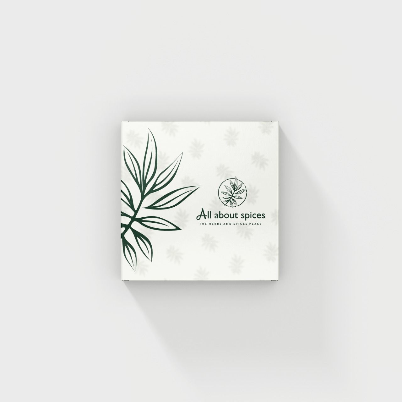
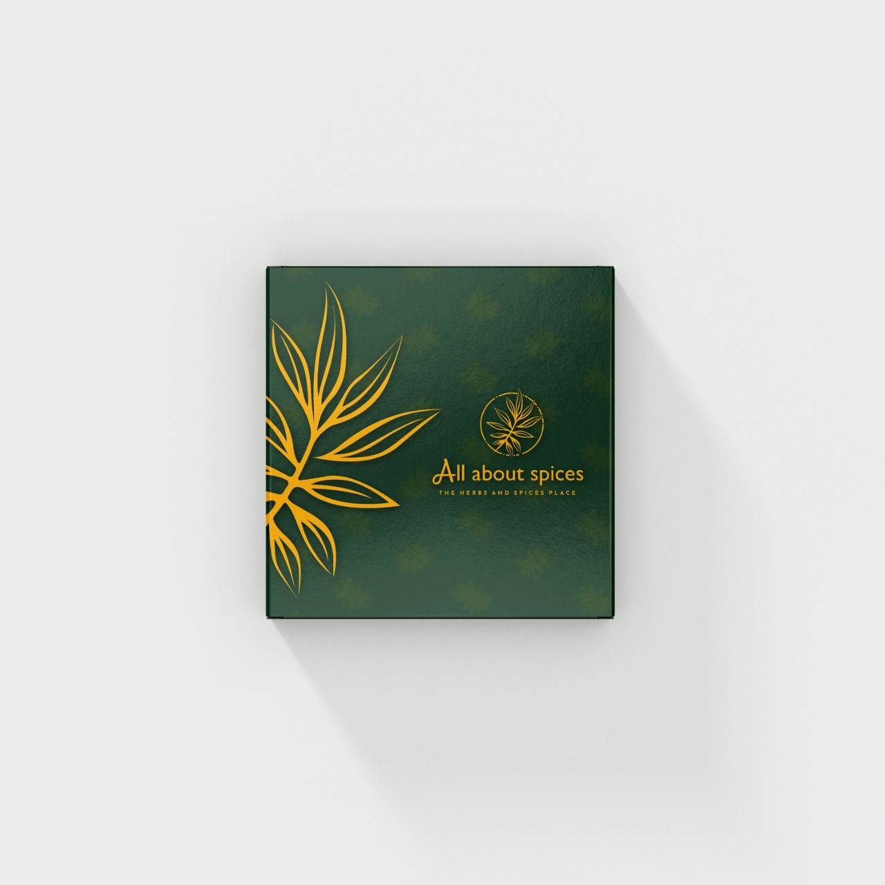
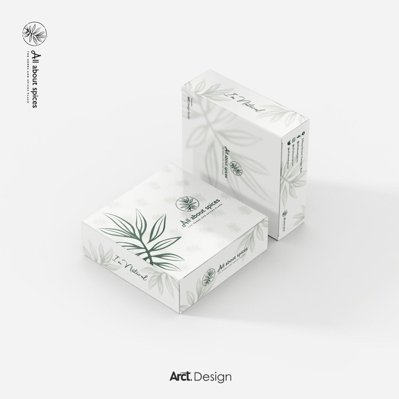
The packaging system was developed as three distinct expressions of the same visual language. The minimal white expression uses the botanical illustration at reduced opacity as a surface graphic — communicating "natural" through restraint. The color-block expression introduces the full green-gold palette in a structured grid layout with the repeating spice pattern — communicating brand confidence and shelf visibility. The premium dark expression inverts the system — deep green ground, gold logo and illustration — communicating luxury and gift-worthiness. All three expressions use the same logomark, the same pattern, the same typography. They are the same brand in three different moods.
The Final Execution.
The Result.
All About Spices launched its refreshed visual identity with a packaging system that immediately elevated the brand's perceived quality in a market where visual communication is a direct proxy for product trust. The three-expression packaging system gave the brand the flexibility to present differently at different price points and occasions — minimal for everyday product, premium dark for gifting — while maintaining complete visual coherence across all touchpoints.
"The packaging changed everything. Before, people were buying our products. After the redesign, people started photographing them. That's the difference. Our products look exactly as good as they taste now — and in Bali, that matters more than anywhere else."
Founder
All About Spices
All About Spices was a lesson in the discipline of restraint applied across a full system.
The temptation with botanical brands is to add — more illustration, more pattern, more texture, more warmth. The work on this project was largely subtractive: identifying which elements to keep and how much space to give them to breathe.
The three-expression packaging system was the central creative challenge. Building three visually distinct outcomes from one set of components — without any of them feeling like a compromise or a variation — required a level of systematic thinking that pure styling does not demand. Every element had to belong to a logic, not just a mood.
When the premium dark expression came together — the gold logomark sitting against the deep forest green, the botanical illustration glowing at reduced opacity beneath — it felt like the brand had always existed. That invisibility of effort is what good packaging design should achieve.