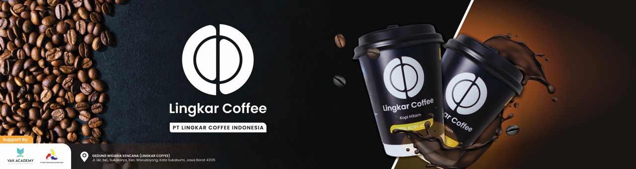
LingkarCoffee
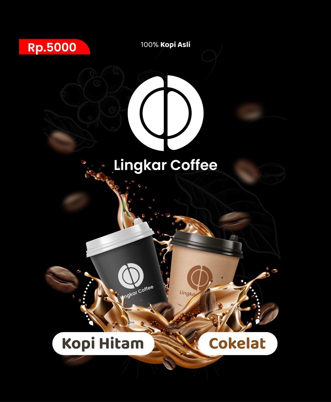
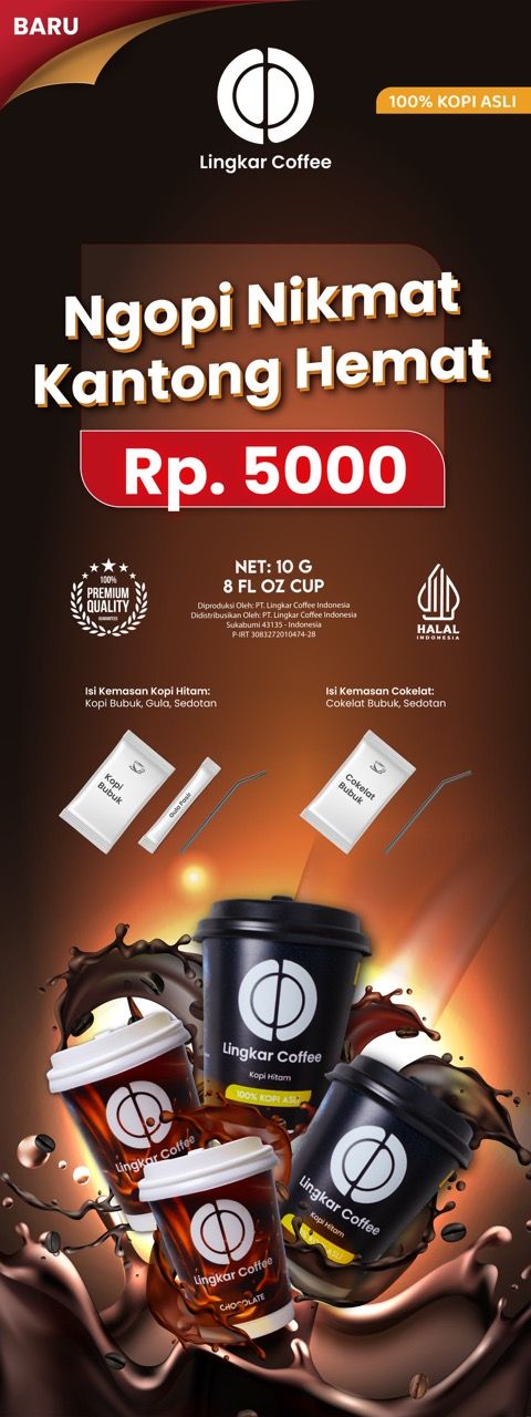
Lingkar Coffee is a ready-to-serve coffee brand from Sukabumi founded by the head of the local barista community. Operating on a consignment model at Rp5,000 per cup, they needed a brand identity that could hold its own against major cafe chains. ARCT Studio delivered a complete brand refresh — from logo and packaging to ambassador photography and marketplace presence — positioning Lingkar Coffee as a premium local brand at an accessible price.
Solving the Complexity.
Lingkar Coffee had strong community roots and a genuinely good product but lacked a visual identity worthy of its founder's standing in the industry. Competing against established cafe brands with tight margins, every visual touchpoint had to do heavy lifting.
Pain Points
- Logo felt inconsistent with premium positioning.
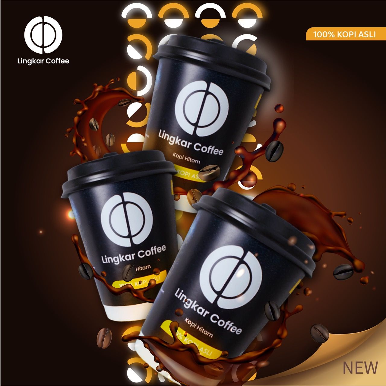
- Cup packaging had no strong visual storytelling.
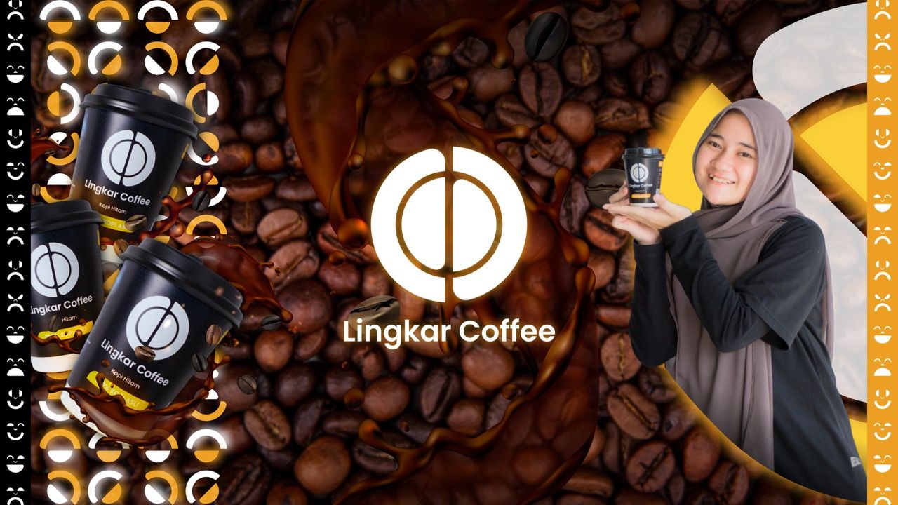
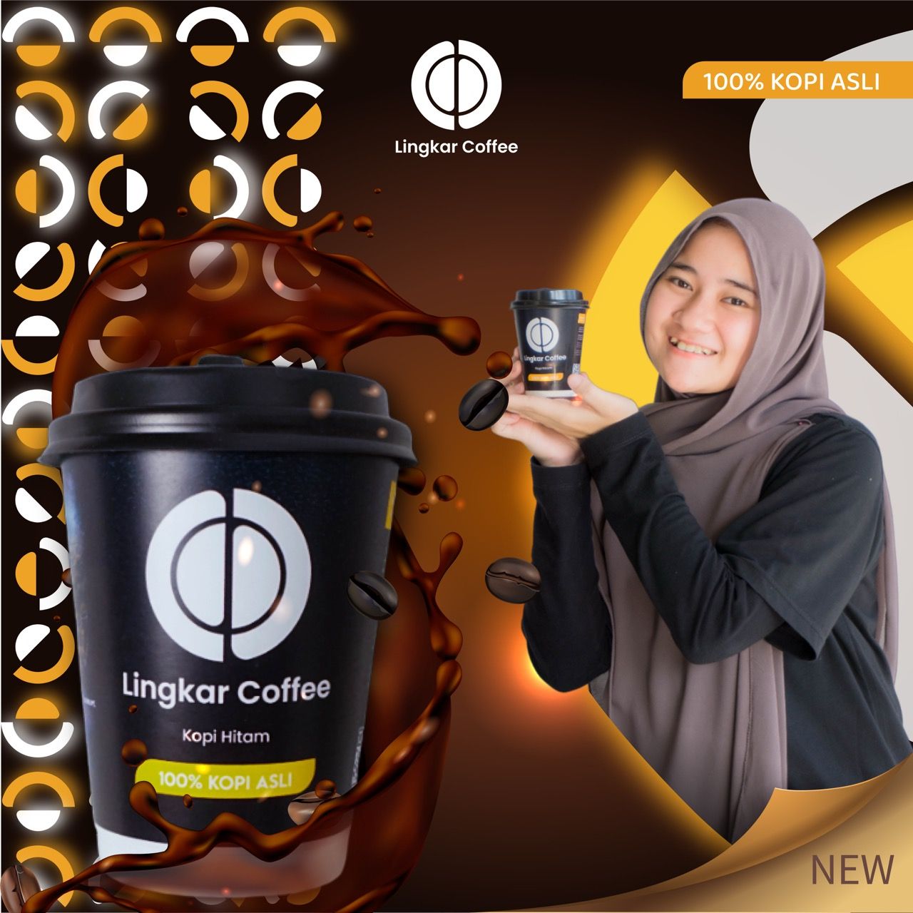
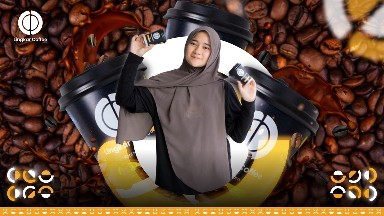
- No ambassador or campaign imagery for digital channels.
- Marketplace presence was weak and unconvincing.
- Brand system wasn't cohesive across all touchpoints.
Objectives
- Redesign a clean, distinctive logo with strong recall.
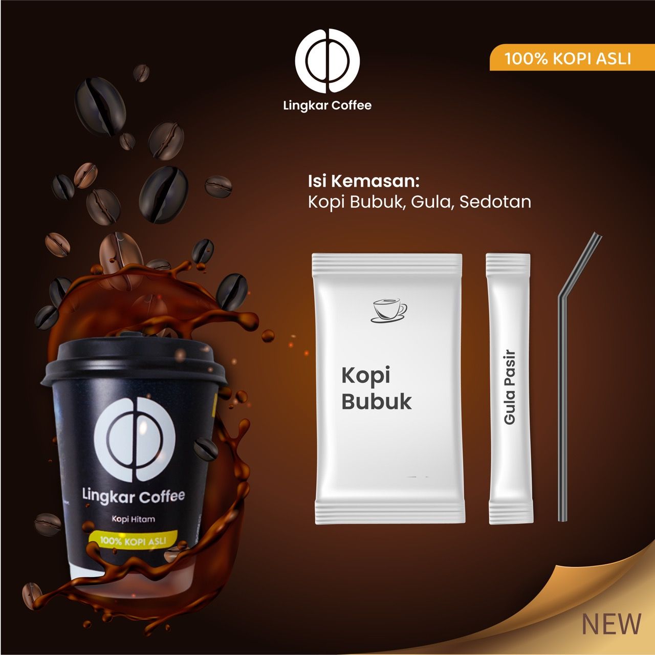
- Build a packaging system that tells the Lingkar Coffee story.
- Create a full brand visual kit for digital and physical use.
- Produce ambassador photography for social and marketplace.
- Deliver all assets production-ready across every format.
Decoding the Audience Psyche.
National sachet coffee brands like Kapal Api and Nescafe dominate the budget segment with massive distribution but zero premiumness. Lingkar Coffee occupies a smarter gap — real coffee, real cup, real price — with a brand that looks like it belongs in a specialty cafe.
Local Sukabumi coffee shops operate with strong community loyalty but inconsistent branding and minimal digital presence. Lingkar Coffee moves ahead by investing in visual quality that builds trust before the first sip.
The logo must work at cup scale — small, dark, fast-read is the primary use case.
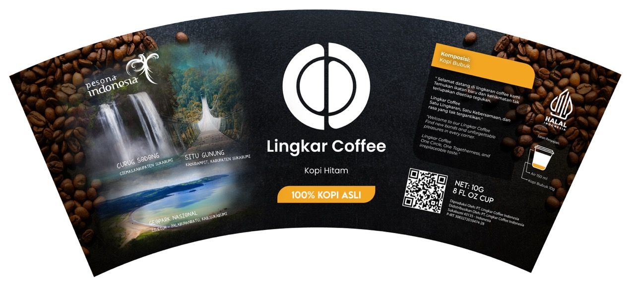
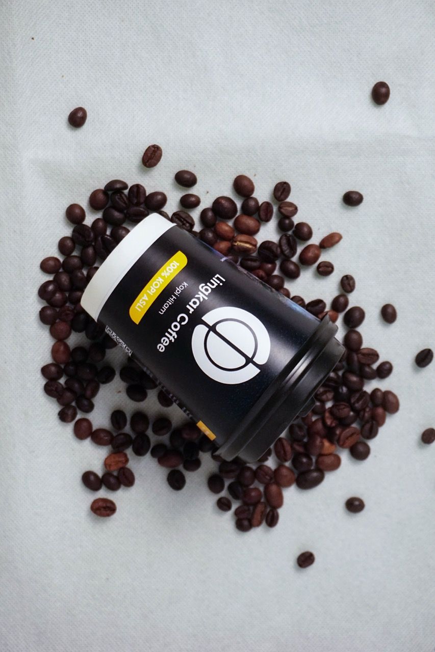
Sukabumi's natural landmarks on the cup sleeve transform packaging into local pride.
A consignment model demands brand trust — the cup must sell itself without a barista present.
The founder's community standing is the brand's most powerful asset — it must be visible.
Premium visuals at economy price creates immediate perceived value advantage.
Crafting the Identity.
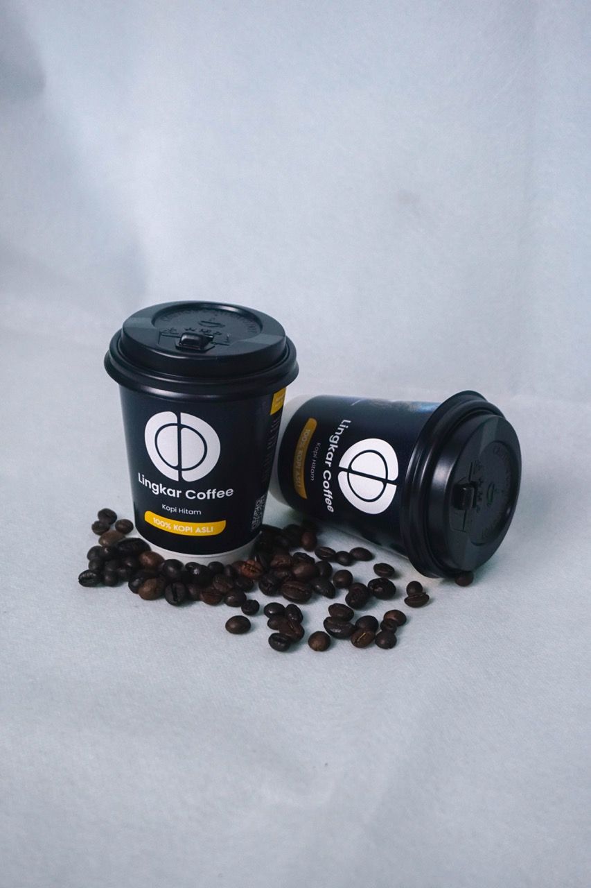
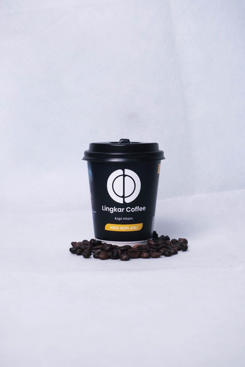
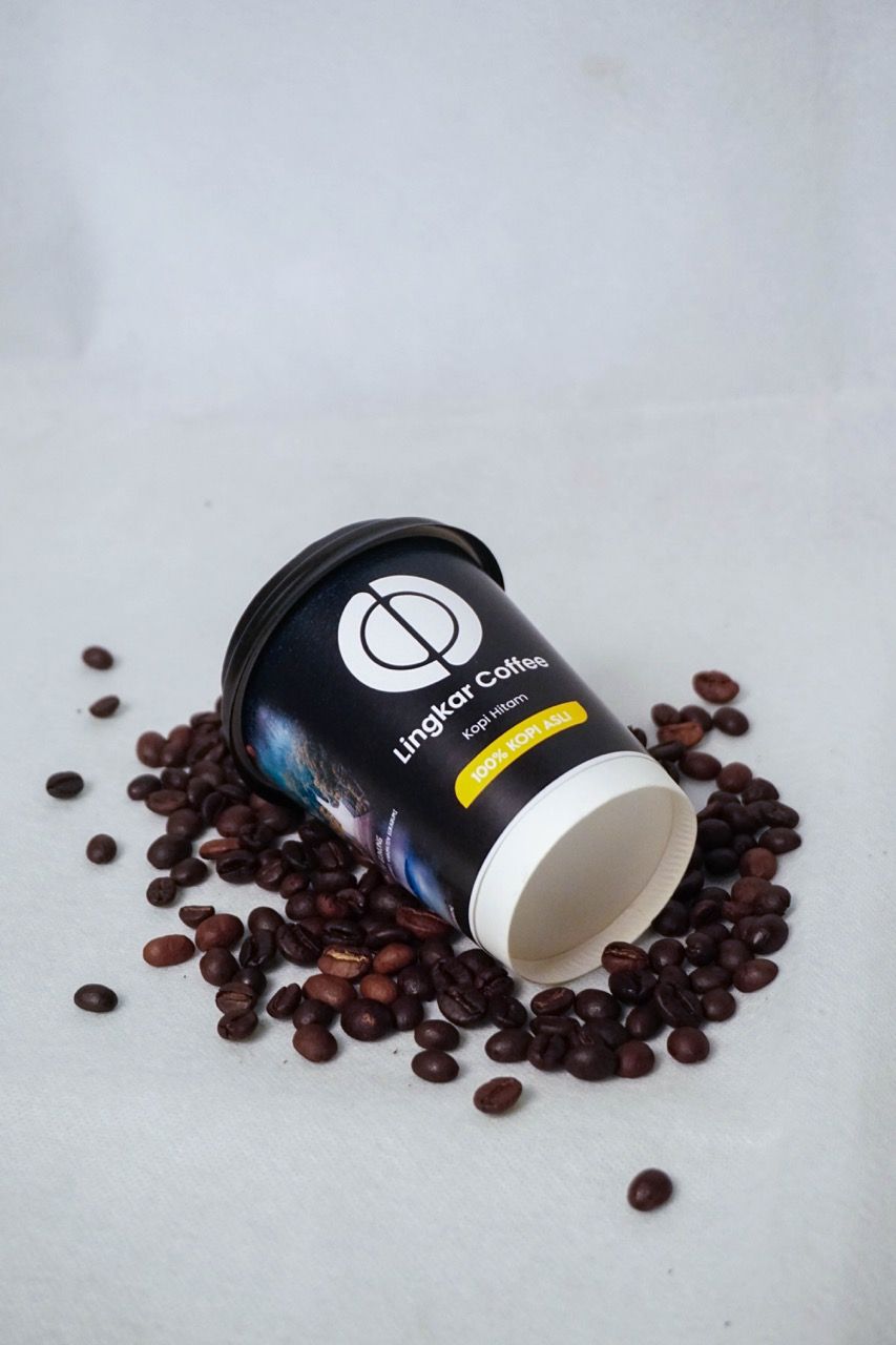
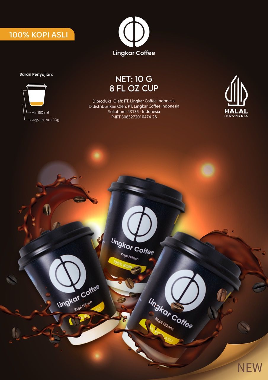
Lingkar Coffee was rebuilt around "Kesempurnaan Kopi Dalam Genggaman" — the perfection of coffee in your hand. The logomark abstracts a coffee bean cross-section into a precise geometric circle, split by a clean center axis — simple enough to read on an 8oz cup, sophisticated enough to hold its own against specialty cafe branding. The black cup with white logo communicates premiumness at a glance. The cup sleeve adds a second layer of storytelling: Sukabumi's iconic natural landmarks — Curug Sodong, Situ Gunung, Geopark Nasional Ciletuh — turning every cup into a quiet statement of local pride and origin.
The Final Execution.
The Result.
Lingkar Coffee gained a complete brand system matching specialty cafe standards — locally rooted, visually premium, and ready for consignment scale.
SATISFIED WITH THE RESULTS, VERY CREATIVE IN BRAND IDENTITY
Abdul Gani
Owner - Lingkar Coffee
Lingkar Coffee was a lesson in the power of restraint applied to the right places.
The logo is simple. The cup is black. The typography is clean. Nothing is trying too hard.
But the Sukabumi landmarks on the sleeve — that detail carries more emotional weight than any graphic treatment could.
The best packaging doesn't just hold a product. It holds a story. And when a product costs Rp5,000 but feels like it belongs in a specialty cafe window, the design has done something rare: it moved the perceived value without moving the price.